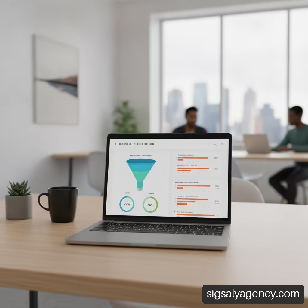
A website can receive constant traffic and have an attractive offer, but if its interface imposes barriers to interaction, visitors will leave before completing a purchase or submitting their data. Usability errors that cause a website to lose customers These issues often go unnoticed by those who manage the project daily, as they are familiar with the conversion process. However, for a new user, an incorrect form validation, a confusing button, or a lack of visual control are sufficient reasons to abandon the process. In this analysis, we evaluate which friction points cause user churn, how to diagnose their business impact, and what solutions should be implemented to optimize conversion.
Table of Contents
• Key Takeaways: UX Diagnosis and Prioritization Summary
• Checkout Failures and Direct Sales Loss
• Friction in Navigation and Information Architecture
• Lead Generation Forms: Why Users Abandon
• Actionable Trust and Transparency at the Decisive Moment
• Diagnosis and Measurement: How to Detect and Prioritize Errors
• Frequently Asked Questions about Web Usability Errors
• Sources and References
Key Takeaways: UX Diagnosis and Prioritization Summary
• The checkout is the area of greatest friction.The global average cart abandonment rate is above 70%. Correcting ambiguous fields and complex flows offers a direct return on conversion.
• The lack of payment options is hindering decisive purchases.The absence of common methods such as digital wallets or deferred payment causes buyers willing to complete their order to abandon the platform.
• User control prevents active frustrationElements such as pop-up windows without a clear close button or shopping carts that do not allow quantity modification degrade the perceived experience.
• Late form validation increases abandonment rates: Notifying errors only after pressing the submit button destroys the data already entered and generates immediate rejection.
• Device-by-device analysis is essentialThe conversion disparity between desktop and mobile often hides adaptive design flaws in interactive elements and navigation menus.
Checkout Failures and Direct Sales Loss
The checkout process is the culmination of the e-commerce experience. When a user reaches this stage, they have already shown intent to purchase; therefore, any technical or design friction at this stage has a direct and immediate cost to the business's revenue.
Evaluating Severity in the Payment Gateway
Analyzing behavior on the payment gateway requires understanding that not all abandonment is due to lack of interest. According to the Baymard Institute's studies on checkout usabilityThe global average cart abandonment rate reaches 70.19%, and it is estimated that 65% of the websites evaluated offer a mediocre or poor checkout experience, compared to only 2% considered truly good. This data confirms that checkout problems can cause direct abandonment, and the overall quality of checkout flows remains low globally.
When we evaluate a purchase flow, we observe that interactive blocks are the main cause of frustration. For example, requiring mandatory account creation before displaying shipping options or only showing taxes in the final step generates immediate rejection. The checkout architecture should be designed to minimize the steps between product selection and final confirmation.
The Lack of Preferred Payment Methods
The diversity of financial habits among consumers demands a flexible offering of payment gateways. The absence of a recognized payment system or the lack of modern mobile options raises concerns about the platform's security.
According to data analyzed by PrimerThirteen percent of shoppers may abandon a transaction if they cannot find their preferred payment method during the checkout process. This phenomenon is not due to a lack of money or interest, but rather a lack of convenience. Integrating one-click solutions, local cards, and deferred payment options significantly reduces abandonment at the final stage of the flow.
Formal Errors in Fields and Late Validation
One of the most common technical issues with payment gateways is the handling of errors in shipping and billing forms. When a customer makes a mistake typing their postal code or card number, the platform should flag it immediately.
- Real-time validationImplementing green verification signals or red warnings while the user types facilitates instant correction.
- Automatic data formattingApplying input masks for expiration dates and phone numbers prevents synthetic syntax errors.
- Preservation of contextIf the page reloads due to a server error, data previously validated by the client should never be deleted.
Friction in Navigation and Information Architecture
Information architecture is the conceptual map that allows users to orient themselves and navigate a website. If categories are ambiguous or labels are incomprehensible, users will waste their energy trying to understand the interface instead of consuming content or exploring products.
Ambiproductive Categorization and Saturated Menus
Drop-down menus with dozens of top-level links cause cognitive overload. Trying to fit the entire catalog into a single top bar makes it difficult to locate key sections.
| Navigation Problem | Visual Manifestation | Impact on the User | Recommended Solution |
|---|---|---|---|
| Oversaturated menus | More than 7-9 main options in the header | Disorientation and difficulty scanning | Group by hierarchical categories and use clean mega menus |
| Ambiguous category names | Use of internal company jargon | Uncertainty about the content of the section | Adopt standard terminology focused on user intent |
| Absence of navigation route | Lack of breadcrumbs | Loss of context in deep pages | Include dynamic breadcrumbs with links to higher levels |
| Ineffective search engine | No auto-completion or typo tolerance | Empty results and premature exit | Implement smart search with dynamic filters |
A balanced menu structure allows you to guide attention without cluttering the screen. In business planning, connecting design with a strategy is key. online marketing how to create a strategy that sells This is essential to ensure that each category responds to the real search intent of potential customers.
The Lack of User Control and Freedom
The browsing experience deteriorates significantly when the platform wrests control from the user. According to the Inprofit usability heuristic analysisThe lack of control to close, edit, or cancel can generate active rejection from visitors. This includes intrusive elements such as pop-ups without a visible close button, autoplaying videos with sound, or shopping carts where it's not possible to modify quantities without restarting the entire process.
To ensure a comfortable environment, the interface must incorporate basic principles of freedom of use:
• Obvious closure buttonsAny modal window must include a visible "X" and allow closing by pressing outside the box or with the key Escape.
• Transparent Cart Edition: Allow updating units, changing sizes, or deleting items with a single click.
• Return navigation: Ensure that the browser's back button works as expected, without trapping the user in redirect loops.
Loss of Consistency Between Desktop and Mobile Devices
A website might function perfectly on a desktop monitor but be completely unusable on a smartphone screen. Buttons that are too small to tap with a thumb, pop-ups that obscure the main text, and slow response times all contribute to a poor conversion rate on mobile devices.
To delve deeper into mobile optimization and its direct impact on user acquisition, it's worth reviewing the key guidelines on The mobile revolution: why responsive web design is the key to success in digital marketingAdjusting visual breakpoints and ensuring that interactive components maintain a minimum touch distance prevents accidental clicks and improves retention.
Lead Generation Forms: Why Users Abandon
Forms represent the gateway to lead generation and the collection of business data. However, they are often designed from the company's perspective (what data they want to obtain) rather than the user's (what effort it takes to respond).
Data Overload and Cognitive Friction
Each additional field added to a form increases the perceived effort and decreases the likelihood of submission. Requesting non-essential data early in the funnel, such as a landline phone number or job title, to download an informational resource raises suspicion.
- Audit of essential fields: Retain only the data strictly required to process the current request.
- Use of implicit data: Detect the city or country using IP location or automatic prefixes instead of forcing the user to select it from an infinite list.
- Explanation of the use of the data: Clearly state why specific information is being requested (for example: "We only request your phone number to coordinate delivery via SMS.").
Confusing Error Messages and Loss of Entered Data
There is no more frustrating situation for a visitor than completing a complex form, pressing the submit button, and encountering a page reload that erases all the entered data without specifying where the error occurred.
Common error: "The form contains errors."
Appropriate solution: "The 'Email' field must include a valid format (example: user@domain.com).»
Error messages should be placed right next to the affected field, use appropriate contrast colors, and offer concrete explanations on how to fix the formatting error.
Inline Validation Strategies vs. Multistep Forms
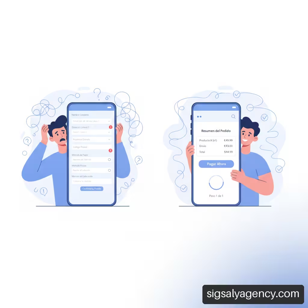
When collecting large amounts of information is unavoidable—such as in insurance policies or customizable services—displaying dozens of fields on a single screen is visually overwhelming. In these cases, dividing the process into logical steps using a multi-step form distributes the workload.
• One-step formsRecommended for short subscriptions or contact requests of up to 3-4 fields.
• Multistep formsIdeal for product configurators, complex quotes, or structured records. They should always include a progress bar indicating the current stage and remaining steps.
• Immediate inline validation: Progressive check that validates each piece of data when changing fields, avoiding unpleasant surprises when pressing the final button.
Actionable Trust and Transparency at the Decisive Moment
Usability isn't limited to the placement of buttons and menus; it also encompasses the clarity with which critical information is conveyed. A lack of transparency creates uncertainty, and uncertainty paralyzes purchasing decisions.
Uncertainty about Hidden Costs and Return Policies
One of the most common triggers for order abandonment is the appearance of unexpected costs during the final stages of the order process. Adding management fees, previously unadvertised shipping costs, or payment commissions in the last step destroys the trust built up on the product page.
• Costs visible from the outset: Display shipping simulators or estimated final prices in the shopping cart before requesting personal data.
• Affordable return policiesExplain in simple terms how the return process works and who covers the transportation costs.
• Satisfaction guarantees: Highlight quality seals, trial periods or warranty coverage in a clear and direct manner.
Absence of Direct Contact Elements and Visible Safety
When someone is about to make a payment or send confidential information to a company they don't know well, they look for tangible signs of legitimacy. The absence of a visible phone number, an accessible physical address, or a live chat support service breeds distrust.
Furthermore, keeping the platform technically and structurally up-to-date is essential to ensure visual stability and session security. To avoid sudden technical failures that could undermine customer confidence, it is advisable to implement an ongoing maintenance plan. Website maintenance: the invisible investment that drives your digital successThe appearance of security alerts in the browser or broken scripts immediately ruins business credibility.
Confusing or Poorly Placed Calls to Action (CTAs)
The call to action is the instruction that guides the user on what step to take next. Buttons with generic labels such as "Send" either "Process" They offer less context than specific benefit-focused statements such as Complete my reservation either Get my free quote.
- Visual contrastThe main conversion button should stand out clearly against the page background using a consistent but distinct color palette.
- Strategic location: Keep the CTA visible within the main viewing area without requiring excessive scrolling on mobile devices.
- Clear hierarchy: Distinguish the main action from secondary actions (such as "Save for later" either "Go back") assigning neutral tones or contour styles to the latter.
Diagnosis and Measurement: How to Detect and Prioritize Errors
Identifying which interface elements are hindering conversion requires combining quantitative analytics with qualitative observation of user behavior.
Distinguishing Abandonment by Intention from Abandonment by Friction
It is essential to differentiate between users who leave a website because they were simply comparing options and those who wanted to convert but encountered a technical failure or an incomprehensible interface.
• Intentional abandonmentThis occurs on the product page or in the initial shopping cart. The user saves information, compares prices, and leaves the website in a planned manner.
• Abandonment due to frictionThis occurs after initiating an interactive flow (such as filling out a form or starting a payment). It is reflected in repeated page reloads and frantic click patterns in non-interactive areas.rage clicks) or repeated validation errors.
Analysis of Metrics by Stage of the Funnel and Device
Performance evaluation should be broken down by screen type and source channel. An acceptable overall conversion rate may be masking a dramatic drop in mobile sales due to a flaw in the province selection dropdown.
Control metric = (Completed conversions on Mobile / Total sessions on Mobile) vs (Conversions on Desktop / Sessions on Desktop)
If the mobile conversion rate is below 50% compared to the desktop rate, there is a high probability that the mobile interface has critical usability problems.
Business Impact Prioritization Matrix vs. Technical Effort
Once the bottlenecks have been identified using analytical tools and heat maps, it is not feasible to address all the corrections simultaneously. A pragmatic prioritization approach is required:
| Priority Level | Friction Detected | Decision Criteria | Recommended Action |
|---|---|---|---|
| Critique (P1) | Blockages in the payment form or 500 errors when processing orders | It directly impacts current revenues with high frequency. | Correct immediately by the technical team |
| High (P2) | Mobile contact forms with misaligned fields | It affects a large proportion of traffic with low switching difficulty | Redesign the layout in the next work cycle |
| Media (P3) | Unclear confirmation messages or broken secondary links | It creates minor doubts without blocking the main passage. | Include in the continuous optimization plan |
| Low (P4) | Minor aesthetic adjustments to secondary pages or footer | No direct measurable impact on the conversion rate | Address during general site redesigns |
Frequently Asked Questions about Web Usability Errors
What are the usability errors that cause a website to lose the most customers?
The errors that result in the most direct loss of revenue are those related to the checkout and purchase form: requiring mandatory registration, adding hidden costs in the final step, not offering standard payment methods, and notifying users of errors late or by deleting their data. In general navigation, a lack of mobile optimization and slow response times are the main reasons for abandonment.
How do I know if the problem is in the design or in the value proposition?
To isolate the problem, it's helpful to analyze at what point in the funnel users are dropping off. If users abandon the site within seconds of reaching the homepage or product page without interacting, the value proposition or the clarity of the message is likely lacking. If users add products to their cart or start the contact form but abandon the process midway, the problem almost certainly lies in the usability and friction of the interface.
What navigation errors cause the most abandonments?
Navigation menus saturated with dozens of links without hierarchy, the lack of a search bar with auto-complete, the absence of breadcrumbs (breadcrumbsDeep architectures and broken links are the factors that most disorient visitors, causing them to abandon the site out of frustration.
How many fields should a contact or registration form have?
The ideal number of fields is the minimum strictly necessary to provide the service or initiate the business relationship. For general lead generation, three to four fields are sufficient (for example: name, email, company, and message). If collecting more data is mandatory, it's advisable to use a multi-step form with a progress bar to reduce cognitive load.
Why does a website work well on a computer but lose sales on mobile?
Performance differences between devices are often due to adaptive layout flaws: buttons too small for touch interaction, pop-up windows that cover the active writing field, drop-down menus that are difficult to close, and forms that do not activate the corresponding numeric keypad when requesting data such as the phone number or postal code.
How do you measure the real impact of a bad user experience?
The impact of usability failures is quantified by measuring the abandonment rate at each step of the conversion funnel, comparing conversion metrics by device type, and analyzing session recordings to detect frustration clicks (rage clicks) and evaluating cart abandonment before and after applying design corrections.
What signs indicate that users do not trust the web?
The most common signs are a high abandonment rate right at the step where the credit card or identity document is requested, massive exits in the order summary after showing the shipping costs and the lack of interaction with the conversion buttons when there is no visible direct contact data, physical address, secure payment seals or clear return policies.
What tools help identify usability barriers?
To detect usability problems, quantitative analytics tools (such as Google Analytics 4 to analyze funnels and dropouts by device), heat map tools and session recordings (such as Hotjar or Microsoft Clarity) are combined with direct usability testing with real users performing specific tasks.
Sources and References
• Baymard Institute: E-Commerce Cart & Checkout Usability Research. Available in: https://baymard.com/research/checkout-usability
• Inprofit10 usability mistakes that are causing you to lose customers. Available at: https://inprofit.eu/neuromarketing/errores-usabilidad-ux-perder-clientes-analisis-heuristico/
• First: Top Reasons for Cart Abandonment and How to Address Them. Available in: https://primer.io/blog/top-reasons-for-cart-abandonment-and-how-to-address-them