
Understanding how to improve the user experience of a corporate website is one of the most urgent priorities for companies seeking to transform visits into real business opportunities. Many corporate websites suffer from high abandonment rates due to confusing structures, slow response times, or interaction barriers that prevent potential customers from finding what they need. When a corporate site fails to offer smooth navigation, brand perception deteriorates immediately and customer acquisition processes become inefficient.
To solve these problems, isolated aesthetic changes are not enough. It is essential to implement a comprehensive method that encompasses information architecture, technical speed, accessibility and conversion-oriented flow design. In this detailed guide we analyse the key mechanisms and practical strategies to optimise every touchpoint of your corporate digital platform.
Table of Contents
• 1. Diagnosis and Classification of Problems in Corporate Sites
• 2. Optimisation of Information Architecture and Content
• 3. Technical Performance and Visual Stability With Core Web Vitals
• 4. Operational Web Accessibility and Inclusive Interaction
• 5. Mobile Strategy, Measurement and Continuous Testing
• Frequently Asked Questions About Corporate User Experience (FAQ)
• External Sources and References
Key Points On User Experience in Corporate Websites
• Comprehensive diagnosis: Separating interaction failures, content, accessibility and technical performance issues avoids applying aesthetic solutions to structural problems.
• Clarity of value proposition: The homepage should explain what the company offers and who it is aimed at within the first seconds of browsing.
• Measurement with Core Web Vitals: Independently assessing load speed, visual stability and interaction response allows specific friction points to be corrected.
• Operational accessibility: Designing keyboard-navigable elements with visible focus ensures access for all users and complies with international standards.
• Continuous Optimisation: Funnel analysis and continuous web maintenance ensure that the platform remains agile, secure and aligned with market expectations.
1. Diagnosis and Classification of Problems in Corporate Sites
Before executing any changes to the design of a corporate website, it is vital to identify the exact source of usability failures. Typically, companies make the mistake of redesigning the entire interface when the real obstacle lies in the clarity of the message or the slowness of server response.
Identification of Content and Interaction Barriers
Problems on a corporate site usually fall into two major groups: content barriers and interaction barriers. Content barriers appear when texts are too abstract, use excessive corporate jargon or do not transparently explain the solutions the company offers. In these cases, the user feels disoriented and abandons the page due to lack of relevance.
On the other hand, interaction barriers occur when interface components do not respond as the visitor expects. Drop-down menus that close accidentally, buttons with click areas that are too small or forms with complex validations are direct examples of how the site's mechanics interrupt user flow. Identifying this distinction is the first step in applying the appropriate corrections.
Difference Between Usability, Accessibility and Overall Experience
Terms such as usability, accessibility and user experience (UX) are often used as if they were synonymous, but they represent entirely different conceptual layers:
- Usability: It refers to the ease with which a person can perform a specific task on the site, such as submitting a contact form or downloading a dossier.
- Accessibility: It is about ensuring that any person, regardless of their physical, sensory or cognitive abilities, can perceive and operate the web.
- User Experience (UX): It encompasses the overall perception, emotions, trust and satisfaction that the visitor experiences before, during and after their interaction with the brand.
Understanding these dimensions prevents optimisation from being reduced to a superficial checklist and allows you to build an accessible and high-performance web design focused on real usability.
Prioritisation Matrix According to Impact, Effort and Risk
When resources or budgets are limited, attempting to correct all details of the website at once can paralyse the project. It is advisable to classify improvements within a structured prioritisation matrix.
| Improvement Category | Impact on Conversion | Technical Effort | Implementation Risk | Suggested Priority |
|---|---|---|---|---|
| Call-to-Action (CTA) Optimisation | High | Low | Low | High (Immediate) |
| Reduction of form fields | High | Low | Low | High (Immediate) |
| Correction of Cumulative Layout Shift (CLS) | Medium | Medium | Low | Medium |
| Restructuring of the main menu | High | Medium | Medium | Medium |
| Complete redesign of the visual system | Variable | High | High | Low (Planned) |
This matrix allows business managers to address first the issues with the greatest commercial return and lower technical complexity.
2. Optimisation of Information Architecture and Content
Information architecture is the skeleton upon which visitor interaction is sustained. A chaotic structure forces the user to think too much, increasing cognitive cost and the likelihood of abandonment.
The Home Page As a Centre of Commercial Decision
The home page or homepage should not function as an overloaded advertising brochure, but as an efficient routing station. Its primary mission is to communicate in less than five seconds three critical elements: what the business does, who it works for and what the suggested next step is.
To achieve this, the upper section (above the fold) should include a direct headline, an explanatory subtitle and a clear call to action. Avoid automatic image carousels or heavy background videos that distract attention and worsen loading speed. Information should be hierarchised in descending order, presenting main solutions first, followed by social proof elements such as testimonials, client logos or industry certifications.
Service Page Structure Oriented to Conversion
Service pages are the engines for generating business opportunities on a corporate website. Each individual service should have its own dedicated URL rather than grouping all offerings into a single generic list.
An effective service page should follow a well-founded logical sequence:
• Problem presentation: Demonstrate a deep understanding of customer needs and pain points.
• Solution explanation: Describe the service offered by detailing its features and direct benefits.
• Working methodology: Explain the steps the project will follow to reduce buyer uncertainty.
• Success cases or examples: Show tangible results achieved with similar clients.
• Conversion point: Incorporate a request form or direct contact button without additional distractions.
Menu Design and Direct Link Iteration
The main navigation menu of a corporate website should be concise and predictable. Limiting first-level options to between five and seven elements helps maintain cognitive clarity. Use descriptive labels such as 'Services' or 'About Us' instead of creative names that may confuse the audience.
On large corporate sites with multiple business lines, expanded dropdown menus or mega menus are very useful, as long as they are organised by logical categories and include clean visual elements. It is essential to verify that secondary navigation does not overlap relevant content when it expands and that it functions with complete precision on both desktop computers and touch screens.
3. Technical Performance and Visual Stability With Core Web Vitals
A company's perception of quality is closely linked to the speed of its website. A delay of just a few seconds in loading or unstable interface behaviour destroys user trust before they can even read the value proposition.
Largest Contentful Paint (LCP) and Initial Loading Speed
The metric Largest Contentful Paint (LCP) measures the time it takes for the main content block of the page to render, such as a featured image or the top headline text block. To provide a good user experience, LCP should be below 2.5 seconds.
To optimise LCP on a corporate website, the following technical measures should be applied:
- Image optimisation and compression: Use next-generation formats such as WebP or AVIF and configure appropriate size attributes.
- Critical resource prioritisation: Avoid render blocking by lazy loading (lazy loading) elements not essential located outside the initial viewport.
- Use of content delivery networks (CDN): Reduce latency by delivering content from servers close to the visitor's geographical location.
Cumulative Layout Shift (CLS) As a Factor of Visual Trust
He Cumulative Layout Shift (CLS) assesses visual stability by measuring unexpected shifts of page elements during the loading phase. There is nothing more frustrating for a user than trying to click a button and having it suddenly move due to the late loading of an advertisement or an image without defined dimensions.
A high CLS conveys a sense of lack of professionalism and technical instability. To control this factor, it is essential to reserve explicit space in the CSS code through width and height attributes (width and height) for all images, videos and embedded frames. According to the guide on Core Web Vitals from Google web.dev, LCP, CLS and INP represent distinct dimensions of the perceived experience: loading, visual stability and interaction response.
Interaction to Next Paint (INP) and Response to Actions
The metric Interaction to Next Paint (INP) analyses the overall page latency in responding to user interactions, such as button clicks, touches on touchscreens or keyboard entries in forms. A corporate site that takes time to react to an action gives the impression of having frozen.
To maintain optimal INP (below 200 milliseconds), it is necessary to simplify the execution of JavaScript code in the client's browser. Breaking down long processing tasks, removing unnecessary third-party scripts and optimising the management of dynamic events in menus and complex interfaces are key actions to achieve immediate response.
4. Operational Web Accessibility and Inclusive Interaction
Web accessibility is not only a legal requirement in an increasing number of jurisdictions, but a good design practice that benefits all users. An accessible site ensures that any person can navigate and interact seamlessly.
Practical Application of WCAG 2.2 Principles
Corporate pages should address accessibility through verifiable principles and criteria, not just visual recommendations, as established by the web content accessibility guidelines (WCAG 2.2) from W3C. This standard framework is structured around four fundamental principles:
• PerceptiblePerceivable: Information and interface components must be presented in a way that users can perceive them through alternative text for images and adequate colour contrast.
• Operable: Navigation and interface components must be usable by any means, such as keyboard or voice.
• Understandable: The content of texts and the functioning of the interface must be clear and predictable.
• Robust: Content must be compatible with a wide variety of browsers and assistive technologies.
Keyboard Focus Visibility in Menus and Forms
Many users navigate using exclusively the Tab key instead of a mouse or touchscreen. For this experience to be functional, the visual indicator that shows which element has system focus at any given time must be clearly identifiable.
In the official WCAG 2.2 documentation from W3C it is emphasised that keyboard focus must be partially visible, a relevant criterion for forms, menus and CTAs. Removing the visual outline of focus (outline: none) in stylesheets without offering an equivalent aesthetic alternative completely destroys usability for people who rely on keyboard navigation.
Simplification of Corporate Forms and Lead Capture
The contact form is the critical point where corporate design efforts and business objectives converge. The more complex a form is, the greater the perceived friction and the lower the final conversion rate.
To optimise corporate forms, it is recommended to follow these practical guidelines:
- Reduce the number of fields: Request only the information strictly necessary for the first commercial contact.
- Use clear labels outside the field: Avoid relying exclusively on placeholder text (placeholders), as they disappear when you start typing and disorient the user.
- Provide real-time validation: Point out input errors immediately with explanatory messages and correction suggestions rather than waiting for the user to press the submit button.
- Design descriptive submit buttons: Replace generic text such as «Send» with explicit calls to action such as «Request a Quote» or «Schedule a Demo».
5. Mobile Strategy, Measurement and Continuous Testing
Optimising user experience is a continuous process based on analysis of real data and user behaviour. No solution is definitive without an iterative evaluation framework.
Adaptive Mobile Design and Touch Usability
Traffic from mobile devices currently represents the majority of visits to corporate websites. However, many pages continue to be designed with computer screens in mind first and simply reduce elements for smaller screens.
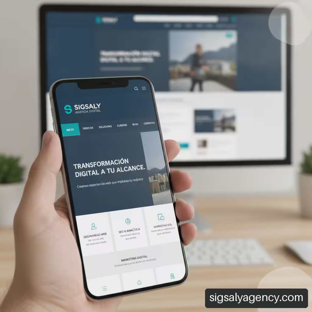
A responsive web design for mobile requires considering touch ergonomics. Buttons and links must have a minimum touch size (at least 44×44 pixels) and have separation space to avoid accidental clicks. Likewise, typography must be adjusted to a readable size without the visitor needing to manually zoom on the screen.
Establishing Baselines and Measuring Funnels
Before launching a redesign or applying structural changes, it is essential to define a baseline of metrics against which to compare future results. Measuring bounce rate by device type, average interaction time and conversion percentage of main funnels provides the quantitative evidence needed to assess the success of modifications.
Digital analytics tools allow users to be segmented by traffic source, operating system or screen resolution. If data shows that mobile device users convert at a significantly lower rate than desktop users, the diagnosis will clearly indicate that the touch interface requires urgent review.
Usability Testing with Real Tasks versus A/B Testing
To validate improvement hypotheses, two complementary methodologies can be used:
• Qualitative usability testing: Consists of observing real people performing specific tasks on the corporate website, such as "find the price of service X" or "contact technical support". These tests reveal the why behind user difficulties.
• Quantitative A/B testing: Allows comparing two versions of the same page (for example, two form designs or two headlines) by showing each to half of the traffic and statistically measuring which achieves superior performance.
Combining qualitative observation with statistical contrast ensures that design decisions are based on solid evidence and not on subjective opinions.
Frequently Asked Questions About Corporate User Experience (FAQ)
What does it really mean to improve the user experience of a corporate website?
It means optimising all interactive, visual and technical aspects of the digital platform so that visitors can understand the company's value proposition, find relevant information and complete their business objectives with the least friction possible.
How can you tell if the problem is in the design, content or navigation?
Web analytics help identify the point of failure. If a page suffers a high immediate abandonment rate on entry, it is usually a problem of content relevance or speed. If users navigate through several pages but do not convert, the failure is usually in the information architecture, the clarity of the offers or the forms.
What should a corporate homepage display?
It should offer a clear explanation of the company's business, the target audience, main services, social proof elements (such as client logos or testimonials) and clear calls to action to guide navigation.
How should a business website menu be organised?
The menu should contain between five and seven main options labelled with clear and intuitive terms. It is recommended to group content by logical categories and avoid names that are too creative or ambiguous that hinder the location of key pages.
How to improve user experience on mobile devices?
To improve mobile usability, fluid responsive designs should be used, increase the size of buttons and touch controls, simplify secondary navigation and ensure that loading times are extremely fast by optimising code and images.
What Core Web Vitals should a company monitor?
It is essential to monitor Largest Contentful Paint (LCP) to measure the loading speed of main content, Cumulative Layout Shift (CLS) to control visual stability and Interaction to Next Paint (INP) to assess the speed of response to user interactions.
How many fields should a corporate contact form have?
It is recommended to limit the form to essential fields for qualifying the first contact (normally between three and five fields: name, email, company and message). Reducing unnecessary fields directly increases conversion rates.
How to prioritise user experience improvements when budget is limited?
Use a prioritisation matrix evaluating business impact against technical effort. Start by resolving high-return obstacles with low complexity, such as optimising existing forms and clarifying calls to action.
External Sources and References
• W3C — Web Content Accessibility Guidelines (WCAG) 2.2
• W3C — What's New in WCAG 2.2
• Google web.dev — Optimise Core Web Vitals for business decision makers