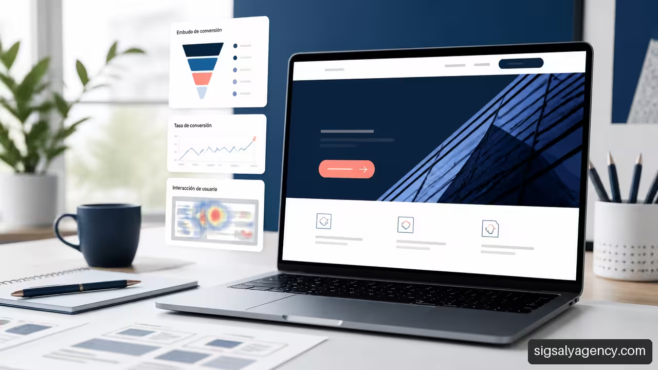
He web design with calls to action for businesses does not consist of adding coloured buttons to a page. It consists of helping each visitor to take the next logical step: request information, book a meeting, buy, compare a solution or contact the sales team. When that decision is easy, clear and consistent with the user's need, the website stops being a digital brochure and becomes a commercial tool.
Table of Contents
- Define The Action That Really Matters
- Design CTA According To Visitor Intent
- Create Buttons And Forms That Reduce Friction
- Measure From Click To Revenue
- Key Aspects
- Frequently Asked Questions
Define The Action That Really Matters
A call to action, or CTA, is the element that proposes a concrete and measurable action. It can be a button, a highlighted link, a form, a clickable phone number or access to WhatsApp. Its value does not depend only on how many clicks it receives. It depends on whether it brings the company closer to a real commercial objective.
My recommendation is to start with a simple question: what should happen after a person understands this page? The answer cannot be generic. On a B2B service page, you may want to request a diagnostic meeting. In an online store, add a product to your basket. In a local business, book an appointment or call.
Pixpa explains that a CTA should lead to a concrete action and communicate the benefit the user will receive, not limit itself to describing a technical gesture such as
One Page, One Priority Commercial Objective
Every page should have a primary CTA, which represents the most valuable action for that page's objective. It can coexist with a secondary CTA, but both should not compete visually or request the same level of commitment.
| CTA Type | Objective | Example | When It's Worth Using It |
|---|---|---|---|
| primary CTA | Generate the priority commercial action | Request a quote | On service pages with high intent |
| Secondary CTA | Reduce uncertainty before contact | View success cases | When the visitor is still comparing options |
| Self-service CTA | Allow progress without commercial intervention | Buy now | On products with clear pricing and process |
| Lead capture CTA | Obtain a contact for follow-up | Download a guide | On visits with initial interest |
For example, a consulting firm can show
Clicks Are Not The Same As Useful Leads
A CTA can achieve many clicks and still produce few useful contacts. This happens when the text sparks curiosity, but the subsequent page demands a commitment the user did not expect. It also occurs when the form attracts applications with no commercial fit.
That's why I propose evaluating lead quality before deciding that a CTA works. A qualified lead is not simply someone who leaves an email. It is a contact that meets criteria defined by the company, such as sector, budget, need, size, location or urgency.
An effective CTA does not pursue the greatest number of clicks. It pursues the right next step for the right visitor.
In a B2B company,
To integrate business objectives, user experience, performance and accessibility, it is useful to review one strategic guide for professional web design before defining conversion flows.
Design CTA According To Visitor Intent
Not all visitors know the company or are prepared to buy. The same CTA across the entire website may be too direct for someone who has just discovered a brand and too slow for someone who is already comparing proposals.
Dorik points out that business websites use CTAs to guide towards appointments, quotes, purchases and other clear next steps. The decisive point is to choose that next step according to the moment of decision, not according to a fixed formula.
CTA Matrix By Stage Of The Journey
The following matrix helps decide what to ask each type of visitor. It is not a universal rule, but a practical structure to avoid premature requests.
| Visitor Situation | Main Need | Recommended CTA | CTA To Avoid |
|---|---|---|---|
| Discover the problem | Understand options | See the solution, consult a guide | Request immediate quote |
| Investigate alternatives | Evaluate credibility | See cases, compare services | Buy without context |
| Compares providers | Reduce risk | Request proposal, schedule meeting | Download overly basic content |
| Has high intent | Complete the action | Book, buy, hire | Force to browse multiple pages |
Let's think about a company that sells management software. A person looking for general information might prefer "See how it works". Someone who already knows the product and checks prices may need "Request a demo". Mixing both routes under a single button can reduce the relevance of the message.
Coherence Between Ad, Page And Conversion
The CTA does not start at the button. It starts with the expectation created before the click: a campaign, a Google search, a social media post or a recommendation. If an ad promises a free audit and the page asks to hire an annual plan, a breach of trust appears.
Continuity should be maintained at five points:
- Initial promise: what is offered and for whom.
- Page headline: confirmation that the visitor has arrived at the right place.
- Main content: explanation of value, conditions and proof of trust.
- CTA: action consistent with the initial promise.
- Confirmation: clear explanation of what will happen next.
A page that captures traffic from campaigns must coordinate design, SEO and acquisition. The approach of professional web design SEO and Google Ads helps connect search intent and advertising message with a consistent conversion experience.
Lead Capture CTA vs Self-Service CTA
It is advisable to separate two models. The lead capture CTA seeks to start a conversation: "Request advice", "Ask for a proposal" or "Book a call". The Self-service CTA allows closing an action without intermediaries: "Buy", "Add to cart" or "Create account".
The first needs trust signals: process, testimonials, service scope, expected response and privacy. The second needs to reduce steps: visible price, availability, payment methods and simple purchasing. Requesting a meeting to purchase a simple product can add unnecessary friction. Allowing purchase without resolving doubts may be insufficient for a complex service.
Create Buttons And Forms That Reduce Friction
A visible button does not guarantee it is usable. The design must explain what will happen, allow activating the action with ease and respond correctly if something fails. Here usability and user experience matter as much as persuasive text.
Convertica proposes that conversion-oriented design organises visual hierarchy, forms, trust signals and speed around a main objective. In practical terms, this means the button should appear when the visitor has enough information to decide, not just at the top of the page by convention.
Text, Visual Hierarchy and Trust
The text of a CTA must answer three questions: what action will be taken, what benefit is obtained, and what commitment it implies.
Visual contrast helps to locate the CTA, but there is no colour that converts better across all companies. Effectiveness depends on visual identity, the rest of the interface, the device, the offer and the audience. An orange button can stand out on a blue page; on a website saturated with colours, it may look like just another element.
I would prioritise these criteria:
• Differentiate the primary CTA from secondary links.
• Maintain sufficient space around it to avoid accidental taps.
• Use visible and understandable text without relying solely on colour.
• Display social proof, terms or privacy information near high-commitment actions.
• Avoid false urgency, ambiguous messages or promises that the company cannot fulfil.
Forms With Clear States
A form does not end when
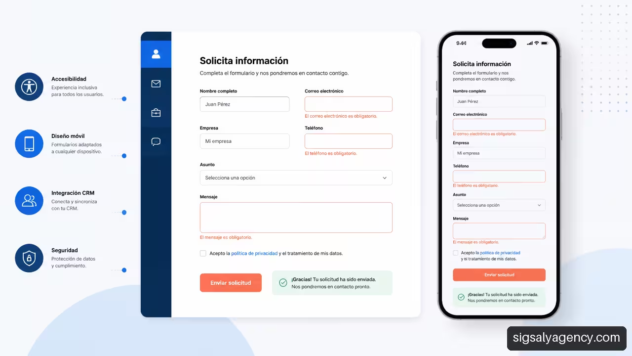
A robust flow contemplates these states:
- Initial state: minimal fields, clear labels and a brief explanation of the purpose.
- Validation: specific errors next to the corresponding field, not a generic warning at the end.
- Submission: loading indicator that prevents repeated clicks.
- Confirmation: message that confirms receipt and explains the next step.
- Recovery: alternative if the form fails, such as telephone, email or messaging.
A progressive form may be appropriate when you need several pieces of data. Instead of asking for all information at once, first request the essentials and expand later. However, it's not always advisable: for a simple booking, dividing the process into too many screens can be slower than a short form.
Mobile Design And Accessibility
On mobile, a CTA competes with less space, a virtual keyboard and a different context of use. A person may be comparing providers on the train, calling from the street or completing a form with one hand. That's why the button should be easy to press, visible without hiding content and compatible with keyboard navigation and screen readers.
I would avoid relying on phrases like 'press the green button'. A person with colour perception difficulties doesn't receive sufficient instruction. It's also advisable to use explicit labels, visible focus, adequate contrast and error messages that are announced in an understandable way.
For companies that combine website, content and customer acquisition, the web design and online marketing should treat the CTA as part of the complete journey, not as an isolated element of the interface.
Measure From Click To Revenue
The conversion rate is useful, but can be misleading if it only measures form submissions. A company can celebrate an increase in conversions and later discover that most of the contacts don't fit their offer. To make better decisions, it's worth measuring the complete funnel.
Metrics That Connect Design And Business
| Stage | Measurable Event | Business Question |
|---|---|---|
| Visit | Session on landing page | Does relevant traffic arrive? |
| Interaction | Click on CTA | Does the proposition spark interest? |
| Conversion | Form submitted, call or booking | Is the flow completed? |
| Qualification | Lead accepted by sales | Does the contact fit? |
| Opportunity | Useful meeting or proposal sent | Is there a real need? |
| Income | Deal closed | Does the CTA contribute to the financial result? |
Connection with a CRM is essential when there are long commercial processes. Each conversion should record, whenever possible and respecting applicable regulations, the campaign origin, entry page, clicked CTA and request type. This way you can detect that "Download comparison" generates fewer forms than "Request demo", but more qualified opportunities months later.
How to Plan a Useful A/B Test
A/B tests are comparisons between two variants. They shouldn't become constant changes without a hypothesis. Mollie indicates that in SaaS you can experiment with headers, CTAs, illustrations, product organisation and pricing models. Useful learning arrives when you modify a relevant variable and observe a defined result.
A reasonable protocol includes:
- Formulating a concrete hypothesis: "Explaining the reduced response time will reduce doubts before contact".
- Choosing a primary metric: valid submissions, completed bookings or qualified leads.
- Keeping other important elements equal during the test.
- Segmenting results by device, channel and visitor type when there is sufficient volume.
- Reviewing subsequent commercial quality, not just the initial click.
Fair warning: there is no universal duration or guaranteed improvement percentage. A change may seem positive during a one-off campaign and disappear when the traffic source changes. For example, if you modify the button and at the same time launch a campaign aimed at users with high intent, it is not possible to attribute the result solely to the CTA.
Key Aspects
• I define a CTA based on a concrete business objective, not from a visual preference.
• I distinguish between a high-value primary action and a secondary alternative that reduces doubts.
• I adapt the message to the level of intent: discover, evaluate, compare or decide.
• I measure the quality of the lead, the opportunity and the income, as well as the click and the form submission.
• Design forms with validation, confirmation and recovery methods if an error occurs.
• I treat mobile accessibility as part of conversion: usable buttons, visible focus and understandable text.
• I test one hypothesis at a time to avoid confusing real improvements with traffic changes, campaigns or seasonality.
Frequently Asked Questions
What Should The Main CTA Of A Services Company Be?
The main CTA should correspond to the most useful commercial step after understanding the service. For complex consulting it could be "Request a meeting". For a service with clear scope, "Get a quote" may be sufficient. If the visitor needs a lot of trust before contacting, I accompany the main action with a secondary CTA such as "View case studies".
Is It Better To Use "Request A Quote", "Contact" Or "Speak With An Expert"?
It depends on the expectation the company can meet. "Request a quote" is direct when the user is looking for price or proposal. "Contact" is broader, but also less specific. "Speak with an expert" can work if there will really be a specialist conversation. The best option describes honestly the next step.
How Many Calls To Action Should A Page Have?
A page can repeat the same primary CTA at natural points, especially if the content is extensive. It can also include a secondary CTA. What is worth avoiding is presenting many actions with the same prominence. If there are five main buttons, the hierarchy disappears.
Where Is It Best To Place The Main Button?
It is advisable to place it where the visitor has sufficient reasons to act. On some pages it will be visible at the top; on others, it will work better after explaining the benefit, the process or the social proof. There is insufficient evidence to claim that a specific position always works better. The intent, the device and the complexity of the offer change the result.
What CTA Works Best For B2B Companies With Long Sales Cycles?
It's usually helpful to combine a high-intent CTA, such as "Request a meeting", with a lower-commitment alternative, such as "Download the evaluation guide" or "View case studies". This allows those still researching to move forward without forcing an early sales conversation.
How Do I Reduce Abandonment Of A Contact Form?
I ask only for the data necessary for the first step, explain why it's being requested and show specific errors next to each field. I also confirm what will happen after submission. If additional information is needed, a progressive form or a later conversation may be more appropriate than an overly long initial form.
How Do I Know If A CTA Generates Quality Leads?
I connect web analytics with the CRM and track the contact beyond submission. I review how many leads are accepted by sales, how many convert into opportunities and how many result in revenue. If a CTA generates many registrations but few qualified contacts, it's worth reviewing the promise, segmentation or qualifying questions.
How Should A CTA Be Adapted For Mobile?
It must be clickable with ease, maintain clear text, prevent the keyboard from obscuring relevant fields and offer contact alternatives when context justifies it. In local businesses, for example, a call button can be useful for mobile users, while a B2B company may prioritise meeting booking or a brief form.
Sources and References
- Pixpa — How to optimise the call to action for a portfolio website. https://www.pixpa.com/es/blog/how-to-optimise-call-to-action-for-portfolio-website
- Dorik — 11 inspiring examples of websites for small businesses. https://es.dorik.com/blog/ejemplos-de-sitios-web-para-pequenas-empresas
- Mollie — Optimising conversion for SaaS. https://www.mollie.com/es/growth/optimising-conversion-for-saas
- Convertica — Conversion Focused Web Design: 9 Principles and a Checklist. https://convertica.org/website-conversion-design/
A call to action, or CTA, is the element that proposes a concrete and measurable action. It can be a button, a highlighted link, a form, a clickable phone number or access to WhatsApp. Its value does not depend only on how many clicks it receives. It depends on whether it brings the company closer to a real commercial objective.
My recommendation is to start with a simple question: what should happen after a person understands this page? The answer cannot be generic. On a B2B service page, you may want to request a diagnostic meeting. In an online store, add a product to your basket. In a local business, book an appointment or call.
Pixpa explains that a CTA should lead to a concrete action and communicate the benefit the user will receive, not limit itself to describing a technical gesture such as
One Page, One Priority Commercial ObjectiveEvery page should have a primary CTA, which represents the most valuable action for that page's objective. It can coexist with a secondary CTA, but both should not compete visually or request the same level of commitment.
CTA TypeObjectiveExampleWhen To Use ItPrimary CTAGenerate Priority Business ActionRequest QuoteOn Service Pages With High IntentSecondary CTAReduce Uncertainty Before ContactView Case StudiesWhen The Visitor Is Still Comparing OptionsSelf-Service CTAAllow Progress Without Sales InterventionBuy NowOn Products With Clear Pricing And ProcessCapture CTAObtain A Contact For Follow-UpDownload A GuideOn Visits With Initial InterestFor example, a consulting firm can show
Clicks Are Not The Same As Useful LeadsA CTA can achieve many clicks and still produce few useful contacts. This happens when the text sparks curiosity, but the subsequent page demands a commitment the user did not expect. It also occurs when the form attracts applications with no commercial fit.
That's why I propose evaluating lead quality before deciding that a CTA works. A qualified lead is not simply someone who leaves an email. It is a contact that meets criteria defined by the company, such as sector, budget, need, size, location or urgency.
An effective CTA does not pursue the greatest number of clicks. It pursues the right next step for the right visitor.
In a B2B company,
To integrate business objectives, user experience, performance and accessibility, it is useful to review one strategic guide for professional web design before defining conversion flows.
Design CTA According To Visitor IntentNot all visitors know the company or are prepared to buy. The same CTA across the entire website may be too direct for someone who has just discovered a brand and too slow for someone who is already comparing proposals.
Dorik points out that business websites use CTAs to guide towards appointments, quotes, purchases and other clear next steps. The decisive point is to choose that next step according to the moment of decision, not according to a fixed formula.
CTA Matrix By Stage Of The JourneyThe following matrix helps decide what to ask each type of visitor. It is not a universal rule, but a practical structure to avoid premature requests.
Visitor SituationMain NeedRecommended CTACTAs To AvoidDiscover The ProblemUnderstand OptionsView The Solution, Consult A GuideRequest Quote ImmediatelyInvestigate AlternativesEvaluate CredibilityView Cases, Compare ServicesBuy Without ContextCompare ProvidersReduce RiskRequest Proposal, Schedule MeetingDownload Content Too BasicHas High IntentComplete The ActionBook, Buy, HireForce To Browse Multiple PagesHas High IntentComplete The ActionReserve, Buy, ContractForce To Browse Multiple PagesLet's think about a company that sells management software. A person looking for general information might prefer "See how it works". Someone who already knows the product and checks prices may need "Request a demo". Mixing both routes under a single button can reduce the relevance of the message.
Coherence Between Ad, Page And ConversionThe CTA does not start at the button. It starts with the expectation created before the click: a campaign, a Google search, a social media post or a recommendation. If an ad promises a free audit and the page asks to hire an annual plan, a breach of trust appears.
Continuity should be maintained at five points:
Initial promise: what is offered and for whom. Page headline: confirmation that the visitor has arrived at the right place. Main content: explanation of value, conditions and proof of trust. CTA: action consistent with the initial promise. Confirmation: clear explanation of what will happen next.A page that captures traffic from campaigns must coordinate design, SEO and acquisition. The approach of professional web design SEO and Google Ads helps connect search intent and advertising message with a consistent conversion experience.
Lead Capture CTA vs Self-Service CTAIt is advisable to separate two models. The lead capture CTA seeks to start a conversation: "Request advice", "Ask for a proposal" or "Book a call". The Self-service CTA allows closing an action without intermediaries: "Buy", "Add to cart" or "Create account".
The first needs trust signals: process, testimonials, service scope, expected response and privacy. The second needs to reduce steps: visible price, availability, payment methods and simple purchasing. Requesting a meeting to purchase a simple product can add unnecessary friction. Allowing purchase without resolving doubts may be insufficient for a complex service.
Create Buttons And Forms That Reduce FrictionA visible button does not guarantee it is usable. The design must explain what will happen, allow activating the action with ease and respond correctly if something fails. Here usability and user experience matter as much as persuasive text.
Convertica proposes that conversion-oriented design organises visual hierarchy, forms, trust signals and speed around a main objective. In practical terms, this means the button should appear when the visitor has enough information to decide, not just at the top of the page by convention.
Text, Visual Hierarchy and TrustThe text of a CTA must answer three questions: what action will be taken, what benefit is obtained, and what commitment it implies.
Visual contrast helps to locate the CTA, but there is no colour that converts better across all companies. Effectiveness depends on visual identity, the rest of the interface, the device, the offer and the audience. An orange button can stand out on a blue page; on a website saturated with colours, it may look like just another element.
I would prioritise these criteria:
• Differentiate the primary CTA from secondary links.
• Maintain sufficient space around it to avoid accidental taps.
• Use visible and understandable text without relying solely on colour.
• Display social proof, terms or privacy information near high-commitment actions.
• Avoid false urgency, ambiguous messages or promises that the company cannot fulfil.
Forms With Clear StatesA form does not end when
A robust flow contemplates these states:
Initial state: minimal fields, clear labels and a brief explanation of the purpose. Validation: specific errors next to the corresponding field, not a generic warning at the end. Submission: loading indicator that prevents repeated clicks. Confirmation: message that confirms receipt and explains the next step. Recovery: alternative if the form fails, such as telephone, email or messaging.A progressive form may be appropriate when you need several pieces of data. Instead of asking for all information at once, first request the essentials and expand later. However, it's not always advisable: for a simple booking, dividing the process into too many screens can be slower than a short form.
Mobile Design And AccessibilityOn mobile, a CTA competes with less space, a virtual keyboard and a different context of use. A person may be comparing providers on the train, calling from the street or completing a form with one hand. That's why the button should be easy to press, visible without hiding content and compatible with keyboard navigation and screen readers.
I would avoid relying on phrases like 'press the green button'. A person with colour perception difficulties doesn't receive sufficient instruction. It's also advisable to use explicit labels, visible focus, adequate contrast and error messages that are announced in an understandable way.
For companies that combine website, content and customer acquisition, the web design and online marketing should treat the CTA as part of the complete journey, not as an isolated element of the interface.
Measure From Click To RevenueThe conversion rate is useful, but can be misleading if it only measures form submissions. A company can celebrate an increase in conversions and later discover that most of the contacts don't fit their offer. To make better decisions, it's worth measuring the complete funnel.
Metrics That Connect Design And Business StageIdentifiable EventBusiness QuestionVisitSession On Landing PageDoes Relevant Traffic Arrive?InteractionClick On CTADoes The Proposal Spark Interest?ConversionForm Submitted, Call Or BookingDoes The Flow Complete?QualificationLead Accepted By SalesDoes The Contact Fit?OpportunityCritical Meeting Or Proposal SentDoes A Real Need Exist?RevenueDeals ClosedDoes The CTA Contribute To Financial Results?Connection with a CRM is essential when there are long commercial processes. Each conversion should record, whenever possible and respecting applicable regulations, the campaign origin, entry page, clicked CTA and request type. This way you can detect that "Download comparison" generates fewer forms than "Request demo", but more qualified opportunities months later.
How to Plan a Useful A/B TestA/B tests are comparisons between two variants. They shouldn't become constant changes without a hypothesis. Mollie indicates that in SaaS you can experiment with headers, CTAs, illustrations, product organisation and pricing models. Useful learning arrives when you modify a relevant variable and observe a defined result.
A reasonable protocol includes:
Formulate a concrete hypothesis: "Explaining response time will reduce doubts before contact". Choose a primary metric: valid submissions, completed bookings or qualified leads. Keep other important elements the same during the test. Segment results by device, channel and visitor type when there is sufficient volume. Review the subsequent commercial quality, not just the initial click.Fair warning: there is no universal duration or guaranteed improvement percentage. A change may seem positive during a one-off campaign and disappear when the traffic source changes. For example, if you modify the button and at the same time launch a campaign aimed at users with high intent, it is not possible to attribute the result solely to the CTA.
Key Aspects• I define a CTA based on a concrete business objective, not from a visual preference.
• I distinguish between a high-value primary action and a secondary alternative that reduces doubts.
• I adapt the message to the level of intent: discover, evaluate, compare or decide.
• I measure the quality of the lead, the opportunity and the income, as well as the click and the form submission.
• Design forms with validation, confirmation and recovery methods if an error occurs.
• I treat mobile accessibility as part of conversion: usable buttons, visible focus and understandable text.
• I test one hypothesis at a time to avoid confusing real improvements with traffic changes, campaigns or seasonality.
Frequently Asked Questions What Should Be The Main CTA Of A Service Company?The main CTA should correspond to the most useful commercial step after understanding the service. For complex consulting it could be "Request a meeting". For a service with clear scope, "Get a quote" may be sufficient. If the visitor needs a lot of trust before contacting, I accompany the main action with a secondary CTA such as "View case studies".
Is It Better To Use "Request A Quote", "Contact" Or "Speak With An Expert"?It depends on the expectation the company can meet. "Request a quote" is direct when the user is looking for price or proposal. "Contact" is broader, but also less specific. "Speak with an expert" can work if there will really be a specialist conversation. The best option describes honestly the next step.
How Many Calls To Action Should A Page Have?A page can repeat the same primary CTA at natural points, especially if the content is extensive. It can also include a secondary CTA. What is worth avoiding is presenting many actions with the same prominence. If there are five main buttons, the hierarchy disappears.
Where Is It Best To Place The Main Button?It is advisable to place it where the visitor has sufficient reasons to act. On some pages it will be visible at the top; on others, it will work better after explaining the benefit, the process or the social proof. There is insufficient evidence to claim that a specific position always works better. The intent, the device and the complexity of the offer change the result.
What CTA Works Best For B2B Companies With Long Sales Cycles?It's usually helpful to combine a high-intent CTA, such as "Request a meeting", with a lower-commitment alternative, such as "Download the evaluation guide" or "View case studies". This allows those still researching to move forward without forcing an early sales conversation.
How Do I Reduce Abandonment Of A Contact Form?I ask only for the data necessary for the first step, explain why it's being requested and show specific errors next to each field. I also confirm what will happen after submission. If additional information is needed, a progressive form or a later conversation may be more appropriate than an overly long initial form.
How Do I Know If A CTA Generates Quality Leads?I connect web analytics with the CRM and track the contact beyond submission. I review how many leads are accepted by sales, how many convert into opportunities and how many result in revenue. If a CTA generates many registrations but few qualified contacts, it's worth reviewing the promise, segmentation or qualifying questions.
How Should A CTA Be Adapted For Mobile?It must be clickable with ease, maintain clear text, prevent the keyboard from obscuring relevant fields and offer contact alternatives when context justifies it. In local businesses, for example, a call button can be useful for mobile users, while a B2B company may prioritise meeting booking or a brief form.
Sources And References Pixpa — How to optimise the call to action for a portfolio website. https://www.pixpa.com/es/blog/how-to-optimise-call-to-action-for-portfolio-website Dorik — 11 inspiring examples of websites for small businesses. https://es.dorik.com/blog/ejemplos-de-sitios-web-para-pequenas-empresas Mollie — Optimising conversion for SaaS. https://www.mollie.com/es/growth/optimising-conversion-for-saas Convertica — Conversion Focused Web Design: 9 Principles and a Checklist. https://convertica.org/website-conversion-design/