
The widespread use of smartphones for shopping, booking services, and accessing information demands that digital platforms respond accurately on any screen. However, simply adjusting content to a narrow width does not guarantee that a visitor will complete an action. Responsive web design to improve mobile conversions It requires transforming the visual structure and task architecture to eliminate tactile friction, accelerate response times, and guide the user toward the goal without distractions.
When a website simply shrinks its elements to fit a phone, it often results in readability problems, tiny touch areas, and frustrating checkout or registration processes. To convert visits into customers, we must implement strategies based on task optimization, device performance analysis, and reducing interactive effort. In this guide, we explore the technical and practical methodology needed to maximize business results in mobile environments.
Table of Contents
• Key Points of Responsive Mobile Design
• Fundamentals of Responsive Web Design to Improve Mobile Conversions
• Visual Adaptation vs. Task Adaptation: The Mobile Funnel
• Mobile Form Optimization and Friction Points
• Measurement, Testing, and Isolation of Variables on Small Screens
• Frequently Asked Questions About Responsive Design and Mobile Conversions
• Sources and References
Key Points of Responsive Mobile Design
• Prioritize the task over aestheticsJust because an interface fits on the screen doesn't mean it facilitates conversion; we must simplify the operational steps for the user.
• Differentiate performance variablesLoading speed, clarity of value proposition, and responsive design interact with each other, but must be measured separately to understand their real impact.
• Optimize touch targets and formsAdjusting input fields, enabling appropriate keyboard types, and expanding action buttons drastically reduces abandonment.
• Segment analytics by device: Mobile experiences should be evaluated using conversion tasks and tracking separated by device..
• Test under real-world conditions: Mobile interface verification should include unstable data networks, deployed virtual keyboards, and horizontal orientation.
Fundamentals of Responsive Web Design to Improve Mobile Conversions
Why Graphic Adaptation Is Not Enough
Many digital projects assume that implementing media queries CSS stylesheets address the mobile experience. While fluid grids (fluid gridsWhile this allows content blocks to be rearranged vertically, this visual adjustment doesn't resolve the functional complexity. A menu that requires four clicks to display key categories or a comparison table that's impossible to read vertically destroys purchase intent before the user even reaches the call to action.CTA).
The true goal of conversion-focused responsive design is to redesign the interaction. While on a desktop screen users navigate with a high-precision pointer, on a phone they interact with their thumb while scrolling or multitasking. If we don't adapt the functional hierarchy, the conversion rate will suffer, even if the structure appears aesthetically pleasing.
Separating Impact from Design, Speed, and Message
When analyzing why a mobile page isn't converting, it's a common mistake to blame only the visual layout. Conversions depend on four interconnected factors that we must isolate during a diagnostic:
- Adaptive Design and Usability: Control layout, button size, and information hierarchy.
- Technical Performance: Time until the page is interactive (Time to Interactive) and workforce stability (Cumulative Layout Shift).
- Relevance of Copywriting and Offer: Clarity of the message in the first two seconds of reading.
- Traffic Quality: Audience intent from ads, organic search, or social media.
Excellent responsive web design won't compensate for a confusing value proposition or poor loading speed. For example, One case cited by Google linked a one-second reduction in loading time with up to 27% more conversions.However, isolating this variable allows us to confirm whether visual changes or infrastructure adjustments generate revenue improvement.
The Mobile-First Concept Applied to Conversion
Adopt the philosophy mobile-first This involves designing first for the constraints of the smaller screen and then expanding the experience to wider screens (progressive enhancementFrom a conversion marketing perspective, this physical restriction acts as a clarity filter: it forces us to eliminate secondary content, distracting banners, and lengthy paragraphs that do not provide immediate value.
By prioritizing essential elements from the initial conceptualization phase, we ensure that the user finds the purchase button or contact form without having to travel kilometers (scrollTo delve deeper into this strategic approach within its overall plan, it is worth reviewing the concept of mobile-friendly web design.
Performance Budget and Actual User Performance (AUP)
Testing in laboratory environments with high-speed connections often masks the everyday problems experienced by mobile customers. Defining a performance budget (performance budget) imposes strict limits on the total size of images, the JavaScript code executed, and the main thread blocking time (main thread).
Through the supervision of real users (Real User Monitoring (or RUM), we can detect how the website behaves on mid-range smartphones exposed to 4G or 3G networks. If an adaptive animation consumes excessive CPU resources on the phone, the delay when pressing the send button causes the user to abandon the process thinking that the system has failed.
Visual Adaptation vs. Task Adaptation: The Mobile Funnel
Reorganization of Critical Elements and Hierarchy of Content
On the desktop version of an online store or corporate website, the horizontal view allows for sidebars, secondary recommendations, and multiple information blocks to be displayed simultaneously. On smaller screens, this layout is stacked vertically. If the secondary information is placed above the main offer, the conversion funnel becomes less effective.
We must structure the visual flow following a priority logic:
• Concise heading: Direct title with the main promise of the product or service.
• Immediate social proof: Visible ratings or trust seals without moving.
• Optimized responsive images: Compressed photographs in modern formats such as WebP or AVIF with specific dimensions according to the resolution.
• Main fixed or prominent action: Direct and clearly differentiated conversion button.
Menus, Filters, and Visibility of Touch Targets
Touch interaction requires sufficiently large contact areas. Accessibility standards recommend a minimum touch target size of 48×48 pixels with enough space between adjacent elements to prevent accidental touches.
Collapsible menus (like the hamburger icon) and search filters in e-commerce are common areas where conversions are lost. If a user tries to filter products by category and the pop-up window (overlayIf the panel doesn't allow you to easily close or scroll through the results, you'll leave the store. Apply rules of web performance and accessibility guide It ensures that each touch control responds instantly to the user's fingers.
Location and Behavior of Call to Action (CTA) Buttons
Should the main button be placed at the top or bottom of the page? The answer depends on the complexity of the purchase decision. For products with direct conversion or simple registrations, a button visible on the first screen (above the fold) captures the user's intent quickly. In complex services or high-value B2B products, the user needs to read information before making a decision.
A highly effective technique in mobile environments is the sticky CTA (sticky CTAThis button remains fixed at the bottom of the screen as the user reads the page, allowing them to convert at the precise moment they make the decision without having to scroll back vertically.
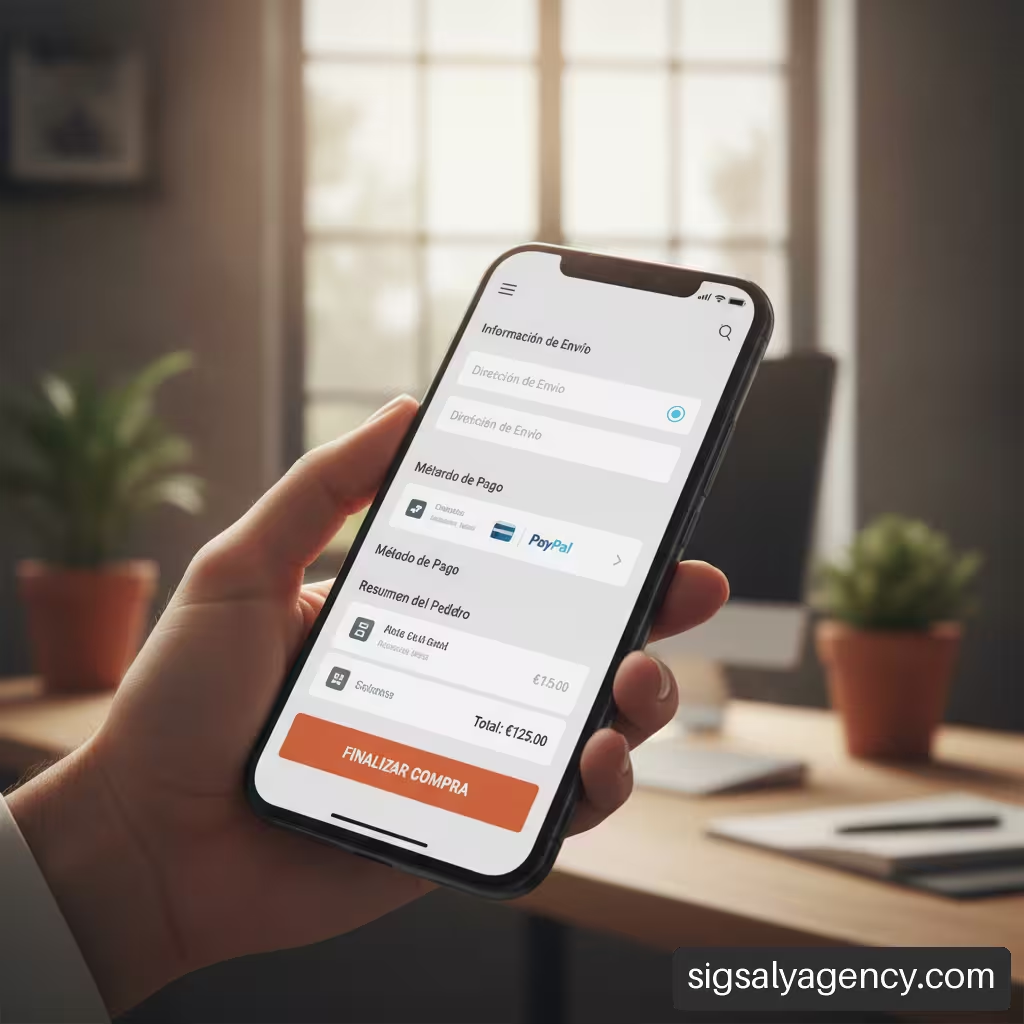
Comparative Matrix: Responsive Design vs. Separate Mobile Site vs. Mobile-First
To make the right technical decisions, it's helpful to compare the three most common approaches to mobile presence:
| Criterion | Responsive Web Design | Separate Mobile Site (m.sitio.com) | Mobile-First (Native) Design |
|---|---|---|---|
| Code maintenance | Single centralized CSS/HTML code | Two separate and duplicate sites | Unique code scalable to large screens |
| URL Management and SEO | Identical URL for all devices | Separate URLs (requires rel=canonical) | Identical URL with priority hierarchy |
| Friction in conversion | It goes down if the controls are optimized. | High due to content desynchronization | Minimal; designed for thumb and touch interaction |
| Resource load | It requires image and CSS optimization. | Lightweight loading but redirects URLs | Maximum optimization of default assets |
| Risk of hidden content | Medium (incorrect hiding using display:none) | Stop (cropped versions from the web) | Null (the essential content originates on mobile) |
Mobile Form Optimization and Friction Points
Reduction of Data Entry Effort
Completing a form on a 6-inch screen with a touch keyboard is one of the most frequently abandoned tasks on the web. Each additional field reduces the likelihood of completion. To maximize conversion on mobile forms, we must reduce the number of fields to the absolute minimum.
We can implement simple technical solutions that facilitate the experience:
- HTML5 AutocompleteConfigure attributes such as
autocomplete="given-name",e-maileitherpostal-codeso that the browser fills in the data in a single tap. - Automatic numeric keypads: Use
input type="tel"eitherinput type="number"to directly display the number keypad when requesting a phone number or postal code. - Visual selection on drop-down menus: Replace long drop-down menus (select) by option buttons (radio buttons) visuals that require a single tap.
Error Management, Virtual Keyboard, and Data Recovery
A common flaw in responsive design occurs when the virtual keyboard pops up when a field is tapped and covers the submit button or the confirmation message. If the user makes a mistake typing their email address and the warning message appears outside the visible area, they will assume the page has frozen.
Error handling in mobile forms must meet three basic conditions:
• Real-time validation: Show green confirmations or red warnings immediately upon leaving the field (blur), without waiting to press the send button.
• Automatic error offsetIf an error occurs after pressing the button, the screen should smoothly scroll to the faulty field.
• Data preservationIf the page reloads or the connection fails, the data already entered should never be deleted.
One-Step Forms vs. Step-by-Step Forms on Mobile Devices
When a customer acquisition or payment process requires collecting ten or more pieces of data, displaying them in a single vertical list is overwhelming. On mobile screens, structuring the process in step-by-step forms (multi-step forms) significantly increases the completion rate.
By breaking the process down into short steps (for example: 1. Basic information, 2. Address, 3. Payment) and incorporating a clear progress bar, the user experiences less cognitive load. Furthermore, by transparently saving the data from step 1, we can recover contacts who abandon step 2.
Technical Prioritization: Conversion Value vs. Implementation Effort
When planning improvements to an existing website, not all adaptive optimizations require the same amount of time or provide the same return. It's advisable to apply a prioritization framework to maximize business impact with available resources.
• High Priority (High Value / Low Effort): Increase the size of payment buttons, enable autocomplete in input fields, and correct text overlays on narrow screens.
• Medium Priority (High Value / High Effort): Redesign the checkout flow to a step-by-step model and restructure the navigation of complex menus.
• Low Priority (Little value / Little effort): Adjust secondary aesthetic margins in the footer.
• Discard (Low value / High effort): Create complex adaptive animations that slow down browser processing.
Measurement, Testing, and Isolation of Variables on Small Screens
Responsive Testing Protocol in Real-World Environments
Checking a site's responsiveness by simulating different resolutions in the browser's developer tools is only the first step. To ensure conversion effectiveness, it's essential to follow a validation protocol on real physical devices that covers various scenarios:
- Screen orientation: Test the interface in both portrait and portrait modes (portrait) and landscape (landscape).
- Zoom and system accessibility: Check that the design does not break if the user has enabled increased text size in their operating system settings.
- Active keyboard interactivity: Verify that floating buttons or fixed elements do not cover the text boxes when the on-screen keyboard is displayed.
- Poor connection states: Emulate network limitations to ensure that the loading hierarchy allows interaction with essential controls before large images finish downloading.
Assisted Conversion Metrics and Task Analysis
Evaluating the effectiveness of mobile design solely by direct conversion rate can lead to misleading conclusions. It's very common for a customer to research a service on their mobile phone in the morning and complete the final transaction on their office computer in the afternoon.
Analyze the mobile-assisted conversion It allows measuring the channel's impact throughout the entire purchase journey. Similarly, it allows evaluating performance through the task analysis It helps to isolate specific problems: if the mobile cart addition rate is similar to that on desktop, but the mobile checkout completion rate drops by half, the problem lies not in the product page, but in the usability of the touch checkout.
Analysis of Documented and Validated Cases
Technical literature on interface optimization provides concrete data on the direct impact of mobile usability on companies' financial results. For example, in the debt advisory financial sector, The reported case saw a 51% increase in mobile conversions This redesign resulted in an 11% increase in pageviews per visit and an 8% reduction in bounce rate. The site replaced a separate, incomplete mobile version with a fully responsive architecture.
In the B2B service comparison sector, BusinessComparison.com identified that over 45% of its traffic came from mobile devices but performed poorly. After implementing usability workshops, PageSpeed Insights analysis, and split testing to optimize buttons, speed, and forms, The case reported a 22% increase in mobile conversion and a one-third reduction in task completion time.These cases demonstrate that correcting operational barriers in smartphones directly impacts revenue.
Avoid Technical Regressions and Visual Overlaps
A common problem in continuous adaptive development is the occurrence of visual regressions. Changes in breakpoints (breakpoints) of the stylesheet can cause horizontal scroll bars to appear on intermediate widths (such as tablets in portrait mode or large-format phones).overflow-x) or that pop-up windows for cookies and registrations completely obscure the conversion flow.
To prevent these failures, it is essential to establish automated visual regression tests and periodically check that no third-party scripts (such as chat widgets or analytics tools) inject frames that hinder user navigation.
Frequently Asked Questions About Responsive Design and Mobile Conversions
What is responsive web design and how can it improve mobile conversions?
It's a web design method that allows a page's visual structure and elements to automatically adjust to the user's screen size. It improves mobile conversions by eliminating the need to zoom, making text easier to read, and offering clear touch buttons that reduce the effort required to complete a purchase or form.
Is a responsive website better than a standalone mobile version?
In the vast majority of cases, yes. Standalone mobile versions (such as m.sitio.comThis leads to duplicate content, technical maintenance issues, and potential redirection errors. Responsive web design concentrates SEO authority on a single URL and ensures that all platform features are available on any device.
Which elements of a mobile page have the greatest influence on the conversion rate?
The factors with the greatest impact are the initial loading speed, the visibility of the main call to action without needing to scroll, the simplicity of the navigation menu, and the degree of optimization of the contact or payment forms.
How many fields should a contact form have on mobile devices?
It's recommended to request only 3 to 5 essential fields in the initial contact (for example: name, email, and phone number). If more information is required, it's best to divide the process into several sequential steps to avoid overwhelming the user.
How does the mobile-first approach differ from conventional responsive design?
Traditional responsive design typically starts with the desktop version and then snips or readjusts elements for smaller screens. The approach mobile-first First design the reduced experience, prioritizing the essentials, and then add complex visual layers for larger screens.
How can I tell if my low mobile conversion rate is due to design or speed?
You should analyze each metric separately. If users leave the page before it finishes loading (high bounce rate in the first 2 seconds), the problem is technical performance. If users stay on the website, visit several pages, but don't click buttons or fill out forms, the friction lies in the design and responsive usability.
Is it advisable to fix the call to action (CTA) button on the mobile screen?
Yes, install a fixed button (sticky CTA) at the bottom of the screen is usually very effective, especially on product pages or long landing pages, as it allows the visitor to convert at any time without having to return to the beginning.
What tools help diagnose conversion failures on mobile screens?
Web analytics tools with device segmentation, heat map software and mobile click intent analysis, and speed monitoring platforms like PageSpeed Insights can be combined to identify technical and visual roadblocks.
Sources and References
• Think with Google + Baines & Ernest: Baines & Ernst Responsive Web Design Case Study
• Google and AnswerLab: Principles of Mobile Site Design
• Google: Designing for Mobile Micro-Moments
• Google: Businesscomparison.com makes mobile work for B2B