He professional web interface design for companies constitutes one of the most strategically decisive pillars for digital competitiveness in 2026. The interface represents not only the aesthetic layer of a corporate site, but the point of contact where an organisation's value proposition transforms into fluid interactions, commercial trust and qualified leads. Designing a digital platform requires balancing visual clarity with technical usability, ensuring that every layout decision responds to measurable business goals.
In this comprehensive analysis we address the methodology necessary to plan, validate and implement high-performance interfaces. We examine how to assess total cost of ownership, ensure accessibility, coordinate the handover between design and code, and avoid the structural errors that often limit digital ROI in the business environment.
Table of Contents
• Key Points in Professional Web Interface Design
• Architecture and Design Decisions Aligned to Business Objectives
• The UX/UI Process: From Research to Navigable Prototyping
• Design Systems, Accessibility and Transition to Development
• Interface State Management, Content and Mobile-First Experience
• Total Cost of Ownership, Technology Platforms and Maintenance
• Frequently Asked Questions on Professional Web Interface Design
• Sources and References
Key Points in Professional Web Interface Design
• Alignment of business objectives: An effective interface translates corporate goals into direct conversion flows, associating each component with metrics such as contact rate, time to action or form conversion.
• Difference between template and custom design: Pre-configured templates accumulate technical debt and visual rigidity; bespoke design prioritises loading speed, scalability and brand differentiation.
• Pre-code validation: Conducting usability testing on navigable prototypes drastically reduces the cost of code rewriting in advanced project phases.
• Accessibility as a technical standard: Complying with WCAG 2.1 guidelines is not an ethical extra, but an operational and regulatory necessity to expand audience reach and ensure usability across any device.
• Total Cost of Ownership (TCO) vision: The initial layout budget represents only a fraction of the investment; hosting, licences, content updates and continuous maintenance must be estimated from the conceptual phase.
Architecture and Design Decisions Aligned to Business Objectives
The development of a corporate digital presence demands moving beyond a strictly ornamental approach. When we evaluate commercial usability and UX/UI projects in the business sector, we confirm that organisations do not merely need visually appealing pages, but digital assets capable of solving specific communication and sales problems.
Each element incorporated into the interface must have a functional purpose backed by behavioural data. The visual structure should guide the user effortlessly from the first visual impact to the achievement of the set objective.
Difference between Generic Template and Bespoke Professional Design
There is a considerable discrepancy between acquiring a packaged theme for content management systems and developing a customised professional interface. Standard templates are designed to appeal to a heterogeneous mass of users, which means loading them with scripts, unnecessary options and heavy visual layout builders that degrade loading speed.
By contrast, customised work starts from a requirements study that eliminates all superfluous code, prioritising performance, accessibility and security. To delve deeper into this strategy, it is worthwhile to analyse the guide on professional web design SEO and Google Ads by niche, where we detail the integration between acquisition and layout.
| Evaluation Criterion | Generic Template / Preconfigured Theme | Professional Made-to-Measure Interface Design |
|---|---|---|
| Performance and Speed | Slow; includes unused libraries and excessive CSS. | Optimal; clean code written according to specifications. |
| Visual Flexibility | Limited by theme builder options. | Absolute; responds exactly to corporate identity. |
| Maintainability | Risk of breakage when updating plugins or base themes. | High; structured and controlled components. |
| Conversion Optimisation | Generic; calls to action without contextualisation. | Targeted; flows mapped through user experience journey. |
| Accessibility (WCAG) | Variable and frequently deficient. | Validated by design from the prototyping phase. |
Selection Matrix: Corporate Website, Landing Page, B2B Portal or Web Application
Selecting the appropriate format depends on the complexity of the sales cycle, the diversity of audiences and the depth of content. Presenting a complex offer in an unsuitable format is one of the most costly mistakes in the corporate ecosystem.
- Conversion Landing Page: Indicated for specific paid advertising campaigns (PPC), single product launches or rapid data capture. Lacks complex navigation menus to prevent traffic leakage.
- Corporate Website: Suitable for companies that need to build credibility, structure complex service catalogues, communicate organisational culture and support different buyer profiles.
- B2B or Customer Portal: Designed for recurring interactions with high information density, data tables, ERP/CRM integration and access protected by credentials.
- Web Application: Aimed at executing complex operational tasks in the cloud, where the interface functions as intensive interaction software.
Commercial Metrics Link to User Interface
To justify the investment in a corporate redesign, UI metrics must be connected with key business indicators (KPIs). As observed in the aatsoft study on types of web projects, the layout must be integrated with measurement tools from its initial conception.
• Form Abandonment Rate: Measures the percentage of users who start entering data but do not complete it. A professional interface reduces friction through real-time validations and legible typography.
• Time to First Useful Action (TFA): Quantifies how quickly the user locates the contact button, search function or the resource they need.
• Cost per Qualified Lead (CPL): Clear and persuasive design improves conversion rate on existing traffic, optimising the return on advertising investment.
• Technical Bounce Rate: Reflects premature exit due to responsive layout issues, poor load times or confusing visual hierarchies.
The UX/UI Process: From Research to Navigable Prototyping
Creating an effective interface requires following a systematic methodology that minimises improvisation. The preliminary research phase ensures that each visual decision responds to real interaction patterns of corporate users.
User Research and Web Map Creation
The process begins by identifying the specific needs of the customer profiles that will interact with the platform. This involves analysing how they search for information, what doubts prevent their purchase decision and what degree of technical sophistication they possess.
With this information, the information architecture and web map are developed. The content hierarchy must ensure that any user can access critical information in less than three clicks. A disorganised structure destroys trust and generates operational frustration.
Wireframing and High-Fidelity Prototyping in Figma
Before writing a single line of code, the interface is materialised into prototypes. This stage is divided into two progressive phases:
- Low Fidelity Wireframes: Structural outlines in grayscale focused solely on the layout of information blocks, heading hierarchy and menu logic.
- High Fidelity Prototypes: Interactive designs developed in tools such as Figma that incorporate the definitive visual system: corporate colour palette, typography, microinteractions, button states and exact spacing.
User Validation Before the Programming Phase
Validating the interface through usability testing with real users makes it possible to correct bottlenecks before programming begins. It is substantially faster and more economical to modify a component in Figma than to rewrite a module in the final development environment.
During these sessions, concrete tasks are assigned to the evaluators (for example, requesting a B2B quote or downloading a technical sheet) whilst observing whether they encounter navigation obstacles. If the success rate for priority tasks falls below 85%, the layout must be adjusted immediately.
Design Systems, Accessibility and Transition to Development
The scalability of a corporate platform depends on the solidity of its structural foundations. Maintaining aesthetic consistency across dozens or hundreds of subpages requires having standardised layout rules.
Creation of Design Systems and Reusable Components
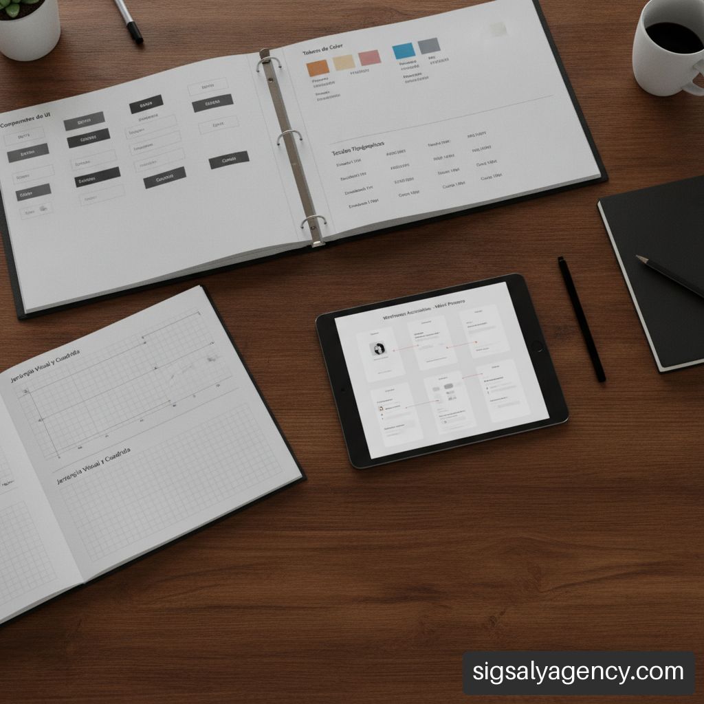
A design system is a centralised library of rules, visual tokens (numerical values for colour, spacing, shadows and typography) and reusable components. Rather than designing each page from scratch, screens are composed using pre-evaluated modular blocks.
This approach ensures that a primary button, contact form or product card maintains exactly the same appearance and behaviour across all sections of the site, speeding up the creation of new pages and simplifying maintenance.
Web Accessibility Criteria (WCAG) in Corporate Environments
Accessibility is an essential component in modern web development. Complying with WCAG 2.1 guidelines (Level AA) requires implementing precise technical criteria in the layout. To understand in detail how these factors influence corporate positioning, we invite you to consult our text on diseno web profesional guia estrategica accesibilidad y rendimiento.
• Sufficient Colour Contrast: Text over coloured backgrounds must guarantee a minimum contrast ratio (4.5:1 for normal text and 3:1 for large text) to facilitate reading for people with visual deficiencies.
• Interactive Keyboard Navigation: All interactive elements (menus, buttons, forms, modals) must be operable via keyboard, showing a visually clear focus indicator.
• Correct Semantic Labelling: Structuring the interface using semantic HTML5 tags (, , , ) allows screen readers to interpret the content without ambiguity.
• Text Alternatives: All informative images and multimedia resources must have concise and descriptive alternative text attributes (alt) .
Ensuring Consistency between Figma and Final Code
One of the greatest risks in web projects is the discrepancy between the approved prototype and the programmed product. This mismatch usually occurs due to poor communication between design and web development teams.
To avoid this, file delivery should include explicit specifications of spacing (grid systems or grid of 8px), container behaviour (flexbox and CSS grid), responsive adaptability breakpoints and documented visual tokens. Developers should have clear visual acceptance criteria in place before marking each component as complete.
Interface State Management, Content and Mobile-First Experience
Companies often make the mistake of evaluating a website by reviewing only static screenshots of ideal screens. However, in the real world, the interface faces variable situations that must be properly laid out.
Planning Edge States and Error Messages
A robust interface considers all possible situations a user may encounter during navigation:
- Empty State: What a corporate search engine or dashboard displays when no results are available. It should offer useful alternatives instead of a blank screen.
- Loading State: Visual indicators (skeletons or progress bars) that inform the user that information is being processed, reducing the perception of slowness.
- Error State: Specific designs for server errors (500), pages not found (404) or form submission failures. Messages should be clear, friendly and offer immediate solutions.
- Expiration or Permissions State: Screens prepared to notify that a session has expired or that a higher level of access is required.
Mobile-First Optimisation and Real Responsive Adaptability
The premise Mobile-First requires laying out the experience for smaller screens first before scaling the design towards desktop monitors. As reflected in the specifications published by the Web Interface services, mobile adaptation does not consist of shrinking the computer screen, but rather restructuring elements for touch environments.
This involves using legible font sizes without requiring zoom, placing interactive elements in thumb-reachable areas, eliminating unnecessary decorations that slow mobile connections, and optimising pixel density in images.
The Critical Dependency of Content and Value Proposition
No interface, however visually refined, can compensate for the lack of a clear value proposition or the presence of empty content. Layout must work in symbiosis with copywriting corporate.
If the copy does not clearly convey what problem the company solves, who it addresses and why its solutions are superior, the user will abandon the platform regardless of design beauty. Visual structure exists to project and amplify the business message, not to replace it. To coordinate these actions within a global digital strategy, we recommend exploring our resource on web design online marketing and mcp to improve your positioning.
Total Cost of Ownership, Technology Platforms and Maintenance
When addressing corporate interface design, it is essential to understand the investment from a complete lifecycle perspective. The initial cost of design and programming represents only part of the economic equation in the medium and long term.
Technological Evaluation: WordPress, SaaS Platforms and Custom Development
The choice of content management system (CMS) or development framework determines the maintainability of the interface, vendor dependency and ongoing operational costs.
• WordPress: A versatile platform that offers a solid balance between customisation capability, editing ease for non-technical teams and a wide ecosystem of integrations. It requires active maintenance of security and code optimisation.
• SaaS Platforms (Shopify, Webflow): Suitable for projects seeking to minimise infrastructure management, although they impose limitations on advanced workflow customisation and entail recurring subscription costs.
• Custom Developments (Laravel, React, Vue): Indicated for complex B2B platforms or web products where the interface requires deep integrations at API level with the company's internal systems.
Total Cost of Ownership (TCO) Breakdown for the Long Term
Evaluating investment in a web interface requires analysing the direct and indirect costs that will accumulate during its useful life (typically between 3 and 5 years).
| Cost Concept | Nature of the Cost | Impact on the Corporate Project |
|---|---|---|
| UX/UI Design and Prototyping | Initial Investment | Defines the structure, usability and brand identity. |
| Development and Layout | Initial Investment | Transforms prototypes into optimised and accessible code. |
| Infrastructure and Hosting | Recurring (Annual/Monthly) | Guarantees server speed, availability and security. |
| Licences and Tools | Recurring (Annual) | Analytics software, accessibility tools or Premium plugins. |
| Technical Maintenance | Recurring (Monthly) | Code updates, security patches and backups. |
| Content Creation | Continuous | Writing corporate texts, professional photography and video. |
Maintenance Strategies and Continuous Interface Evolution
A corporate web interface should not be considered a static product that ends on the day of its publication. The collection of analytics data through heatmaps, session recordings and conversion funnels allows real-time friction detection.
As described in the Webservi.es corporate website guide, continuous evolution through A/B testing and incremental improvements ensures that the platform maintains its commercial effectiveness against changing market demands.
Frequently Asked Questions on Professional Web Interface Design
What does a professional web interface design for a company really include?
A professional service encompasses audience research, information architecture, website mapping, structural wireframes, high-fidelity navigable prototypes (Figma), development of a modular design system, responsive layout, accessibility validation (WCAG) and optimisation for conversion capture.
What is the exact difference between UX and UI on a corporate website?
User Experience (UX) focuses on the logic, structure, research and ease with which a person achieves their objectives on the platform. User Interface (UI) is the visual layer that makes that interaction possible: components, typography, colour palette, spacing and visual states.
How long does the complete website interface design process usually take?
A corporate project of medium complexity typically requires between 6 and 12 weeks. This timeframe covers the phases of research, architecture, visual prototyping, usability testing, layout and integration with the selected content management system.
Why is it not advisable to use a cheap template for a corporate website?
Standard templates typically accumulate superfluous code that slows down site loading, present difficulties in adapting strictly to brand identity, lack rigorous accessibility controls and generate dependence on third-party plugins that increase security vulnerabilities.
How do you verify that a website interface is optimised to generate customers?
It is verified by evaluating metrics such as conversion rate per form, abandonment percentage in contact flows, time to first useful action and by conducting A/B tests on the main calls to action (CTAs).
What level of web accessibility must a company's interface comply with?
In the corporate field, it is recommended to comply with the AA level of the WCAG 2.1 guidelines. This ensures adequate colour contrast, complete keyboard navigation, compatibility with screen readers and textual alternatives for multimedia content.
What information should the company prepare before starting the design?
It is essential to have a clear definition of business objectives, target buyer profiles (buyer personas), the drafted value proposition, corporate identity manuals (logo, colours, typefaces) and an inventory of the necessary content.
What maintenance does the web interface require once published?
It keeps the site alive through security patches for the content manager, updates to the base code, continuous performance optimisation, compatibility reviews in new browsers and visual adjustments derived from user usage analysis.
Sources and References
• Diligent: Usability and web design strategists in Barcelona
• aatsoft: Web Design: bespoke professional pages
• Web Interface: Professional Web Design and Development
• Webservi.es: Corporate web design for businesses
He professional web interface design for companies constitutes one of the most strategically decisive pillars for digital competitiveness in 2026. The interface represents not only the aesthetic layer of a corporate site, but the point of contact where an organisation's value proposition transforms into fluid interactions, commercial trust and qualified leads. Designing a digital platform requires balancing visual clarity with technical usability, ensuring that every layout decision responds to measurable business goals.
In this comprehensive analysis we address the methodology necessary to plan, validate and implement high-performance interfaces. We examine how to assess total cost of ownership, ensure accessibility, coordinate the handover between design and code, and avoid the structural errors that often limit digital ROI in the business environment.
Table of Contents• Key Points in Professional Web Interface Design • Architecture and Design Decisions Aligned to Business Objectives • The UX/UI Process: From Research to Navigable Prototyping • Design Systems, Accessibility and Transition to Development • Interface State Management, Content and Mobile-First Experience • Total Cost of Ownership, Technology Platforms and Maintenance • Frequently Asked Questions on Professional Web Interface Design • Sources and References
Key Points in Professional Web Interface Design• Alignment of business objectives: An effective interface translates corporate goals into direct conversion flows, associating each component with metrics such as contact rate, time to action or conversion per form. • Difference between template and custom design: Pre-configured templates accumulate technical debt and visual rigidity; bespoke design prioritises loading speed, scalability and brand differentiation. • Pre-code validation: Conducting usability testing on navigable prototypes drastically reduces code rewriting costs in advanced project phases. • Accessibility as a technical standard: Compliance with WCAG 2.1 guidelines is not an ethical extra, but an operational and regulatory necessity to broaden audience reach and ensure usability on any device. • Total Cost of Ownership (TCO) vision: The initial layout budget represents only a fraction of the investment; hosting, licences, content updates and continuous maintenance must be estimated from the conceptual phase.
Architecture and Design Decisions Aligned to Business ObjectivesThe development of a corporate digital presence demands moving beyond a strictly ornamental approach. When we evaluate commercial usability and UX/UI projects in the business sector, we confirm that organisations do not merely need visually appealing pages, but digital assets capable of solving specific communication and sales problems.
Each element incorporated into the interface must have a functional purpose backed by behavioural data. The visual structure should guide the user effortlessly from the first visual impact to the achievement of the set objective.
Difference between Generic Template and Bespoke Professional DesignThere is a considerable discrepancy between acquiring a packaged theme for content management systems and developing a customised professional interface. Standard templates are designed to appeal to a heterogeneous mass of users, which means loading them with scripts, unnecessary options and heavy visual layout builders that degrade loading speed.
By contrast, customised work starts from a requirements study that eliminates all superfluous code, prioritising performance, accessibility and security. To delve deeper into this strategy, it is worthwhile to analyse the guide on professional web design SEO and Google Ads by niche, where we detail the integration between acquisition and layout.
Evaluation CriterionGeneric Template / Pre-configured ThemeBespoke Professional Interface DesignPerformance and SpeedSlow; includes unused libraries and excessive CSS.Optimal; clean code written according to specifications.Visual FlexibilityLimited by theme builder options.Absolute; responds precisely to corporate identity.MaintainabilityRisk of breakage when updating plugins or base themes.High; structured and controlled components.Conversion OptimisationGeneric; calls to action without contextualisation.Targeted; flows mapped through user experience mapping. Selection Matrix: Corporate Website, Landing Page, B2B Portal or Web ApplicationAccessibility (WCAG)Variable and frequently poor.Validated by design from the prototyping phase.Selecting the appropriate format depends on the complexity of the sales cycle, the diversity of audiences and the depth of content. Presenting a complex offer in an unsuitable format is one of the most costly mistakes in the corporate ecosystem.
Conversion Landing Page: Indicated for specific paid advertising campaigns (PPC), single product launches or rapid data capture. Lacks complex navigation menus to prevent traffic leakage. Corporate Website: Suitable for companies that need to build credibility, structure complex service catalogues, communicate organisational culture and support different buyer profiles. B2B or Customer Portal: Designed for recurring interactions with high information density, data tables, ERP/CRM integration and access protected by credentials. Web Application: Oriented towards the execution of complex operational tasks in the cloud, where the interface functions as intensive interaction software. Business Metrics Link to User InterfaceTo justify the investment in a corporate redesign, UI metrics must be connected with key business indicators (KPIs). As observed in the aatsoft study on types of web projects, the layout must be integrated with measurement tools from its initial conception.
• Form Abandonment Rate: Measures the percentage of users who begin data entry but do not complete it. A professional interface reduces friction through real-time validation and legible typography. • Time to First Useful Action (TFA): Quantifies the speed at which the user locates the contact button, search function or resource they need. • Cost per Qualified Lead (CPL): Clear and persuasive design improves conversion rate on existing traffic, optimising return on advertising investment. • Technical Bounce Rate: Reflects premature exit due to responsive layout issues, poor load times or confusing visual hierarchies.
The UX/UI Process: From Research to Navigable PrototypingCreating an effective interface requires following a systematic methodology that minimises improvisation. The preliminary research phase ensures that each visual decision responds to real interaction patterns of corporate users.
User Research and Web Map CreationThe process begins by identifying the specific needs of the customer profiles that will interact with the platform. This involves analysing how they search for information, what doubts prevent their purchase decision and what degree of technical sophistication they possess.
With this information, the information architecture and web map are developed. The content hierarchy must ensure that any user can access critical information in less than three clicks. A disorganised structure destroys trust and generates operational frustration.
Wireframing and High-Fidelity Prototyping in FigmaBefore writing a single line of code, the interface is materialised into prototypes. This stage is divided into two progressive phases:
Low Fidelity Wireframes: Structural outlines in grayscale focused solely on the layout of information blocks, heading hierarchy and menu logic. High Fidelity Prototypes: Interactive designs developed in tools like Figma that incorporate the definitive visual system: corporate colour palette, typography, microinteractions, button states and exact spacing. User Validation Before Programming PhaseValidating the interface through usability testing with real users makes it possible to correct bottlenecks before programming begins. It is substantially faster and more economical to modify a component in Figma than to rewrite a module in the final development environment.
During these sessions, concrete tasks are assigned to the evaluators (for example, requesting a B2B quote or downloading a technical sheet) whilst observing whether they encounter navigation obstacles. If the success rate for priority tasks falls below 85%, the layout must be adjusted immediately.
Design Systems, Accessibility and Transition to DevelopmentThe scalability of a corporate platform depends on the solidity of its structural foundations. Maintaining aesthetic consistency across dozens or hundreds of subpages requires having standardised layout rules.
Creation of Design Systems and Reusable ComponentsA design system is a centralised library of rules, visual tokens (numerical values for colour, spacing, shadows and typography) and reusable components. Rather than designing each page from scratch, screens are composed using pre-evaluated modular blocks.
This approach ensures that a primary button, contact form or product card maintains exactly the same appearance and behaviour across all sections of the site, speeding up the creation of new pages and simplifying maintenance.
Web Accessibility Criteria (WCAG) in Corporate EnvironmentsAccessibility is an essential component in modern web development. Complying with WCAG 2.1 guidelines (Level AA) requires implementing precise technical criteria in the layout. To understand in detail how these factors influence corporate positioning, we invite you to consult our text on diseno web profesional guia estrategica accesibilidad y rendimiento.
• Sufficient Colour Contrast: Text on coloured backgrounds must guarantee a minimum contrast ratio (4.5:1 for normal text and 3:1 for large text) to facilitate reading for people with visual impairments.
• Interactive Keyboard Navigation: All interactive elements (menus, buttons, forms, modals) must be operable via keyboard, showing a visually clear focus indicator.
• Correct Semantic Labelling: Structuring the interface using semantic HTML5 tags (, , , ) allows screen readers to interpret content without ambiguity.
• Text Alternatives: All informative images and multimedia resources must have concise and descriptive alternative text attributes (alt) .
One of the greatest risks in web projects is the discrepancy between the approved prototype and the programmed product. This mismatch usually occurs due to poor communication between design and web development teams.
To avoid this, file delivery should include explicit specifications of spacing (grid systems or grid of 8px), container behaviour (flexbox and CSS grid), responsive adaptability breakpoints and documented visual tokens. Developers should have clear visual acceptance criteria in place before marking each component as complete.
Interface State Management, Content and Mobile-First ExperienceCompanies often make the mistake of evaluating a website by reviewing only static screenshots of ideal screens. However, in the real world, the interface faces variable situations that must be properly laid out.
Planning Edge States and Error MessagesA robust interface considers all possible situations a user may encounter during navigation:
Empty State: What a corporate search engine or dashboard displays when no results are available. It should offer useful alternatives instead of a blank screen. Loading State: Visual indicators (skeletons or progress bars) that inform the user that information is being processed, reducing the perception of slowness. Error State: Specific designs for server errors (500), pages not found (404) or form submission failures. Messages should be clear, friendly and offer immediate solutions. Expiration or Permissions State: Screens prepared to notify that a session has expired or that a higher level of access is required. Mobile-First Optimisation and Real Responsive AdaptabilityThe premise Mobile-First requires laying out the experience for smaller screens first before scaling the design towards desktop monitors. As reflected in the specifications published by the Web Interface services, mobile adaptation does not consist of shrinking the computer screen, but rather restructuring elements for touch environments.
This involves using legible font sizes without requiring zoom, placing interactive elements in thumb-reachable areas, eliminating unnecessary decorations that slow mobile connections, and optimising pixel density in images.
The Critical Dependency of Content and Value PropositionNo interface, however visually refined, can compensate for the lack of a clear value proposition or the presence of empty content. Layout must work in symbiosis with copywriting corporate.
If the copy does not clearly convey what problem the company solves, who it addresses and why its solutions are superior, the user will abandon the platform regardless of design beauty. Visual structure exists to project and amplify the business message, not to replace it. To coordinate these actions within a global digital strategy, we recommend exploring our resource on web design online marketing and mcp to improve your positioning.
Total Cost of Ownership, Technology Platforms and MaintenanceWhen addressing corporate interface design, it is essential to understand the investment from a complete lifecycle perspective. The initial cost of design and programming represents only part of the economic equation in the medium and long term.
Technological Evaluation: WordPress, SaaS Platforms and Custom DevelopmentThe choice of content management system (CMS) or development framework determines the maintainability of the interface, vendor dependency and ongoing operational costs.
• WordPress: Versatile platform that offers a solid balance between customisation capability, ease of editing for non-technical teams and a wide ecosystem of integrations. Requires active maintenance of security and code optimisation. • SaaS Platforms (Shopify, Webflow): Suitable for projects seeking to minimise infrastructure management, although they impose limitations on advanced personalisation of workflows and entail recurring subscription costs. • Custom Developments (Laravel, React, Vue): Indicated for complex B2B platforms or web products where the interface requires deep integrations at API level with the company's internal systems.
Total Cost of Ownership (TCO) Breakdown for the Long TermEvaluating investment in a web interface requires analysing the direct and indirect costs that will accumulate during its useful life (typically between 3 and 5 years).
Expense ConceptCost NatureImpact on Corporate ProjectUX/UI Design and PrototypingInitial InvestmentDefines structure, usability and brand identity.Development and LayoutInitial InvestmentTransforms prototypes into optimised and accessible code.Infrastructure and HostingRecurring (Annual/Monthly)Ensures server speed, availability and security.Licences and ToolsRecurring (Annual)Analytics software, accessibility tools or Premium plugins.Technical MaintenanceRecurring (Monthly)Code updates, security patches and backups.Content CreationContinuousWriting of corporate texts, professional photography and video. Strategies for Maintenance and Continuous Evolution of the InterfaceA corporate web interface should not be considered a static product that ends on the day of its publication. The collection of analytics data through heatmaps, session recordings and conversion funnels allows real-time friction detection.
As described in the Webservi.es corporate website guide, continuous evolution through A/B testing and incremental improvements ensures that the platform maintains its commercial effectiveness against changing market demands.
Frequently Asked Questions about Professional Web Interface Design What does professional web interface design really include for a company?A professional service encompasses audience research, information architecture, website mapping, structural wireframes, high-fidelity navigable prototypes (Figma), development of a modular design system, responsive layout, accessibility validation (WCAG) and optimisation for conversion capture.
What is the exact difference between UX and UI on a corporate website?User Experience (UX) focuses on the logic, structure, research and ease with which a person achieves their objectives on the platform. User Interface (UI) is the visual layer that makes that interaction possible: components, typography, colour palette, spacing and visual states.
How long does the complete website interface design process usually take?A corporate project of medium complexity typically requires between 6 and 12 weeks. This timeframe covers the phases of research, architecture, visual prototyping, usability testing, layout and integration with the selected content management system.
Why is it not advisable to use a cheap template for a corporate website?Standard templates typically accumulate superfluous code that slows down site loading, present difficulties in adapting strictly to brand identity, lack rigorous accessibility controls and generate dependence on third-party plugins that increase security vulnerabilities.
How do you verify that a website interface is optimised to generate customers?It is verified by evaluating metrics such as conversion rate per form, abandonment percentage in contact flows, time to first useful action and by conducting A/B tests on the main calls to action (CTAs).
What level of web accessibility must a company's interface comply with?In the corporate field, it is recommended to comply with the AA level of the WCAG 2.1 guidelines. This ensures adequate colour contrast, complete keyboard navigation, compatibility with screen readers and textual alternatives for multimedia content.
What information should the company prepare before starting the design?It is essential to have a clear definition of business objectives, target buyer profiles (buyer personas), the drafted value proposition, corporate identity manuals (logo, colours, typefaces) and an inventory of the necessary content.
What maintenance does the web interface require once published?It keeps the site alive through security patches for the content manager, updates to the base code, continuous performance optimisation, compatibility reviews in new browsers and visual adjustments derived from user usage analysis.
Sources and References• Diligent: Usability and web design strategists in Barcelona • aatsoft: Web Design: bespoke professional pages • Web Interface: Professional Web Design and Development • Webservi.es: Corporate web design for businesses