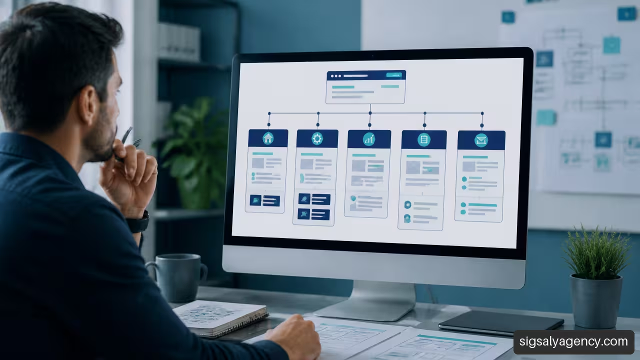
When I think about how to organise the structure of a business website, I don't start with the menu or the visual design. I start with a more useful question: what does each visitor need to do and what information do they need to take the next step? A good structure turns a website into a clear system: it helps find services, compare options, resolve doubts and contact the company without confusing routes.
A corporate website can have few pages or hundreds of URLs. In both cases, the priority is the same: create an understandable hierarchy for people, search engines and internal teams. Information architecture defines how those contents are organised, labelled and related. The menu is just one visible part of that architecture.
Table of Contents
• Define Objectives, Audiences and Tasks
• Create a Useful Content Hierarchy
• Convert the Hierarchy into Navigation
• Prepare the Structure for SEO, Accessibility and Migrations
• Sources
Define Objectives, Audiences and Tasks
The structure must first respond to the business and user needs. If it's organised solely according to internal departments, it's easy to end up with labels like 'Corporate solutions', 'Technical area' or 'Commercial unit', which may make sense within the company, but not for someone visiting for the first time.
Start with Priority Tasks
I would start from the journeys that support the website's objectives. For example, a services company may need a person to:
- Understand what problem the company solves.
- Identify the right service.
- Check if it works with their sector or situation.
- Review proof of trust, such as success stories.
- Request a proposal or a meeting.
In an industrial company, the customer journey can be different: consulting specifications, downloading a technical data sheet, locating a distributor or requesting commercial information. The architecture must facilitate these tasks without forcing users to go through a generic page that adds no context.
The homepage does not have to explain everything. Its main function is to guide towards the most valuable routes on the site.
Before creating sections, it is advisable to define between three and five priority tasks. If there are twenty tasks declared as critical, prioritisation is probably lacking. This selection guides the main pages, featured links and calls to action.
Separating Audiences Without Duplicating The Website
Many companies serve several audiences: customers, distributors, candidates, media, suppliers or investors. The usual mistake is to create a complete website for each profile, with repeated services and almost identical content.
Separation deserves its own section when an audience has clearly different objectives, language, documentation or actions. For example, a jobs area may require job offers, corporate culture and selection process. It does not need to duplicate all commercial information.
| Situation | Recommended Structural Decision | Risk It Avoids |
|---|---|---|
| Two audiences are looking for the same service | A homepage with blocks and context-specific links by profile | Content duplication |
| Each audience needs different documentation | Specific sections within a shared hierarchy | Generic navigation |
| A sector has its own requirements | Sector page linked to relevant services | Creating isolated microsites |
| A profile uses private tools | Restricted area separated from public navigation | Exposing irrelevant routes |
It is also worthwhile to differentiate what the company wants to communicate from what the visitor needs to find. Identity, history and values may be relevant, but they should not displace essential commercial routes if most visits are looking for services, products or support.
Making An Inventory Before Reorganising
If the website already exists, it is not advisable to redesign blindly. The URL inventory allows you to review which pages are published, what objective they have, who maintains them and whether they remain valid. It is a less attractive task than creating a wireframe, but it prevents useful pages from disappearing or obsolete content from surviving through inertia.
The preliminary design should include an inventory, editorial sitemap, hierarchy, planned URLs, priority routes and a primary action per page, as explained in Soulvi's enterprise web architecture planning.
For each URL, I would record at least these fields:
• Title and current address.
• Page type: service, product, article, contact, form, legal or campaign.
• Commercial or informational objective.
• Recommended status: retain, update, merge, redirect or remove.
• Content owner.
• New planned URL, if modified.
This inventory helps detect orphan pages, that is, URLs without sufficient internal links. It also reveals duplicates: two pages that attempt to rank or convert for the same need, but use different names.
Key Takeaways
• Organise the website according to real visitor tasks, not according to the internal structure.
• Define a primary action for each important page.
• Use a URL inventory before redesigning or migrating.
• Create specific routes for different audiences only when their needs truly change.
Create a Useful Content Hierarchy
A content hierarchy shows the relationship between the general and the specific. In an enterprise website there is usually a main level of value proposition, service or product areas, and more detailed pages that address concrete needs.
The hierarchical structure is common because it allows moving from general categories to specific content. However, it is not the only option. A catalogue may need filters, a resource library can be organised by topics, and a training platform can include sequential learning paths.
Choose The Main Organisational Axis
The key question is not 'what sections does the competition have?', but 'how does the client formulate their need?'. A company can organise its offering by services, problems, sectors or a limited combination of routes. The key is to choose one main route and prevent them all from competing with each other.
| Main Model | When To Choose It | Example | When To Avoid It |
|---|---|---|---|
| Services | The client knows the type of solution they are looking for | Web design, SEO, maintenance | When the audience does not know the terminology |
| Products | There is a catalogue, datasheets and comparable attributes | Software, machinery, equipment | When each purchase requires complex advice |
| Problems | Demand arises from a concrete need | Improve speed, capture leads, rebrand | When problems overlap too much |
| Sectors | Each industry requires different tests or processes | Healthcare, tourism, industry | When only the example changes, not the solution |
| Limited combination | There are several real entry routes | Main services and priority sectors | When it generates duplicate pages |
For example, an agency can have 'Web design', 'SEO' and 'Digital advertising' as main routes because they are recognisable services. It can then include pages by sector, such as 'Web design for clinics' or 'SEO for law firms', as long as they provide their own cases, requirements and arguments. If only two sentences change, it is better not to create that additional layer.
The strategic guide for professional web design can serve as support to connect this decision with accessibility, performance and conversion objectives from the planning phase.
Design The Editorial Sitemap Before The Menu
An editorial sitemap is not the XML sitemap. It is a map of planned pages, their relationships and their objectives. It can be created in a spreadsheet, a visual document or a wireframing tool. What matters is that it allows the structure to be discussed before visual design or development makes changes difficult.
A reasonable foundation for a corporate website usually includes Home, About Us, Services or Products, Case Studies, Resources and Contact. This composition also appears in Aspiration Marketing's guide on corporate website structure. However, not all companies need all sections with the same priority.
A practical editorial sitemap could follow this logic:
- Home: value proposition and entry points to priority routes.
- Services: main category and individual pages per service.
- Sectors: only when there are differentiated needs and specific content.
- Case studies: evidence connected with services or sectors.
- Resources: articles, guides, FAQs and downloadable materials.
- Contact: clear conversion channel, with forms tailored to the type of request.
Validate Names Before Publishing Them
Labels determine whether a person understands what they will find after clicking. 'Solutions' can work if explained well, but 'Services' is usually more direct when it comes to a professional offering. 'Resources' can group useful content; 'News' can sound more editorial and less oriented towards resolving a question.
If there is doubt between several labels, we can validate them with a card sort or a tree test. Card sorting helps discover how people group content. Tree testing removes visual design and essentially asks whether someone can find a piece of information within the proposed hierarchy.
There is no universal number of levels or clicks suitable for all websites. A company with three services can use a very flat structure. A manufacturer with thousands of references will need more depth and local navigation. The useful test is another: can the user reach the necessary information without losing context?
Convert the Hierarchy into Navigation
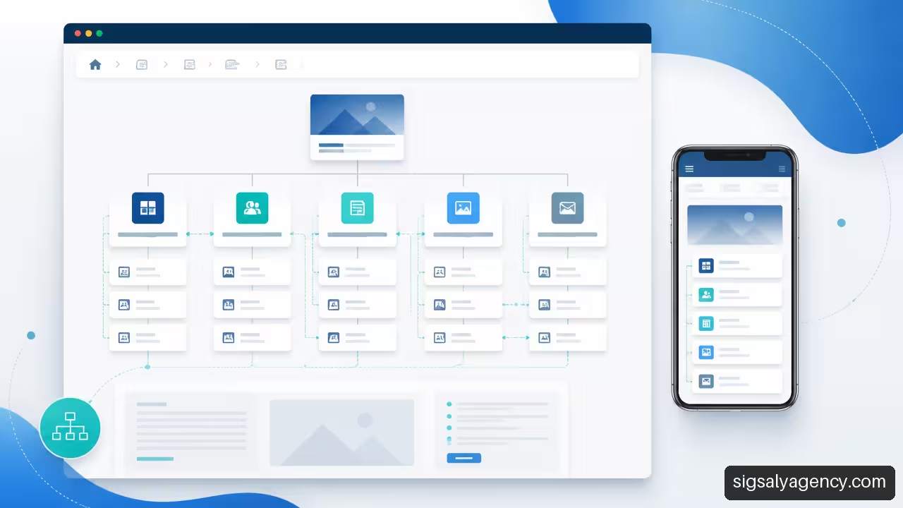
The complete hierarchy does not necessarily need to appear in the main menu. This is one of the most common mistakes: turning the header into an exhaustive map, with too many options and submenus that are difficult to navigate on mobile.
The hierarchy establishes everything that exists. Navigation decides which routes are displayed at each moment.
Deciding What Should Appear In The Main Menu
The global menu should contain the entries that help initiate priority journeys. It normally includes Home, Services or Products, a trust section such as Success Stories or About Us, Resources when they add value, and Contact.
Before choosing the visible elements, it is advisable to define the architecture. Brandpost's recommendation on hierarchy and menu summarises this order well: first the site hierarchy is defined and then it is decided what appears in the main navigation.
Leaving a page out of the menu does not mean hiding it. A very specific service page can be discovered from its category, from a success story, through links in related articles or from an internal search. This reduces noise without isolating valuable content.
Use Local Navigation And Contextual Links
In extensive sections, local navigation maintains context. A 'Services' page can link to each speciality; a product sheet can link to documentation, compatibilities and support; a guide can lead to a related service when the reader's intention justifies it.
Internal links should answer a specific question: 'What would this person want to do next?'. An article about web slowness can lead to an optimisation guide, a maintenance page or a technical audit. It should not link to any commercial page just to fill space.
To integrate organic acquisition and campaigns without separating the site experience, it may be useful to review the approach of professional web design with SEO and Google Ads. Campaign landing pages should respect the overall structure, although their navigation may be more focused.
Building Service Pages That Help With Decision-Making
A service page should not just be an extended description. It must allow you to assess whether the solution fits the problem, the type of business and the stage of decision-making.
A clear structure for these pages includes:
• What problem the service solves.
• Who it is for and who it may not be suitable for.
• Scope, process and deliverables.
• Use cases, frequently asked questions or available trials.
• Related complementary services.
• A main call to action, consistent with intent.
If a company offers audits, implementations and monthly support, it does not make sense to bring everything together under a single page without differentiated routes. Someone wanting an initial audit needs a different explanation from someone comparing a recurring service. Hierarchy clarifies those differences before the form has to do so.
Prepare the Structure for SEO, Accessibility and Migrations
Clear architecture improves content discovery, but does not guarantee organic rankings by itself. SEO depends on many factors: content quality and relevance, crawling, performance, search intent, competition and technical signals. Structure makes it easier for those pieces to work together.
Creating Coherent URLs And Internal Linking
URLs should be readable, stable and consistent with the hierarchy. For example, /services/seo/ and /services/web-design/ show a clear relationship. It is not advisable to change addresses purely for aesthetics if they already receive traffic, links or conversions.
The XML sitemap communicates to search engines the URLs you wish to present for crawling, but does not replace internal links. An important page should be linked from relevant routes. To review titles, headings, intent and other elements of each URL, this is useful on-page SEO guide.
Integrate Accessibility From The Start
Accessibility is not a final layer of design. It affects link names, navigation order, headings and form comprehension. A dropdown menu that only works on hover, for example, excludes those who navigate with keyboard or on devices that don't use a mouse.
When structuring pages, I would review these points:
• Links should describe their destination, not just say "see more".
• Headings should follow a logical hierarchy to present content as an understandable map.
• Forms must have labels associated with each field.
• Menus must be able to open, be navigated and close with keyboard.
• The mobile version must preserve essential routes without hiding critical actions.
Responsive design is also part of the architecture. If a section only makes sense with a desktop mega menu, there's a problem that isn't solved by reducing font size on mobile.
Migrating Without Breaking Valuable Routes
A migration is a change of architecture, not just a change of template. When services are merged, categories are eliminated or URLs are rewritten, the routes used by visitors, campaigns, external links and search engines change.
The process should include a map of 301 redirects from each relevant old URL to its closest substitute. Redirecting everything to the home page is often a bad solution: it erases context and can frustrate someone who was looking for a sheet, article or specific service.
After launch, I would review broken links, pages with errors, canonicals, XML sitemap, mobile navigation and forms. Phased publishing can reduce risks when reorganisation is complex: first a section is tested, validated and then the model is extended to the rest.
Measuring If The Structure Works
Traffic alone is not enough to know if an architecture is useful. A page can receive many visits and still fail to help complete tasks. You need to observe what people do after they enter.
| Indicator | What It Can Reveal | Possible Action |
|---|---|---|
| Internal searches with no results | A page, tag or link is missing | Create content or improve names |
| Exits from categories | The route does not guide or prioritise | Add descriptions and useful access points |
| Abandoned forms | The conversion does not fit the stage | Reduce fields or clarify the offer |
| Orphan pages | Content difficult to discover | Add contextual links and local navigation |
| Long routes to key services | Too many steps or ambiguous tags | Simplify the hierarchy |
Review must be continuous. Content changes, services are launched and new customer questions emerge. A useful architecture is not a closed delivery; it is a structure that is maintained and corrected with evidence.
Frequently Asked Questions
What Structure Should a Business Website Have?
A business website should have a hierarchy based on its objectives and visitor tasks. As a base, it usually includes Home, service or product offerings, corporate information, trust proofs, useful content and contact. The priority of each section depends on the business model.
Is it Better to Organise a Website by Services, Sectors or Problems?
It depends on how your audience searches. If customers know the service, it makes sense to organise by services. If they arrive with a specific need, a problem-based route may work better. Pages by sector make sense when they provide different requirements, processes or proofs, not just a change of name.
How Many Levels of Depth Should a Website Have?
There is no universal figure. A small website may need two levels, while a large catalogue will require more. The decision should be based on the ease of finding content, not on a rigid rule. If a deep category provides context and helps compare options, it may be justified.
What Should Appear in the Main Menu?
The routes that initiate priority tasks should appear: services or products, information that builds trust, relevant resources and contact. Specific pages can be left out if they can be discovered from categories, internal links, breadcrumbs or search.
Where Should Success Cases Be Placed?
They can have their own section to facilitate exploration, but should also be linked from related services or sectors. An isolated success case provides less context than one connected with the solution being evaluated by the visitor.
How to Organise the Blog Without It Competing With Commercial Pages?
The blog should answer informative questions and link naturally to service pages when there is a relationship. Commercial pages solve a hiring intention; articles explain, compare or teach. It is advisable to avoid publishing articles that repeat exactly the same proposal as a service page.
How to Know if Users Find What They Are Looking For?
Combine analytics, internal searches, task testing and form review. A simple test can ask several people to find a service, a success case or a way to contact. If they hesitate in the category or misinterpret the name, the problem is usually in the structure or labelling.
Sources
• brandpost.es — https://www.brandpost.es/blog/arquitectura-web/
• soulvi.com — https://soulvi.com/blog-entradas/innovacion-y-tecnologia/arquitectura-web-empresas-menu-paginas/
• blog.aspiration.marketing — https://blog.aspiration.marketing/en-gb/best-practice-structure-for-my-business-website