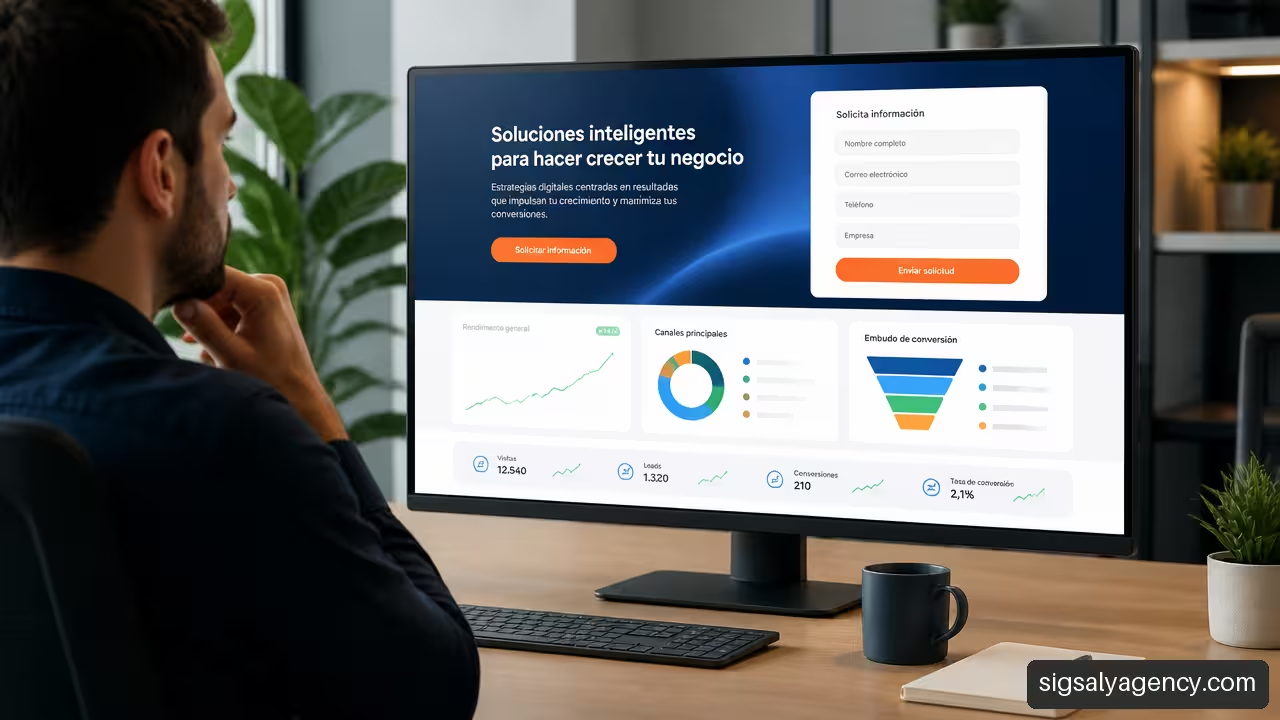
Designing an attractive website is not enough. To understand how to design a website that converts visits into customers, we must create a clear journey: explain the offer, resolve doubts, reduce friction and facilitate the next step. A visit does not convert because of a striking button; it converts when the page responds to a concrete need and makes taking action seem simple and safe.
Table of Contents
• Define The Strategy Before Design
• Create A Page That Guides The Decision
• Reduce Friction And Increase Trust
• Measure, Segment And Improve With Data
Key Ideas
A page that converts does not try to say everything. It prioritises what is necessary for the right person to take the next step with confidence.
• Let us define a primary conversion, such as a sale, a budget request or a booking, before choosing colours, texts or sections.
• Let us adjust the message, the CTA and the form to the visitor's real intention, not to a generic structure.
• Let us measure both final conversions and microconversions: clicks on phone, form initiations, downloads or demonstration requests.
• Let us treat each change as a measurable hypothesis. An A/B test without sufficient volume or without a defined metric can lead to erroneous conclusions.
Define The Strategy Before Design
Conversion starts before visual design. If a company does not know what action it wants to achieve, the page will accumulate buttons, messages and forms that compete with each other. That is why I propose starting with a concrete question: what should a person do when this page has fulfilled its function?
It could be to buy, request a call, book an appointment, request a budget or download a resource. Each objective implies a different level of commitment. Asking someone who has just discovered the brand for a one-hour meeting is usually premature; offering a useful guide to someone who is already comparing providers may be insufficient.
Dorik recommends starting from quantifiable objectives, visible CTAs and an action-oriented structure. It's a good starting point, as long as the objective is not limited to generating more forms, but to generating contacts that can be converted into customers.
Design A Conversion Matrix By Intention
Not all visitors arrive with the same urgency. A person searching for 'what does web maintenance include' is exploring. Another searching for 'WordPress agency quote' is probably comparing options. Both could end up being customers, but they shouldn't receive exactly the same page or the same call to action.
| Visitor Intent | Main Need | Recommended Action | Success Signal |
|---|---|---|---|
| Discovery | Understanding a problem or a solution | Reading a guide, watching a video or downloading a resource | Reading, downloading or subscription |
| Comparison | Evaluating alternatives and criteria | View services, cases, process or indicative prices | Visit to key pages or request for information |
| High Intent | Solving a concrete need | Request a quote, book a call or purchase | Qualified lead, booking or sale |
| Existing Customer | Obtain support or expand services | Access the support area or hire an upgrade | Request attended or renewal |
This matrix avoids a frequent error: measuring all visits with the same criteria. An informative guide can have a low direct sales rate and still provide assisted conversions weeks later. A paid landing page, on the other hand, should be evaluated with a more direct relationship between click, qualified contact and business result.
Separate Primary Conversions And Microconversions
The primary conversion is the business result that matters most. In e-commerce it is usually a purchase. In a service company it can be a qualified meeting. The microconversions are intermediate actions that help understand the journey: clicking a phone number, opening a calendar, starting a form or downloading a proposal.
Don't confuse them. If clicks on
The conversion rate must always indicate its denominator:
Conversion rate = conversions / sessions or defined users × 100
It is not equivalent to divide by total sessions, by visitors from a campaign or by new users. To make useful decisions, let's keep the same criteria during the analysed period.
Convert The Value Proposition Into A Clear Decision
The first screen must answer, in a few seconds, four questions:
- What is being offered.
- Who it is for.
- What problem it solves or what result it facilitates.
- What the visitor should do next.
A practical formula is: “We help [type of client] achieve [result] through [method or differentiation].” For example: “WordPress web design for service companies that need to generate qualified leads without relying on a slow or difficult-to-manage website.”
The promise must be able to be sustained with the rest of the page. If the headline promises speed, the website cannot take several seconds to load. If it promises support, the process and support must be explained. Consistency reduces the sense of risk.
Create A Page That Guides The Decision
A conversion page works like an organised conversation. First it captures attention, then demonstrates relevance, resolves doubts and finally asks for action. If we reverse that order, for example by showing a form before explaining the value, we force the visitor to commit without sufficient context.
Choosing Between A Complete Website And A Landing Page
A corporate website and a landing page do not compete: they fulfil different functions. The complete website helps build brand, position content, explain services and meet different needs. The landing page concentrates a campaign, audience or offer on a main action.
The case published by Unbounce about Webistry supports the use of dedicated landing pages, the match between advert and page and a main CTA for specific campaigns. The lesson is not to always eliminate navigation, but to reduce decisions when the visitor has arrived from an advert or a campaign with a concrete intention.
| Situation | Most Suitable Option | Reason |
|---|---|---|
| Advertising campaign for a specific service | Dedicated landing page | Maintains consistent messaging between advert and offer |
| Brand search or recurring visit | Corporate website | Allows exploration of services, team, resources and support |
| Simple product with direct purchase | Product page | Facilitates comparison, resolves doubts and enables purchase |
| Complex or high-value service | Service page with supporting resources | Requires more context, trial and qualification |
A visitor who clicks on an advert about SEO audit expects to see an SEO audit, not a generic homepage with ten services. When the message changes between the advert and the landing page, mental effort increases: the person must check whether they are still in the right place.
Build A Useful Visual Hierarchy
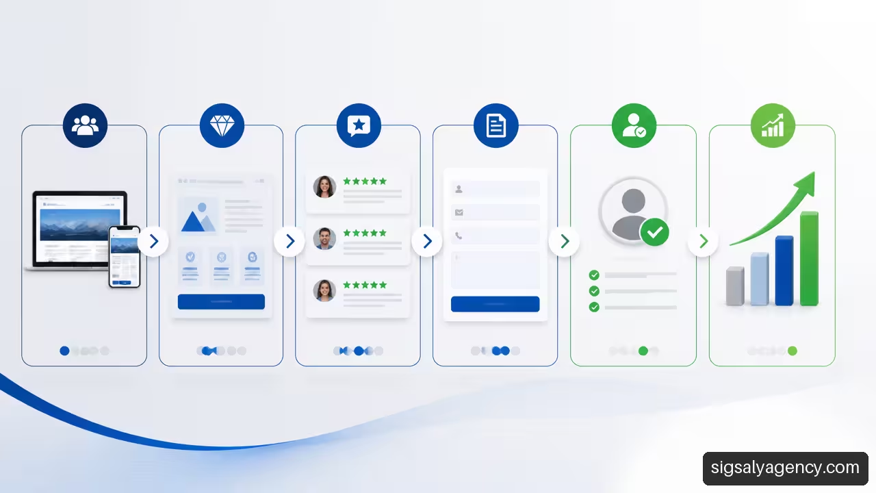
Hierarchy is not just about using large sizes. It is about deciding what information needs to be seen first and what can appear as the person progresses. A typical journey might include:
- Value proposition and main CTA.
- Brief explanation of the problem and expected result.
- Concrete benefits, not a list of isolated features.
- Method, process or deliverables.
- Social proof and answers to objections.
- Final CTA adapted to the decision.
Let's think about a consultancy that offers services to companies.
User-centred design also requires readable contrast, easy-to-tap buttons and responsive design. On mobile, an extensive table, a small button or a field that triggers an uncomfortable keyboard can break the user journey. Adaptation is not just about shrinking the desktop: it requires prioritising content and reviewing touch interaction.
To delve deeper into structure, accessibility and performance, this is useful strategic guide on professional web design.
Write CTAs That Reinforce Value
An effective CTA describes the action and anticipates the benefit.
We can repeat the same CTA at several points on a long page, because the visitor decides at different moments. What should be avoided is placing actions incompatible with the same visual weight:
If there is a secondary action, it should serve those who are not yet ready for the main one. For example, a company selling a complex service can keep
Reduce Friction And Increase Trust
Friction is any effort, doubt or perceived risk that prevents progress. Sometimes it is technical, such as a slow page. Other times it is psychological: not knowing the indicative price, fearing insistent sales calls or doubting what will happen after sending the data.
SeedProd brings together value proposition, benefits, social proof, trust signals and follow-up as elements of a page designed to convert. Its usefulness depends on those signals being verifiable and relevant to the decision.
Use Social Proof Without Empty Decoration
Testimonials work better when they reduce concrete uncertainty.
Social proof can include:
• Reviews with verifiable identity or source.
• Case studies that explain challenge, solution and result.
• Customer logos with authorisation.
• Certifications, guarantees or clear policies.
• Verifiable operational data, such as deadlines, coverage or support conditions.
If the company is new and doesn't yet have many cases, it's not worth inventing authority. It's better to explain the process, show real examples of deliverables, publish transparent conditions and answer common questions. Trust is built by reducing uncertainty, not by filling the page with irrelevant badges.
Decide How Much to Ask in the Form
"The fewer fields, the better" is an oversimplification. A short form can increase contact volume, but it can also generate poorly qualified enquiries. A more detailed one can reduce submissions and improve sales preparation. The decision should be evaluated based on subsequent quality, not just submission rate.
Landingi's case file includes a communicated example of a minimalist page with long form and conversion above 30%. It does not demonstrate that long forms convert better in all sectors, but it does show that context and intent matter.
A five-field form may be reasonable for requesting a complex audit or quote if each answer improves the proposal. However, asking for annual billing, charge, exact budget and mandatory phone number to download a basic guide can be excessive.
An alternative is the multi-stage form. It divides questions into blocks and displays the simplest ones first. It should not be used as a trick: if the second step asks for invasive information without explaining why, abandonment will continue to exist.
We should also indicate what happens after submission: response time, contact channel and data purpose. This clarity reduces anxiety and helps meet reasonable privacy expectations.
To connect lead generation, visibility and commercial message, you can broaden the approach with web design and online marketing to improve positioning.
Measure, Segment And Improve With Data
Conversion rate optimisation is not about redesigning by intuition every few months. It is about detecting a concrete loss, formulating a hypothesis and checking whether a change improves a relevant result.
Before modifying a page, let us define a measurement protocol. Without this foundation, it is easy to confuse a seasonal improvement, a campaign change or an increase in brand traffic with a design success.
Set Up Events Before Changing The Page
At minimum, it is advisable to record the events that explain the funnel:
- Visit to the landing page.
- Display of the main CTA.
- Click on CTA, phone, email or calendar.
- Form start.
- Form submission.
- Qualified lead in the CRM.
- Meeting held, proposal sent or sale.
For each event, let us note the traffic source, device, campaign, start date and attribution window. A person may arrive from organic search, return two days later via direct access and contact from mobile. Without a consistent criterion, attributing the result to a single page may oversimplify reality.
The difference between traffic and page is also clarified with segments. If a landing page converts well in branded traffic but poorly in cold ads, perhaps the page demands too much prior familiarity. If desktop converts and mobile doesn't, let's review speed, form layout, interaction and readability before changing the overall message.
Organic visibility should attract queries aligned with the offer. This on-page SEO guide to optimise pages helps to work on that relationship between search intent, content and structure.
Run A/B Tests When The Decision Justifies It
An A/B test compares two controlled versions of a page. For it to be useful, we must change one variable or a group of closely related variables linked to a hypothesis. For example:
The landing page update case published by Namecheap shows comparative results communicated by the company after specific changes. It is a reason to measure variations, not to expect the same adjustment to produce the same percentage in another audience.
An A/B test is not advisable if the page receives few conversions and an urgent decision is needed. With small samples, a difference of two or three forms can seem decisive and be pure chance. In that case, it's usually wiser to combine qualitative analysis, review of recordings or interaction maps when available, sales interviews and abandonment analysis.
Let's also avoid testing too many things at once. If headline, image, price, form and CTA all change, we won't know what caused the result. And don't declare a variant a winner because it performs well for two days: traffic can vary by campaign, day of the week or device.
Recovering Those Who Aren't Ready Yet
Not all visits should end in an immediate sale. For those who need time, let's offer a useful and voluntary way out: a guide, a comparison, a calculator, a case study or a list of questions to evaluate suppliers.
The key is to segment follow-up. Someone who downloaded content about web speed can receive performance-related information; someone who requested a quote needs a quick and contextual business response. In both cases, consent and expectation should be clear. Capturing emails without a useful proposal only increases a database, not necessarily the business opportunity.
Frequently Asked Questions
What Should Appear On The First Screen Of A Website To Generate Contacts?
A clear value proposition, a brief explanation of the benefit, a main CTA and a relevant trust signal should appear. It's not mandatory to include all the details above, but sufficient context so the visitor knows they've arrived at the right place.
Is A Complete Website Or A Landing Page Better For Attracting Customers?
It depends on the source and intent of the traffic. A landing page is usually more suitable for specific campaigns with a concrete offer. A complete website is necessary to explain a company, capture organic traffic and serve different profiles. We can use both in a complementary way.
How Many Call-To-Action Buttons Should A Page Have?
A page can repeat the same CTA several times, especially if it's long. The recommendation is to keep one main action clear and use secondary actions only when they help those who still need more information before contacting.
Is It Advisable To Ask For Little Data Or Use A More Detailed Form?
It is advisable to request the necessary information to move forward without creating unnecessary friction. For an initial download, a few fields are usually reasonable. For a complex budget, asking for information about needs, timelines or project type can improve lead quality. We should measure commercial results, not just forms submitted.
How Can I Tell If The Problem Is In The Traffic Or On The Page?
Let's segment by channel, campaign, device and visitor type. If a page converts poorly across all channels, there may be a problem with messaging, offer or usability. If it fails only on cold ads, there may be a disconnect between the ad and the landing page. If the problem appears only on mobile, let's first review the mobile experience.
When Is It Worth Running An A/B Test?
It is worth it when there is sufficient traffic and a concrete hypothesis that can affect an important metric. If there are few conversions, it is better to prioritise obvious usability corrections, form analysis and qualitative learning before drawing weak statistical conclusions.
How Can I Demonstrate Trust If My Company Is New?
Let's explain the process with transparency, show real work or deliverables when possible, detail terms and answer common objections. If testimonials don't yet exist, we should not replace them with grandiose claims. Clarity is a sign of trust in itself.
Why Does My Page Receive Many Visits But Few Contacts?
It could be due to misaligned traffic, an ambiguous offer, lack of trust, too much friction in the form, a weak CTA or a message that doesn't match the expectation created before the click. Let's analyse the entire funnel, from traffic source to lead quality, before redesigning.
Sources and References
• Dorik — How to design a website that converts visitors into customers? https://es.dorik.com/blog/como-disenar-una-pagina-web
• SeedProd — How to convert website visitors into customers https://www.seedprod.com/es/how-to-convert-website-visitors-into-customers/
• Unbounce — How Unbounce landing pages helped digital agency Webistry get… https://unbounce.com/customer-case-study/webistry-digital-agency/
• Namecheap — 49% Increase in Conversion Rate: Landing Page Update Case Study https://www.namecheap.com/guru-guides/landing-page-update-case-study-dp/
• Landingi — Case studies archive https://landingi.com/case-studies/