
Grasp How to adapt a business website for mobile phones It's not just a visual design exercise, but a direct strategic requirement for customer acquisition and brand consolidation. In the corporate environment, users navigate from devices with small screens, unreliable connections, and very specific time constraints. If a platform doesn't respond quickly, the loss of leads or sales is inevitable.
When adapting a corporate website, we find that simply shrinking images or arbitrarily hiding sections isn't enough. It requires structuring the content to deliver a seamless, efficient, and results-oriented user experience. In this comprehensive analysis, we explore the technical approaches to web architecture, the reorganization of key components like forms and menus, performance monitoring, and the testing processes necessary to ensure a successful transition.
Table of Contents
• Web Architecture and Mobile Adaptation Models
• Strategic Prioritization and Redesign of Key Components
• Technical Performance and Mobile Charging Budget
• Multi-device Testing and Quality Control Matrix
• Key Points for Corporate Web Adaptation
• Frequently Asked Questions about Mobile Web Adaptation
• Sources and References
Web Architecture and Mobile Adaptation Models
The starting point for transforming a corporate website lies in choosing the right technical architecture. There are different approaches to presenting a website on small screens, but the choice directly influences the complexity of maintenance, operating costs, and the consistency of search engine optimization.
Responsive Design vs. Dynamic Version and Separate Subdomains
Historically, many companies opted to create separate sites on specific subdomains for mobile devices (such as m.empresa.comHowever, this scheme introduces code duplication, requires maintaining two parallel structures, and necessitates implementing complex redirects that can slow down navigation or generate indexing discrepancies.
The standard technical alternative is structured design under unified code. As stated in Google Search Central mobile optimization guideResponsive design is the recommended approach because it serves the exact same HTML and URL to all devices, relying on CSS stylesheets for visual adaptation to each screen. By maintaining a single URL per resource, we eliminate the risk of duplicate content and simplify link management and SEO authority building.
| Adaptation Model | URL structure | Server and HTML | Main Advantages | Disadvantages or Risks |
|---|---|---|---|---|
| Responsive Design | Identical for all devices | Same HTML and server for all access | Simplified maintenance, unique URL, and improved SEO optimization | It requires optimizing the loading of global assets. |
| Dynamic Serving | Identical for all devices | Different HTML depending on device detection | Allows you to adapt specific code for server | Risk of failure in the detection of User-Agents |
| Separate Mobile Subdomain | Different URLs (e.g. m.sitio.com) | HTML and code are completely separate | Possibility of dedicated ultralight interfaces | High complexity, duplicate URLs, and constant redirects |
Mobile First Methodology and Single Column Structure
Planning with a focus primarily on mobile devices means altering the traditional workflow. Instead of designing an experience for high-resolution desktop monitors and then cropping or hiding elements for phones, we start by defining the essential interface hierarchy on a narrow screen.
As detailed in the MDN documentation on responsive web designThe mobile-first methodology involves building the version for narrow screens first and then adding styling layers and additional columns using CSS rules as the available space increases. This methodology requires making clear decisions about the relevance of each block of information. To broaden this strategic approach within the overall business vision, it is helpful to review how a mobile-friendly web design in corporate conversion initiatives.
On a smartphone, the most effective layout for facilitating reading and preventing eye strain is a single-column pattern. The multi-column horizontal structures typical of widescreen displays are rearranged vertically, ensuring that the user's gaze flows smoothly without distractions or uncomfortable horizontal scrolling.
Definition of Breakpoints Based on Content and Performance
The breaking points (or breakpointsThese determine the exact moment when the CSS rule alters the arrangement of the elements. A recurring mistake in business projects is setting the breakpoints according to the exact dimensions of specific smartphone or tablet models available on the market.
We recommend defining breakpoints based on the content's behavior. If a corporate headline awkwardly breaks into three lines or service blocks start to bunch up when the window width is reduced, that's precisely where the breakpoint should be set. breakpointWith the use of modern tools like CSS Grid and Flexbox, the transition between screens is extremely smooth and responsive.
Strategic Prioritization and Redesign of Key Components
Adapting a corporate website isn't simply about compressing visual elements to fit a smaller screen. It requires reconfiguring how users interact with the platform through touch.
Navigation Menus and Touch Areas on Small Screens
Desktop navigation typically relies on horizontal scroll bars operated by the mouse pointer. On mobile phones, this mechanism fails due to the lack of precision of the human finger on small surfaces.
To overcome this obstacle, we suggest redesigning the main menu using recognizable and simplified patterns:
- Implementation of Side Drop-Down Menus or Full ScreenWhen you press the main navigation icon, the menu unfolds, occupying a large space, isolating the main options and preventing accidental presses.
- Definition of Generous Tactile AreasInteractive elements should have sufficient spacing. If two links are placed too close together, the rate of unintended clicks increases significantly.
- Setting up Immediate Action Buttons (CTAs)Critical buttons, such as "Request a Quote" or "Contact Us", can be pinned to a bottom bar during scrolling to keep the conversion option always visible.
Corporate Forms and Lead Generation
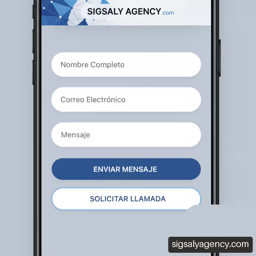
The form is the critical conversion point on most business pages. Filling out lengthy fields on a phone screen can become a frustrating experience if the interface isn't carefully designed.
To optimize data collection from mobile devices, it is advisable to apply the following practical adjustments:
• Selecting Specific Keyboards Using HTML AttributesIt is essential to assign the correct input type (for example, type="email", type="tel" either inputmode="numeric"). In this way, the phone automatically displays the appropriate virtual keyboard for entering numeric data or email addresses without additional steps.
• Reduction of Non-Essential FieldsWe only request essential information during the initial contact. Secondary data may be obtained at later stages of the business relationship.
• Disabling Autocorrect on Proper Names: Attributes such as autocorrect="off" They prevent the autocorrect from modifying company names, surnames, or product codes.
• Clear and Immediate Error MessagesIf the user makes a mistake when filling in a field, the alert should appear right next to the affected element, avoiding full page reloads.
Handling Tables, Graphs, and Complex Elements
Comparative rate tables, service matrices, and interactive charts are common on business websites, but displaying them on vertical screens presents obvious technical challenges.
A common mistake when adapting corporate websites is forcing the reduction of table font sizes until they become unreadable. The optimal solution is to transform the structure or allow controlled horizontal scrolling.
To maintain the usefulness of this data without harming navigation, we can apply different technical alternatives:
• Containers with Horizontal Scrolling: Wrap the table in a dynamic block that allows the user to horizontally slide the data while keeping the first reference column fixed.
• Transforming Rows to Cards: Convert each row of the table into an independent vertical block when a screen with a width less than 768 pixels is detected.
• Replacing Complex Graphics with Interactive Summaries: Replace cluttered statistical tables with clear numerical summaries with the option to expand details upon user request.
Technical Performance and Mobile Charging Budget
Mobile networks frequently experience latency and coverage variations. Therefore, visual adaptation must be accompanied by rigorous technical optimization to ensure fast response times.
Image Optimization, Flexible Formats, and Deferred Loading
High-resolution corporate images often represent the largest volume of data transferred by a website. Serving large photos designed for desktop monitors to a mobile phone severely impacts site performance.
To solve this, it is essential to implement responsive images using the element <picture> or the attributes srcset and sizesThis allows the browser to download the image version that best matches the device's resolution. Furthermore, the adoption of next-generation formats like WebP or AVIF reduces file size without degrading visual quality.
The application of deferred charging (lazy loading) through the property loading="lazy" This ensures that images located outside the initial screen are only downloaded when the user scrolls towards them, saving data and speeding up the initial site presentation. To learn more about integrating these measures into your business's digital infrastructure, we recommend consulting our professional web design and performance guide.
Management of Third-Party Scripts, Banners, and Core Vitals Web Metrics
Extensive use of analytics tools, live chats, external font libraries, and social media widgets introduces multiple HTTP requests that block page processing on less powerful mobile processors.
It is essential to analyze the impact of each script using Google's Core Web Vitals metrics:
• Largest Contentful Paint (LCP): Measures the loading time of the main visual element. On mobile devices, it should be kept below 2.5 seconds.
• Interaction to Next Paint (INP): Evaluates how quickly the site responds to touches or clicks. An optimal value is below 200 milliseconds.
• Cumulative Layout Shift (CLS)It measures unexpected content shifts during loading. This can be avoided by reserving space in the layout for images, ads, or cookie banners using CSS rules.
Impact of Mobile Speed on Technical SEO
Since search engines have prioritized mobile-first indexing, a website's mobile version determines its overall organic ranking. If mobile content is scarce, slow, or inaccessible, the website's performance on search results pages will suffer.
Maintaining content parity between the desktop and mobile views is vital. If informative text or a relevant heading is hidden in the mobile version to save space, crawlers might not value it properly. To ensure a robust technical architecture that supports this structure, it's key to apply principles of technical SEO optimization and performance.
Multi-device Testing and Quality Control Matrix
Verifying that a web adaptation works correctly requires a systematic evaluation protocol that goes beyond simulating screens in the working browser.
Validation of Critical Tasks and Approval Criteria
The quality control process should be organized according to the business goals of the enterprise platform. We recommend developing a validation matrix focused on key tasks:
- Contact Form Submission: Check that all fields are legible, that the virtual keyboard does not cover the submit button, and that the confirmation message is visible without needing to scroll vertically.
- Direct Call from Telephone Links: Ensure that phone numbers incorporate the protocol
href="tel:"and they open the smartphone's calling application directly. - Location and Map Interaction: Verify that the interactive map sections do not block vertical scrolling of the page (scroll trap).
Tablet Testing, Landscape Orientation, and Real-World Accessibility
Often, the testing process is limited to smartphones in a vertical position, overlooking other very common usage scenarios in professional environments.
The recommendations on devices from Google Search Central It highlights the importance of explicitly validating the responsive experience on tablets and not assuming that a scaled-down mobile configuration will work optimally on these devices. Tablet screens have intermediate resolutions where desktop menus can be awkward and smartphone versions can appear excessively stretched.
It is also essential to audit the platform in horizontal orientation (landscape) and evaluate behavior when users activate text magnification or accessibility tools on their devices.
Pre- and Post-Launch Audits Without Interrupting Conversions
Before putting the changes to the corporate website into production, a verification protocol must be run in a test environment (staging):
• Analytics Event Audit: Confirm that conversion tags (form submissions, WhatsApp button clicks, or calls) are still accurately recording events.
• Checking Redirects: Verify that no redirect loops or HTTP 404 status codes have been introduced when rearranging URLs or CSS styles.
• Load Testing under Limited Networks: Simulate unstable 3G or 4G connections using development tools to ensure the website remains functional under adverse conditions.
Key Points for Corporate Web Adaptation
Key Criteria for Successful Adaptation
• Unified Code ApproachWe prioritize responsive design architecture with a single URL over subdomains or independent dynamic configurations.
• Designed for Touch InteractionWe expanded clickable areas, restructured navigation menus, and adapted forms with specific virtual keyboards.
• Content HierarchyWe adopted single-column structures that simplify the user journey and highlight commercial calls to action.
• Resource Optimization and SpeedWe reduce data volume through modern image formats, lazy loading, and strict control of third-party scripts.
• SEO Performance GuaranteeWe maintain full equivalence of content and structured markup between the desktop and mobile versions.
Frequently Asked Questions about Mobile Web Adaptation
What does it mean for a business website to be responsive?
This means the platform uses a single HTML codebase and flexible CSS stylesheets that automatically adjust the site's visual layout to the screen width of the device being accessed. This ensures proper display on mobile phones, tablets, and computers without the need to create separate websites.
Is it better to adapt the existing website or rebuild it from scratch?
It depends on the current technical state of the website. If the site has clean code, structured semantic HTML, and a modern content management system (CMS), adapting stylesheets using dynamic CSS is usually the most efficient approach. However, if the website is built on outdated templates, has rigid code with fixed widths, or accumulates an excessive amount of scripts, it is more advantageous and cost-effective in the medium term to rebuild the platform using a mobile-first methodology.
How is the mobile-first approach applied to a corporate website?
The mobile-first approach involves designing and implementing the website version for smaller screens first, prioritizing essential business information and key user actions. Once the mobile experience is optimized, design layers and columns are added using media queries to take advantage of the additional screen space on desktop monitors.
What size should the buttons and touch areas be on a phone?
Touch areas should be large enough to be activated with the thumb without accidentally pressing neighboring elements. We recommend a minimum size of 48 by 48 pixels for interactive buttons and navigation links, maintaining a reasonable distance between them.
How to prevent corporate forms from being abandoned on mobile?
To reduce abandonment on mobile forms, it is essential to limit the fields to those strictly necessary, activate the virtual keyboard identical to the requested data (phone, email or number), use the browser's native autocomplete function and offer real-time error validation so that the user does not have to repeat the process.
Why is it essential to test responsive websites on tablets and not just smartphones?
Tablets offer intermediate screen resolutions and aspect ratios, combining touch functionality with a larger viewing area. If the test is performed solely on smartphones, tablets typically exhibit disproportionate elements, unnecessary white space, or difficult-to-use navigation menus.
How to adapt your website for mobile devices without losing SEO ranking or analytics data?
Maintaining a single URL responsive design architecture, preserving the integrity of meta tags and textual content in both versions, and performing analytics traceability tests before going into production to ensure that conversion tags continue to record activity correctly.
Sources and References
• MDN Web Docs + Responsive Web Design
• Google Search Central + Recommendations for building smartphone-optimized websites
• Google Search Central + Giving Tablet Users the Full-Sized Web