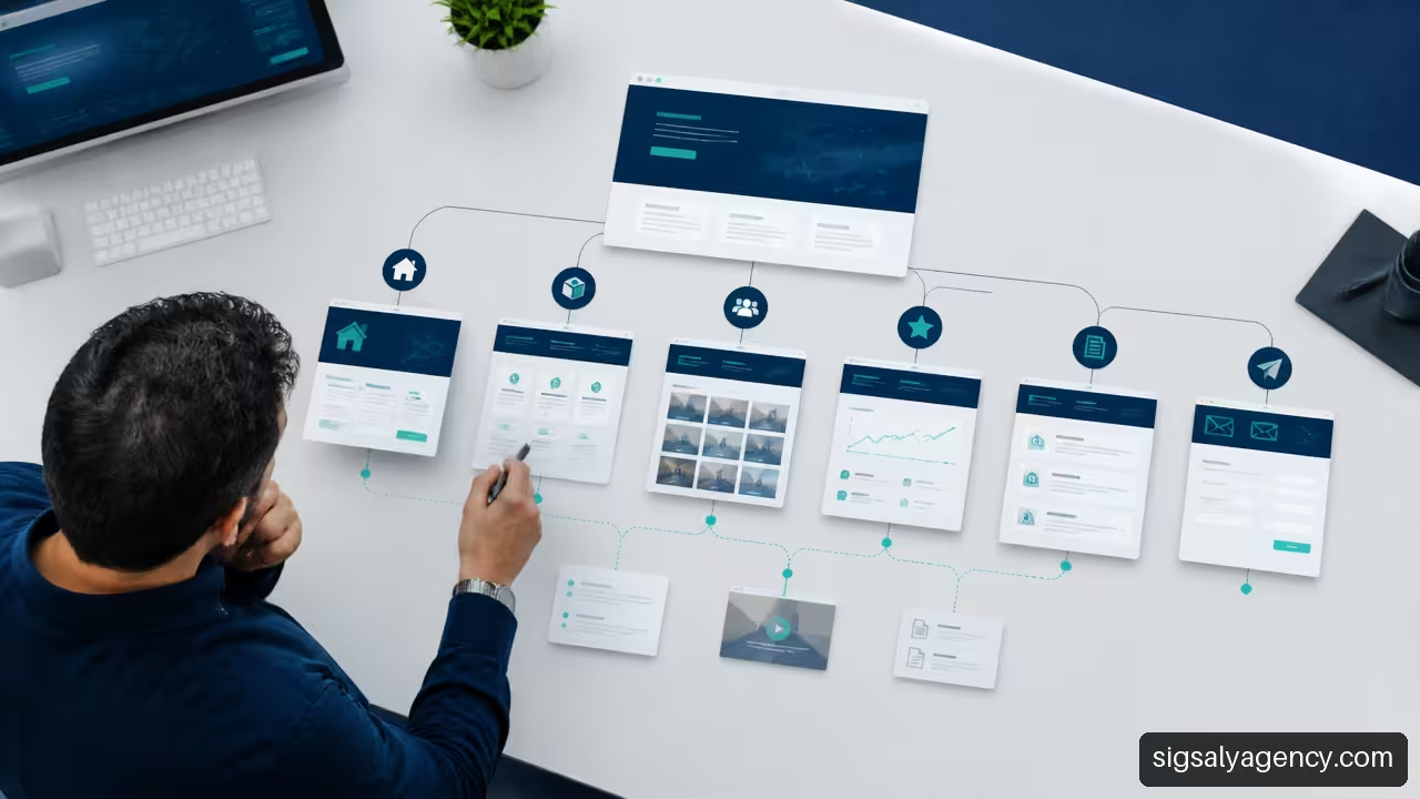
The information architecture for a services website defines how pages are grouped, named and connected so that a person understands the offer and finds the next step effortlessly. It is not just about creating an attractive menu. It is the system that organises services, needs, sectors, trust proofs and calls to action to turn a confusing visit into a business opportunity.
Table of Contents
- What Is Information Architecture And Why Does It Affect Conversion
- How To Define The Structure Of A Services Website
- How To Design Pages And User Journeys That Facilitate Decision-Making
- How To Validate And Improve Architecture Before And After Launch
- Key Takeaways
- Frequently Asked Questions
What Is Information Architecture And Why Does It Affect Conversion
Information architecture organises content according to the way people search, compare and understand an offer. On a services website, it answers very specific questions: what the company does, for whom, what problem it solves, what it might involve and how to initiate contact.
It is worth distinguishing three elements that are often mixed up:
| Element | What It Solves | Example On A Services Website |
|---|---|---|
| Information architecture | Defines the global logic of contents and relationships | Group SEO, advertising and content within digital growth |
| Site map | Represents existing or planned pages | Home, Services, SEO, Web Design, Cases, Contact |
| Navigation | Allows movement through that structure | Main menu, breadcrumbs, related links and footer |
A website can have a complete site map and still fail. This happens when names are not understood, services are duplicated or the user must visit too many pages to answer a basic question. The content hierarchy must reduce that mental load.
A useful structure does not require learning how the company thinks. It translates the offer into the language and intention of whoever is seeking help.
The Relationship Between Clarity, Trust And Conversion
When a person arrives at a service website, they rarely start by admiring the menu. First, they try to confirm whether they are in the right place. If they find a clear proposition, predictable categories and a straightforward path to contact, they can devote attention to comparing options. If not, they are likely to leave before discovering the value of the offering.
Consider a company that offers web design, SEO, maintenance and digital advertising. If it presents four buttons with internal names like 'Solutions 360', 'Boost', 'Presence' and 'Scale', the visitor needs to interpret each label. That effort is avoidable. It is clearer to use descriptive categories, such as 'Web Design', 'SEO', 'Digital Advertising' and 'Web Maintenance', and explain the nuances within each page.
Clarity does not imply over-simplifying. A complex service may need to explain processes, deliverables, limitations and dependencies. The difference is in the order: first the need and expected result; then, the technical detail for those who need it.
The Error Of Organising The Website Only According To The Organisational Chart
Many companies create their navigation based on departments, tools or trade names. This approach works internally, but does not always align with market questions. A person may search for 'improve the speed of my WordPress' without knowing whether they should enter 'Maintenance', 'Technical Support' or 'Optimisation'.
We can avoid this problem with a dual-access structure:
• A main entry by service, for those who already know what they need.
• A complementary entry by problem or objective, for those who identify a need but do not know the solution.
• Contextual links between both routes, without repeating pages with the same content.
For example, a page about web slowness can explain frequent causes and direct to the maintenance or optimisation service. There's no need to create three almost identical pages for
Principles That Should Guide The Hierarchy
Before thinking about visual design, it's worth establishing classification rules. These rules ensure decisions are consistent as the website grows.
- Business priority: strategic services should be easy to locate from the start and from the menu.
- User understanding: names should describe what the person will receive or resolve.
- No overlap: each category should have its own purpose. If two sections seem identical, they need to be redefined or merged.
- Controlled depth: a person should not need to go through many layers to reach a key page. On most service websites, a two or three-level structure is usually more manageable than a deep tree.
- Scalability: the architecture should support new services, sectors or resources without forcing a complete redesign of navigation.
To connect structure, accessibility and performance from the outset, it's useful to review this strategic guide for professional web design. Architecture does not replace visual design or speed, but it determines how both are leveraged.
How To Define The Structure Of A Services Website
The starting point should not be 'what pages do we want to publish?', but 'what decisions does a person need to make before contacting?'. This question shifts focus from internal inventory to the user journey.
Creating An Inventory Before Creating The Menu
First we gather all available and planned content. This includes services, sectors, cases, business questions, resources, locations, testimonials, technologies and forms. Then, we classify each piece according to its function.
| Content Type | Main Function | Usual Location |
|---|---|---|
| Service page | Explain a solution and capture demand | Services menu and contextual links |
| Need page | Help recognise a problem | Resources, campaigns or links from services |
| Success story | Provide context and proof | Cases, service pages and sector |
| Sector page | Adapt the proposal to a specific audience | Secondary menu or related blocks |
| Educational resource | Resolve doubts and attract informational traffic | Library, blog or resource centre |
| Contact or quote | Convert intention into action | Header, service pages and footer |
This inventory reveals duplicities. For example,
Choosing the Right Classification Model
There is no single valid taxonomy. The choice depends on the breadth of the offer, the language of the audience and the buying cycle. These are the most common options:
| Model | When To Choose It | Primary Risk |
|---|---|---|
| By service | When the offer is clear and known | Talking too much from internal speciality |
| By need | When the user starts from a problem | Create ambiguous or repeated categories |
| By sector | When each industry requires different messages | Multiply pages with little differential value |
| By location | When local attention is key | Generate almost identical geographical pages |
| Hybrid model | When multiple real intentions coexist | Overload the main menu |
In a digital agency or company with diverse services, a moderate hybrid model usually works well. The main menu can prioritise services. Within each page, related blocks can lead to sectors, needs and educational content. This way, the header maintains clarity and the site preserves depth.
Fair warning: it is not advisable to add all categories to the menu. A page being useful does not mean it should compete for space in the top navigation. A section like "Sectors" may be important, but it might work better within "Solutions" or through links from service pages.
Name Services Using the User's Language
The navigation label is a promise of content. It must be brief, specific and understandable outside the company. Creative names can be used in campaigns or business proposals, but should not replace a descriptive name in the base structure.
A practical way to review labels is to submit them to three questions:
- Does someone arriving for the first time understand what they will find by clicking?
- Does the label clearly differentiate itself from the other menu options?
- Does the same term appear consistently across the page, links and calls to action?
If the answer is no, the name needs revision. "Digital Strategy" can be valid if it explains what it includes and who it is for. If it is used to group SEO, social media, advertising, analytics and content without a concrete definition, it can become a catch-all category.
The structure must also support organic visibility. Each main service needs a defined intention, a coherent title and content that meets real expectations. This on-page SEO guide helps to work on optimising each page without treating the architecture as a sum of keywords.
How To Design Pages And User Journeys That Facilitate Decision-Making
Good architecture does not end in the menu. Each page should indicate where the user is, what they can do next and what relationship that content has with the rest of the offering.
The Anatomy Of A Service Page
A service page should allow for progressive decision-making. Not everyone needs the same level of detail at the same time. Some want to know quickly if the solution fits; others will compare process, scope and requirements.
A useful structure can follow this order:
- Main proposal: what service it is, who it's designed for and what objective it addresses.
- Problems it solves: concrete situations that help the reader recognise themselves.
- Scope and deliverables: what the service includes and what may fall outside it.
- Work process: phases, expected participation and relevant decisions.
- Trust proofs: cases, verifiable results, methodology or frequently asked questions, if they exist and are applicable.
- Related services: selected links that expand the solution without distracting.
- Call to action: a clear step, proportional to the degree of intention.
The mechanism matters. The main proposal reduces uncertainty. The scope avoids misunderstandings. The process makes visible how you move from a need to a solution. Related links prevent the visitor from having to return to the menu to continue exploring.
Connecting Services Without Creating A Labyrinth
Internal links should express a real relationship. "SEO" can link to "content", "analytics" and "web design" when explaining how those disciplines complement each other. But not all services should link to all others. An excessive network dilutes priorities and makes pages seem interchangeable.
We can apply a simple rule: each service page should link to a reduced number of options that respond to one of these relationships:
• A prior service, necessary to prepare the project.
• A complementary service, that expands the result.
• A subsequent service, useful after launch.
For example, a web design page can link to branding if the visual identity is not yet defined, to SEO if the aim is to capture demand and to maintenance if the site is already published. This connection reflects a logical journey. It also better integrates the web design and online marketing as part of a coherent strategy, not as isolated departments.
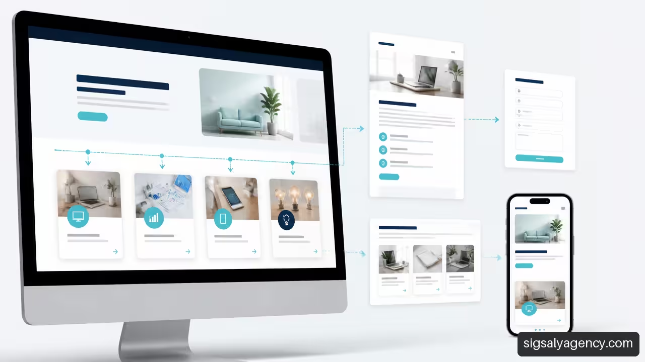
Adapt The Architecture To Mobile And To Different Levels Of Intention
On mobile, space reduces tolerance for extensive menus. The solution is not to hide critical information, but to prioritise it. A dropdown menu can contain more options, but main access points should remain recognisable and easy to tap.
It is also worth differentiating between visitors with high and low intent. A person searching for 'web design quote' usually needs indicative pricing, scope, timelines and contact details. Another searching for 'why my website doesn't generate leads' may require educational content before considering a service. Both routes can end in the same solution, but shouldn't start with the same message.
A common mistake is driving all traffic to a generic contact page. It is more effective for each page to offer an action consistent with its context: request an audit, explain the project, ask for a proposal or ask a question. Conversion is not always immediate. Sometimes it consists of facilitating the next correct step.
How To Validate And Improve Architecture Before And After Launch
Information architecture should not be approved simply because it looks organised to the team. It should be tested with people who did not participate in its creation and reviewed with real site usage.
Validate The Structure Before Visual Design
Two techniques are especially useful when you need to evaluate categories and labels:
| Technique | What It Allows You To Check | When To Use It |
|---|---|---|
| Card sorting | How people group content and what names they expect | Before finalising categories or renaming services |
| Tree testing | If they find a task within a hierarchy without visual support | When a proposed navigation tree already exists |
In a card sorting exercise, cards are presented with content such as
In a tree testing, a task is posed, for example: "You want to improve a slow website without completely rebuilding it. Where would you look for information?". If many people choose different routes, the problem may be in the label, the grouping, or both.
There is no universal number of participants that guarantees a perfect architecture. The decision depends on the variety of audiences and the complexity of the site. For a small website, a few qualitative sessions can uncover clear confusion. For an extensive platform with multiple user profiles, it will be necessary to expand the sample and separate journeys.
Measure Findability and Conversion Signals
After publishing, it is advisable to observe how real routes behave. It is not enough to look at total visits. A page can attract traffic and, at the same time, fail to help move towards a decision.
These signals usually provide context:
• Use of the internal search, if it exists, and terms entered.
• Frequent journeys between service pages.
• Recurring exits from menus or key pages.
• Clicks on calls to action and forms initiated.
• Repeated questions received by sales or customer service.
• Performance in specific tasks during usability testing.
Metrics are not interpreted in isolation. A long time on a page may indicate interest, but also confusion. A low click on a call to action may mean lack of intent, an unclear proposition, or the action appearing too soon. It is necessary to contrast analytics with content and with the task the user is trying to solve.
Fix Problems Without Breaking the Structure
When friction is detected, not always the entire website needs to be redesigned. We can act in layers:
- First review the name of the category or link.
- Check if a brief explanation is missing before the click.
- Add contextual links from related pages.
- Reorder navigation elements according to actual priority.
- Merge or remove pages that compete for the same intent.
- Repeat the test with a specific task before applying major changes.
Recovery is usually safer when correcting one hypothesis at a time. If you change labels, menu, content and calls to action all at once, it will be difficult to know what caused the improvement or deterioration.
Key Takeaways
• Information architecture for a services website organises decisions, not just pages.
• Services should be named with clear language, close to the needs of those visiting the website.
• A short main menu and a network of contextual links are usually more useful than cluttered navigation.
• Each service page needs to explain proposal, scope, process, relationships and next step.
• Organising by service, need, sector or location depends on the business model. It is not advisable to copy a taxonomy without checking whether it fits.
• Card sorting and tree testing allow you to detect problems before investing in design and development.
• Analytics should be interpreted together with the page's intent and the questions users still have.
Frequently Asked Questions
What Is the Information Architecture of a Services Website?
It is the way of organising, labelling and connecting the contents of a website so that people find services, understand their usefulness and move towards an action. It includes categories, page names, navigation, relationships between contents and access priorities.
What Is the Difference Between Information Architecture, Sitemap and Menu?
Information architecture is the complete logic that defines how content is structured. The sitemap is a representation of the pages that form part of the site. The menu is a navigation interface to access a part of that structure. A menu does not necessarily show all pages, but must reflect the priorities of the architecture.
Should Services Be Organised By Client Type, Need Or Sector?
It depends on how demand is expressed. If the public searches for specific services, it makes sense to prioritise classification by service. If they arrive with poorly defined problems, it can be useful to create routes by need. Sector-specific pages make sense when the message, requirements or applicable cases truly change. If only a few words change, it is preferable not to multiply them.
How Many Navigation Levels Should A Service Website Have?
There is no fixed number, but most key commercial pages should be a few steps away from the main navigation. A structure of two or three levels usually makes control easier. If more levels are needed, you should review whether the taxonomy is too detailed or whether certain pages should be connected through contextual links rather than appearing in the menu.
What Should A Service Homepage Include?
It should explain what the service is, what problem it addresses, who it may be suitable for, what it includes, how it works and what the next step is. It can also incorporate frequently asked questions, relevant case studies or complementary services when they provide real context. The priority is to clear up doubts before asking for a conversion.
How To Prevent Multiple Pages From Competing For The Same Intent?
You must assign a primary function to each page. If two pages address the same need with very similar content, it is advisable to merge them, clearly differentiate their approaches or convert one of them into supporting content. For example, a 'web maintenance' page can be commercial, while an article on 'how to detect WordPress errors' can be educational and link to the service.
How Is Information Architecture Adapted To Mobile?
The most important routes are prioritised, long labels are reduced and dependence on elements requiring mouse-over is avoided. The menu should be easy to navigate, but pages should also contain visible links and calls to action. On mobile, a person may arrive directly from a search engine to an internal page without having seen the homepage or the full menu.
How Do You Know If The Architecture Is Working?
It works when people find relevant services, understand the differences between options and complete useful actions with few doubts. To check this, it is advisable to combine task testing, review of internal queries, journey analysis, link clicks and feedback from the sales team. The most useful signal is not an isolated metric, but sustained reduction of friction in priority routes.