
A web redesign to improve a company's conversion rates it does not consist of changing colours, typefaces or photographs because the website looks old. It consists of eliminating friction that prevents a person from understanding the offer, trusting it and taking the next step: requesting information, booking, purchasing, calling or asking for a demonstration.
The correct question is not 'do we need a more modern website?'. I would ask another: at what point in the customer journey are commercial opportunities lost and why?. A useful redesign answers that question with data, hypotheses and measurable changes.
Table of Contents
- Deciding If A Complete Redesign Is Needed
- Designing The Journey That Leads To Conversion
- Measure, Launch And Optimise Without Losing Results
- Key Points
- Frequently Asked Questions
- Sources
Deciding If A Complete Redesign Is Needed
Before approving a budget, it is worth distinguishing between a design problem, a messaging problem, an uncompetitive offer or a failure in the sales process. A website can look impeccable and convert poorly if the value proposition is confusing. It can also appear visually outdated and yet still generate quality contacts.
The conversion rate is calculated by dividing the number of desired actions by the total number of visitors and multiplying the result by one hundred. If 1,000 people visit a page and 25 submit a form, the conversion rate is 2.5%. That figure alone is not enough. You need to review which channel attracted the user, which device they used, which page they visited first and what happened after the contact.
When To Choose A Full Redesign
I would recommend proposing a comprehensive redesign when problems affect several parts of the site rather than just a single page. For example, if the navigation is confusing, the messaging changes between sections, the site doesn't work well on mobile, the templates are slow and the technical system makes any improvement difficult, applying isolated patches could end up being more expensive in the medium term.
A complete redesign usually makes sense when several factors come together:
• The value proposition is not understood in the first seconds of a visit.
• The main templates share problems with structure, performance or accessibility.
• Navigation does not respond to the real needs of potential customers.
• The site has been built with components that are difficult to maintain or edit.
• The website does not represent the company's current offering, services, sectors or positioning.
• Analytics events do not allow you to know which actions generate business opportunities.
There is no universal percentage that requires redesigning. It would be unrigorous to promise it. The decision depends on the scope of the problem, the technical risk, the traffic volume, the ability to measure and the cost of continuing to lose opportunities.
When To Start With Targeted Optimisation
If most visitors abandon a specific landing page, if a form has too many fields or if a CTA receives barely any clicks, it may be more reasonable to test localised changes. This reduces risk and allows you to learn before altering the entire architecture.
Let's think of a professional services company. Its homepage receives branded traffic, but paid campaigns lead to a landing page with a nine-field form. Before redesigning the entire site, it is worth testing a version with fewer questions, a clearer message about the benefit and a visible explanation of what will happen after submitting the request. If contacts improve, the learning can later be applied to the rest of the pages.
| Situation Detected | Most Appropriate Response | When to Avoid It |
|---|---|---|
| CTA not very visible on a page | Localised test of copy, position or design | If the problem is repeated in all templates |
| Abandoned forms | Simplify fields and review validations | If leads require essential information to be qualified |
| Confusing navigation throughout the site | Redesign of architecture and menus | If only a specific section shows high bounce rates |
| Slow website and difficult to maintain | Technical review or complete redesign | If the problem comes from a specific campaign, server or integration |
| Unclear sales message | Rewriting of value proposition | If the offer is not competitive or does not address a real need |
This diagnosis does not replace a sales strategy. A website can increase poorly qualified requests if it makes contact too easy without filtering expectations. That's why I wouldn't measure only quantity of leads: I would also review their quality, their progress in the CRM and their conversion into sales.
The Audit That Should Precede Design
A conversion-oriented audit should combine quantitative data and qualitative observation. Analytics reveal which pages receive traffic, where the funnel drops off and which devices convert poorly. Heat maps and session recordings can help detect failed clicks, ignored CTAs or scrolling difficulties, although they should be interpreted with caution and respecting privacy.
It's also worth reviewing calls, forms, bookings and emails received. If a company generates contacts via phone, but only measures forms, it will be undervaluing the actual performance of certain pages. Similarly, a page can generate many requests without any reaching the sales team due to faulty integration.
To understand the basis of performance, accessibility, structure and user experience, it may be useful to review this strategic guide for professional web design. A design that cannot be used well from mobile, keyboard or assistive technologies leaves part of the audience out before they can convert.
Designing The Journey That Leads To Conversion
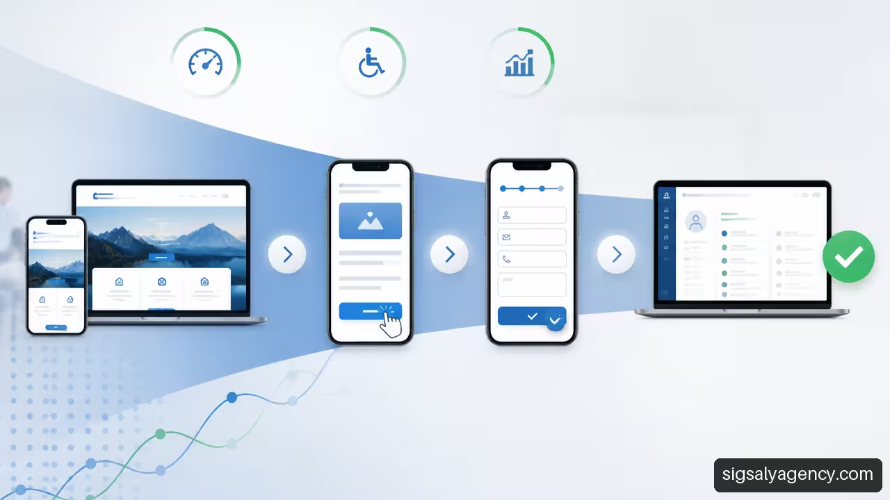
An effective redesign reduces the distance between a user's doubt and a clear answer. It's not about pushing everyone towards the same button, but about presenting the next most logical step according to each visitor's intention.
Build A Comprehensible Value Proposition
The top of a page should quickly answer four questions:
- What does the company offer?
- Who is it intended for?
- What problem does it solve or what result does it enable?
- What should the visitor do next?
A phrase like 'Innovative solutions for businesses' doesn't clarify much. In contrast, a company offering industrial maintenance could explain that it reduces unplanned downtime, indicate what types of facilities it serves, and offer a review or technical call. The difference is not just stylistic: it reduces uncertainty.
The message must remain consistent throughout the journey. If an advert promises a free audit and the landing page talks about general services without mentioning that audit, the user perceives a break. That lack of continuity can lower conversion even if the design is attractive.
Prioritise Navigation, Mobile and Speed
Navigation should help you choose, not force you to decipher. Extensive menus, ambiguous names and duplicate pages create mental load. For an SME providing services, it is usually more useful to organise the site by needs, services, sectors and trust indicators than to create a menu full of internal labels.
On mobile, the priority changes. The user has less space, may be comparing several alternatives and usually has less patience for long forms. I would especially review these elements:
• Contact buttons visible without excessive scrolling.
• Telephone, booking or WhatsApp configured as measurable actions when they are relevant channels.
• Legible text, sufficient contrast and large touch areas.
• Forms with appropriate keyboard for each field, clear error messages and understandable validation.
• Images and scripts that do not delay the loading of essential content.
Speed should not be treated as an isolated indicator. If a page loads quickly but hides the price, terms or the information the user needs, it will still create friction. The goal is to get important content to arrive early and be easy to use.
Design CTA, Forms And Trust Tests
A CTA works when it explains the value of the next step. 'Submit' is a technical instruction; 'Request a proposal' or 'Book a 20-minute call' better express what will happen. It is not advisable to promise an immediate response if there is no real capacity to deliver it.
Forms should ask for the minimum information necessary to move forward. In an initial consultation, name, email, company and need may be sufficient. However, reducing fields is not always the answer. In complex services, a question about budget, project type or location can avoid contacts that the team cannot handle. The decision depends on whether the main bottleneck is the quantity of requests or the quality of the lead.
Social proof also needs context. A testimonial without a name, sector or problem solved contributes little. A reference that explains what situation the client had, what service they hired and what result they perceived is more useful. Logos, certifications, privacy policies, timelines and clear terms can reduce doubts near the CTA.
A case published by CodeHammerhead on redesign and CRO focused on improving navigation, making it easier to locate content and creating specific pages for local searches. The lesson is not to copy that structure, but to relate each design decision to a concrete user need and search intent.
Redesign should also not be separated from acquisition and positioning. The relationship between content, architecture, campaigns and landing pages is developed in this resource on web design and online marketing to improve positioning. If traffic arrives with a different expectation to what the page presents, conversion will suffer.
Measure, Launch And Optimise Without Losing Results
Publishing the new website is not the end of the project. It is the moment when real behaviour, technical incompatibilities and differences between hypotheses and results begin to appear.
Define Conversions Before Launch
The primary conversion must be connected with a business objective. For an ecommerce it can be a completed purchase. For a B2B company, a qualified demo request. For a clinic, a confirmed booking. It is not enough to choose the easiest event to measure.
I would establish three levels of tracking:
| Measurement Level | Examples | Utility |
|---|---|---|
| Primary conversion | Purchase, confirmed booking, qualified demo | Evaluates the main business objective |
| Microconversion | Form start, phone click, download | Detects interest before final conversion |
| Business Result | Accepted lead, opportunity, sale | Measures quality and actual return |
Before launching, baseline values should be recorded by device, channel, landing page and conversion type. A global rate can hide a serious drop on mobile compensated by a small improvement on desktop. It can also conceal that organic traffic converts differently from campaign traffic.
Protect SEO, Forms And Business Tracking
Changing URLs without planning redirects can break journeys, shared links, active campaigns and ranked pages. 301 redirects should take each old URL to the most equivalent new alternative, not simply to the homepage. A user who searches for a specific service and arrives at a generic home may abandon even if the website is new.
A discussion in r/smallbusiness reminds the importance of checking forms, tracking, calls, bookings and redirects before publishing. Although it is a community recommendation, it describes a real risk: excellent design does not compensate for a form that does not deliver data to the CRM.
Pre-launch validation should include a complete test from the CTA to the sales follow-up:
- Click on each relevant CTA from mobile and desktop.
- Submit forms with test data and check receipt.
- Confirm that the CRM correctly assigns the contact.
- Verify analytics events, calls, bookings and messages.
- Review confirmations, automated emails and response times.
- Check redirects, 404 errors and broken links.
Launch in Phases and Learn Without Over-Attributing
When the business depends heavily on the web, a gradual launch can be more prudent than replacing everything at once. You can start with a priority template, a set of landings or part of the traffic. A reversible deployment allows you to temporarily return to a stable version if an anomalous drop in conversions, speed or forms appears.
It is not advisable to attribute an improvement to the design without reviewing the context. If a new offer, a different campaign, price changes and a redesigned landing coincide, it is not possible to know for certain what caused the increase. In that case, it is advisable to record hypotheses and compare equivalent segments.
Success stories can inspire, but do not constitute a guarantee. Wingify collects a case with a 125% increase in checkout conversion and an 18-fold return; as it is a commercial case published by a provider, it should not be generalised to all businesses. The product, traffic, price, sample and experiment can be very different.
After launch, optimisation must continue. Reviewing monthly landing pages, CTAs, forms, lead quality and technical performance allows you to prioritise improvements with evidence. This sustained work is related to the web maintenance and its impact on digital success: a website that converts today can degrade with new integrations, browser changes, outdated content or security errors.
Key Points
A conversion-focused redesign does not pursue a website that is simply more beautiful. It pursues a clearer, more reliable and measurable journey between the visitor's intent and the business objective.
• I would start by identifying real friction before deciding whether the entire site needs to be redone.
• I would choose a comprehensive redesign when the problem is structural, technical and cross-cutting.
• I would prioritise targeted improvements when friction is concentrated on a landing page, a form or a CTA.
• I would measure primary conversions, microconversions and lead quality in the CRM.
• I would review performance by channel, device, entry page and user type.
• I would validate forms, calls, bookings, events and redirects before publishing.
• I would maintain a post-launch optimisation plan to avoid confusing the launch with the end of the work.
Frequently Asked Questions
How Do I Know If I Need A Complete Redesign Or Just Optimise Some Pages?
If friction appears across multiple templates, navigation, messaging, performance and mobile experience, the problem is likely structural. If the drop is concentrated on a landing page or form, I would start with a localised test. The criterion should be the extent of the problem, not the visual age of the site.
What Elements Have The Most Influence On A Website's Conversion?
The value proposition, the fit between intent and content, navigation, speed, mobile experience, CTAs, forms and trust signals usually have a major impact. Their specific importance varies depending on the business model and the stage of the funnel.
How Much Can Conversion Increase After A Redesign?
There is no reliable range that can be applied to all businesses. Improvements depend on supply, traffic, price, competition, business process and implementation quality. It is more useful to define a baseline and measure change by segments than to expect a predetermined percentage.
How Do I Calculate the Return On Investment Of a Redesign?
You can compare the margin generated by additional sales attributed to the new journey with the cost of the project, maintenance, campaigns and tools. In B2B businesses, it is advisable to calculate it with opportunities and closed sales, not just with submitted forms.
What Should I Measure Before And After Launch?
Measure primary conversion, microconversions, form abandonment rate, calls, bookings, speed, technical errors and lead quality. Segment by mobile, desktop, acquisition channel, landing page and service type.
How Do I Avoid Losing Traffic And Leads When Changing The Website?
Prepare a URL inventory, set up relevant 301 redirects, preserve high-value pages when necessary and test forms, CRM, phones, emails and analytics events before publishing. After launch, review 404 errors and drops by channel.
What Do I Do If The Redesign Increases Traffic But Lowers Leads?
First check the fit between traffic sources and value proposition. Then analyse CTA, forms, landing pages, mobile experience and redirects. The design may attract more informational visits, but may not guide those with commercial intent well.