The elements of a corporate website focused on conversions are not limited to attractive design or including a contact form. A corporate website that converts helps each visitor understand what the company offers, whether that solution fits their need and what the most reasonable next step is.
When a page is designed only to "be on the internet", it usually explains too much about the company and too little about the problems it solves. Instead, a page oriented towards conversions connects the message, user experience, lead generation and sales follow-up. The goal is not to get more clicks for their own sake, but to generate opportunities with real potential.
A useful conversion does not end when a form is submitted. It begins when the contact receives a clear response, reaches the right team and can move forward within the sales process.
Table of Contents
• Fundamentals Of A Corporate Website That Converts
• Architecture, Forms And Sales Tracking
• Key Takeaways
• Frequently Asked Questions
• Sources And References
Fundamentals Of A Corporate Website That Converts
A corporate website oriented towards conversions works as an active piece of the conversion funnel. Its function is to reduce uncertainty: what the company does, who it works for, what result the visitor can expect and how they can start a conversation.
Not all visits have the same intention. A person comparing suppliers needs proof and decision criteria. A technical profile may want documentation. Management may value a strategic meeting. That's why it's not advisable to treat your entire audience as if they were ready to click the same button.
Define A Primary Conversion And Secondary Actions
Before choosing colours, modules or animations, it's worth deciding what the page's primary conversion is. In a B2B service company it could be requesting a meeting. In a consultancy, asking for an audit. In a technology company, booking a demonstration.
The primary conversion should be unique per page. This doesn't mean eliminating any other action, but organising priorities. Secondary conversions help to not lose visitors who are still researching.
| Level Of Intention | Visitor Need | Recommended Conversion | CTA Example |
|---|---|---|---|
| High | Wants to speak to a provider | Primary conversion | Request a meeting |
| Medium | Is comparing solutions | Microconversion | View case studies |
| Initial | Seeks to understand the problem | Content or resource | Download the guide |
| Technique | Needs to validate requirements | Documentation or demo | Check specifications |
A page showing five buttons with the same relevance creates an unnecessary decision. The visitor doesn't know what path is a priority and often chooses none. It's better to highlight one main action and present alternatives as supporting routes.
Segmentation should also affect the message. Toimi explains that different buyer profiles may need different CTAs, from a strategic conversation for management to a trial, documentation or personalised terms for technical and financial profiles.
Build A Value Proposition That's Understood Quickly
The first screen, also called hero, must answer three questions in a few seconds:
- What problem does the company solve?
- Who is it relevant for?
- What result or improvement can the visitor expect?
A headline like
Condato suggests that a corporate website focused on conversion must connect message, CTA, social proof, form and sales follow-up. That connection is key: if the headline promises agility, the contact process cannot ask for excessive information or leave the user without a response for days.
The value proposition should not live only in the hero. It must remain coherent in the explanation of services, in success cases and in the form. If a company claims to simplify complex processes, the structure of the website must also be simple.
To delve deeper into the relationship between visual clarity, performance and usability, it is useful to review this strategic guide for professional web design. Conversion depends as much on the message as on the ease of understanding and using it.
Use Clear, Specific And Accessible CTAs
A CTA, or call to action, should describe a concrete action and reduce doubt about what will happen next.
There is no universally perfect position for a CTA. It depends on the cost of the decision, on knowledge of the service and on the visitor's intent. On a simple service, a visible CTA on the first screen may suffice. On a complex or costly solution, the user may first need benefits, process, proof and answers to objections.
A typical structure combines promise, benefits, process, social proof, FAQs and a final CTA. Nuvace proposes this sequence to organise a services page focused on conversion. The order works because it accompanies a basic commercial conversation: first interest, then understanding, trust and action.
Accessibility is also part of conversion. A button with poor contrast, a small touch area or an invisible keyboard focus can prevent a person from completing the action. On mobile, this becomes more evident: the CTA must be easily tappable, content must be scannable and the form must be completable without obstacles on a cellular connection.
Architecture, Forms and Commercial Tracking
A corporate page converts when each element reduces a concrete barrier. Information architecture organises. Social proof provides context. The form collects useful data. Analytics reveal where opportunity is lost. And the CRM prevents the contact from being isolated.
Demonstrate Trust With Evidence, Not With Decoration
Logos, testimonials and figures can strengthen credibility, but only if they provide verifiable information. A row of brands without context may impress visually, although it doesn't explain what work was done or what problem was solved.
Social proof is stronger when it includes details that allow you to assess the case:
• Name of the company or client, when authorised to display it.
• Sector or starting context.
• Specific problem that needed to be solved.
• Service or approach applied.
• Observable result and the period it corresponds to.
• Name, position and date of the testimonial, if a quote is published.
For example, "An industrial sector company improved its customer acquisition process" is a weak statement if it doesn't explain how. Instead, a case that explains that the catalogue was reorganised, forms were simplified and applications were integrated with the CRM provides information to assess the solution, even if it doesn't publish confidential figures.
Vokko Agency identifies the combination of specific headline, visible CTA, problem explanation, social proof, brief form and direct contact as a frequent basis on conversion-oriented pages. The value of these elements is not in accumulating them, but in that they all tell the same story.
Designing Forms That Don't Break Conversion
The form is a critical point because it asks the visitor to provide data and make a commitment. It should only ask for the information necessary for the next business step.
There is no universal number of fields that guarantees a better conversion rate. A three-field form can generate many poorly qualified contacts. One with six fields can filter better if each question really helps prepare the conversation. The decision depends on the value of the offer and the team's ability to handle requests.
A good criterion is to classify fields into three groups:
| Field Type | Function | Recommended Decision |
|---|---|---|
| Identification | Name, email, company | Keep if it allows responding and contextualising |
| Qualification | Budget, need, size | Include only if it changes commercial prioritisation |
| Research | Data not necessary to respond | Remove or ask later |
The form must also contemplate errors and recoveries. If an email does not have a valid format, the message should appear next to the field and explain how to correct it. If submission fails, the data entered should be preserved when possible. If completed correctly, the confirmation page should explain what will happen next.
A useful confirmation can include:
- A clear receipt message.
- The estimated response timeframe.
- The channel through which the contact will arrive.
- A relevant resource while you wait.
- An alternative if you need urgent attention.
Avoid empty messages like "Thank you, we'll be in touch". Text such as "We have received your request. Our sales team will review the context provided and will respond by email within the timeframe communicated" reduces uncertainty without promising immediacy that cannot be delivered.
Connect The Web With CRM, Data And Commercial Operations
A web conversion should not be measured solely as a submitted form. The relevant data is whether that contact becomes a qualified lead, meeting, proposal or commercial opportunity. To know this, the page must be connected with subsequent operations.
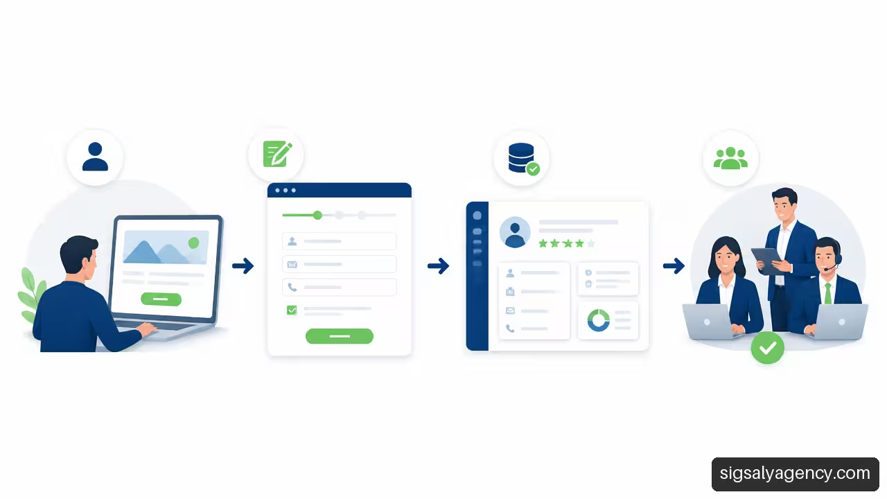
The basic flow can be organised as follows:
- The user submits a form or makes a call.
- The web records the source, page, campaign and action taken.
- The CRM creates or updates the contact.
- A rule of lead routing assigns the lead to the appropriate team, region or person responsible.
- A realistic response SLA is activated.
- The team classifies the contact according to need, fit and interest.
- The information returns to analytics to evaluate which channels generate quality opportunities.
Here a relevant difference appears between quantity and quality. A campaign can increase the conversion rate if it offers a very generalised resource, but those registrations may not have commercial intent. Another page might record fewer submissions, yet produce more requests that advance to meeting. Without this connection, one can optimise a superficial metric and worsen commercial efficiency.
Measurement should separate the stages of the journey:
• Display of CTA.
• Click on CTA.
• Form initiation.
• Validation error.
• Submission completed.
• Qualified lead.
• Commercial opportunity.
• Sale, when it is possible to attribute it responsibly.
It is also advisable to segment by device, channel and landing page. If the form is frequently started on desktop but rarely completed on mobile, the problem may lie in the mobile experience, not in the offer. If there are clicks on the CTA but few form starts, perhaps the button text promises something different from what the user finds.
Clicks on phone, email and forms are useful signals to check whether the website generates opportunities, as recorded in the professional corporate website checklist by Desvern Web. Still, the analysis gains value when connected with the subsequent quality of each contact.
SEO also plays a role in conversion because it conditions the intent with which visits arrive. A page that attracts informational searches needs an initial offer different from one that receives traffic from contracting terms. This on-page SEO guide helps align content, search intent and structure of each page.
Review Performance, Accessibility and Coherence of the User Journey
UX does not end in appearance. A slow website, with content jumps or difficult-to-use buttons creates friction before the visitor values the offer. Mobile performance is especially important when navigation occurs from social networks, paid campaigns or local searches.
The review should include, at a minimum:
• Stable loading of images, typefaces and content blocks.
• Navigation usable with keyboard.
• Visible and understandable labels in forms.
• Sufficient contrast between text, buttons and backgrounds.
• Explanatory error messages.
• CTAs clickable on small screens.
• Confirmation pages and recovery routes for failures.
It is not about pursuing an isolated technical score. It is about checking whether a real person can progress without interpreting ambiguous instructions or struggling against the interface. The relationship between web design and online marketing it is especially visible here: acquired traffic only has value if the page meets the expectation created by the advertisement, content or search.
Key Takeaways
• A corporate website focused on conversions must define a primary conversion clear and keep secondary actions in the background.
• The value proposition must explain the problem, audience and expected result before talking extensively about the company.
• CTAs work best when they express a concrete action and adapt to the level of intent or buyer profile.
• Forms should ask for information useful for the next step, not data that the team will not use.
• Social proof gains credibility when it provides context, identity, problem and verifiable result.
• A high conversion rate does not guarantee good business results: you need to measure lead quality, meetings and opportunities.
• The CRM, response SLA and assignment rules are part of the conversion system, even though they occur after the page.
Frequently Asked Questions
What Elements Should a Corporate Website Have to Generate Leads?
It should include a clear value proposition, a main CTA, explanation of services or solutions, evidence of trust, form or contact channel, information about the process and measurement of actions. The order depends on the complexity of the decision. The greater the perceived risk, the more context and evidence the visitor will need before contacting.
What Should Appear On The First Screen Of A Corporate Homepage?
The first screen should show what the company offers, who the solution is for, what main benefit it presents and what the next action is. You can add brief evidence, such as a contextualised figure or a reference to served sectors, but without displacing the central message.
How Many Calls To Action Should A Page Have?
You may have several CTAs, but one should be clearly prioritiary. Repeating the same CTA at strategic points is reasonable when content is long. Secondary CTAs should serve visitors with different intentions, such as viewing a case study or downloading documentation, without competing visually with the main action.
Is It Better to Use "Contact" Or a More Specific CTA?
A specific CTA usually communicates the next step better. "Request a quote", "Book a demo" or "Discuss your project" provide more context than "Contact". "Contact" can remain in the menu, where it functions as general access, but on landing pages it is best to specify the benefit or action.
How Many Fields Should a B2B Form Have?
There is no figure that works for all cases. As a practical criterion, only fields necessary to respond to and prioritise the contact should be included. If asking about budget, timeline or project type changes commercial assignment, it may be justified. If the information is not used, it adds friction without adding value.
How Can You Reduce Form Abandonment?
You must remove unnecessary fields, use clear labels, indicate which data is required and show understandable errors near the affected field. It also helps to explain what will happen after submission. If the form is long for an operational reason, it can be divided into steps as long as progress is clear and data entered is not lost.
How Can You Tell If the Problem Is in the Message, the CTA or the Form?
Stage-based analytics helps you locate it. Many visits with few CTA clicks can indicate irrelevant messaging or poor visibility of the action. Many clicks but few form starts can reflect misaligned expectations. Many starts but few submissions often point to friction, errors or too many fields. Afterwards, you need to review whether the submitted leads have commercial quality.
Sources and References
• Condato — Website that converts: keys to attract customers in your business: https://condato.es/web-que-convierte-claves-pyme/
• Toimi — Corporate Website Design: What Makes a B2B Site Actually Convert: https://toimi.pro/blog/corporate-website-design-b2b-conversion/
• Desvern Web — Professional corporate website checklist: https://desvernweb.com/checklist-web-corporativa-profesional/
• Nuvace — How to create a website that converts: https://nuvace.com/blog/como-crear-una-web-que-convierte
• vokkoagency.com: https://vokkoagency.com/blog/10-elementos-pagina-web-que-convierte/