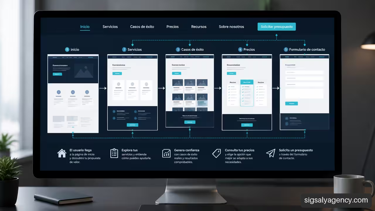
A web navigation structure that facilitates customer acquisition does not consist of adding more links to the menu. It consists of reducing unnecessary decisions and guiding each visitor towards the next logical step: understanding the proposal, evaluating the solution and contacting when they have enough information.
If a person arrives from Google, a campaign or a recommendation, they should be able to quickly answer three questions: what is being offered, whether it solves their problem and what they should do next. When navigation does not provide those answers, the user jumps between pages, loses context or leaves before requesting a quote.
Table of Contents
• Key Points
• Design The Architecture According To Purchase Intention
• Build Conversion Paths That Do Not Generate Friction
• Frequently Asked Questions
• Sources and References
Key Points
• Primary navigation should prioritise real business tasks, not internal departments or pages that only interest the company.
• An effective menu connects each decision phase with an appropriate page: service, solution, price, social proof, resources or contact.
• There is no universal correct number of options. My criterion is to keep visible only those destinations that have high utility for the visitor and clear value for the business.
• Buyers with different intentions should not receive the same call to action. Someone comparing needs evidence; someone who has already decided needs quick access to contact.
• Mobile navigation, keyboard, focus states, broken links and orphan pages influence customer acquisition as much as visual design.
Good navigation does not push the user towards a form. It eliminates the uncertainty that prevents them from reaching it.
Design The Architecture According To Purchase Intention
Information architecture organises content, relationships and access paths. On a website aimed at attracting customers, its function is not just to help find pages: it must accompany a business decision.
My recommendation is to start with the tasks that a person is trying to complete. For example, a company looking for an agency might want to compare services, review case studies, understand the process, learn about an investment range, or request a meeting. If the menu reflects those tasks, the user moves forward. If it reflects internal names like 'Digital Unit', '360 Area' or 'Integrated Solutions', they will have to interpret what each option means before acting.
Separate Exploration, Evaluation And Decision
Not all visits have the same intention. A person arriving at an informational article may be exploring. Another searching for 'web design price' is usually evaluating. Someone visiting a contact page after reviewing a case study is closer to deciding.
Navigation should recognise this difference. The same website can offer different routes without becoming a maze.
| Visitor Phase | Main Question | Recommended Destination | Appropriate CTA |
|---|---|---|---|
| Exploration | What options exist? | Resources, guides, solution categories | View guide, Explore solutions |
| Evaluation | Does this option suit me? | Service pages, comparisons, process, case studies | See how we work, Request information |
| Decision | What do I need to get started? | Price, requirements, schedule, contact | Request a quote, Book a call |
This logic avoids a common mistake: asking for a meeting with someone who doesn't yet understand the offer. A direct commercial CTA can still be visible, but it shouldn't be the only way out. Forcing the same step for everyone can reduce the quality of the experience and cause users with genuine interest to abandon before their decision matures.
In B2B processes, the difference is even more relevant. Management may need to understand return and reach; a technical person may seek security, integrations or maintenance; purchasing perhaps requires prices, timelines and conditions. The guide to Upqode on B2B web design it precisely proposes differentiated routes by role, CTAs and contextual access to pages such as pricing, security, resources and contact.
There is no need to create a separate website for each profile. Contextual links within solution pages may suffice: "For technical teams", "For management" or "View project requirements". The key is that these routes address a specific objection, not that they multiply options without criteria.
Deciding What Deserves to Be in the Main Menu
Primary navigation is limited space. Each visible element competes for attention. That's why it's not advisable to decide what goes in the menu simply because a page exists or because a department wants visibility.
I would use four criteria before promoting a URL to the main menu:
- Frequency of need. Do many visitors search for this information on their first or second visit?
- Commercial impact. Does the page help to evaluate, contact or move towards a conversion?
- Label clarity. Does someone outside the company understand the link without opening it?
- Relationship with entry intent. Does it align with what SEO, ads and campaigns promise?
For example, a "Services" page usually deserves a prominent place if it brings together relevant offerings and leads to specific pages. On the other hand, a press page, corporate policy or support for existing customers probably fits better in the footer, in secondary navigation or in a private area.
The recommendation to deliberately limit primary navigation does not imply that there is a universal number of links. The reasonable amount depends on the catalogue, purchase complexity and audience. A specialist firm may need few routes. A SaaS company with security, integrations and documentation may require more. The useful reference is not a fixed number, but the effort required to choose.
The approach to Clever for user-centred navigation suggests starting from the task inventory, card sorting, sitemap and labelling that reflects how the audience expresses itself. This process allows detecting duplicate pages, obsolete destinations and unnecessary navigation levels before redesigning the menu.
Validate Labels Before Publishing Them
A label that is understandable within the company can be opaque to a potential customer. 'Solutions' seems flexible, but it can hide services, products, consulting or support. 'Success cases' is usually more specific; 'Pricing' responds to a direct intention; 'Resources' works when it groups guides, templates or webinars coherently.
A simple validation consists of showing the labels to people who are not participating in the project and asking what they expect to find behind each one. It is not about asking if they like the menu. You have to check if they can correctly predict the content and complete tasks such as these:
• Find the appropriate service for a specific problem.
• Identify how much a solution can cost or how the budget is calculated.
• Locate proof of results before contacting.
• Reach the form without returning to the homepage.
The guide to Vasuyashii on contact-oriented navigation recommends grouping by tasks, validating labels with people outside the organisation and reviewing responsive states, keyboard, focus, URLs and analytics. It is a useful list because a label only works if it is understood in all usage contexts.
It is also advisable to differentiate acquisition navigation from after-sales navigation. If the main menu mixes
To expand the relationship between accessibility, performance and orientation, it's useful to consult this strategic guide for professional web design. The structure works best when content loads quickly, maintains clear hierarchies and can be used without barriers.
Build Conversion Paths That Do Not Generate Friction
The menu doesn't work alone. Conversion depends on continuity between the entry link, the page visited, internal links, available tests and the final CTA. A visit that reaches a service page shouldn't have to return to the menu to know what to do next.
A basic conversion structure usually connects homepage, services, tests, content and contact. The explanation of AgenciesMarketing on web structure for lead capture relates those elements to CTAs such as requesting information, downloading a resource, booking a call or requesting a quote. What matters is not copying a list of pages, but assigning a function to each one within the route.
Connect Services, Tests And Contact
A service page has to answer a specific business question. If it's titled 'Web Design', it should explain who it's for, what problem it solves, what it includes, how the process develops and what step the visitor can take. Afterwards it needs links that reduce foreseeable doubts.
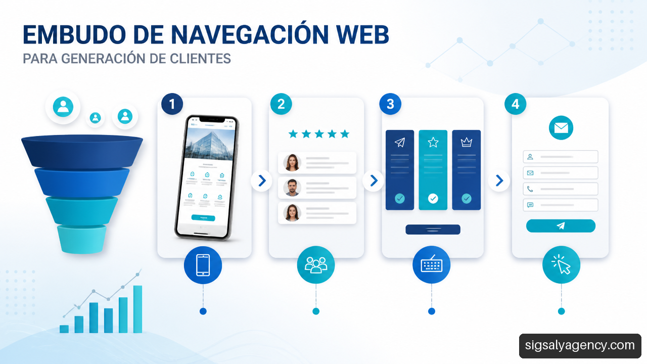
A coherent route can follow this sequence:
- The user arrives at a service page from a search or campaign.
- They find a clear explanation of the scope and expected results, without absolute promises.
- They consult a case study, an authoritative review, a process or frequently asked questions related to it.
- They move to a provided action: request a proposal, book a meeting or download useful information.
- They receive confirmation and know what will happen after the form.
The typical failure occurs when the CTA leads to a generic form without context. If the person has read about WordPress maintenance, the form should retain that reference, whether through a pre-selected subject line, an interest field, or a contact page that anticipates the type of request.
Pricing pages require their own criteria. It is advisable to include them in navigation when cost, contracting model or investment range is a frequent and publicly addressable objection. A page on 'How the budget is calculated' may be preferable if each project depends on relevant variables. Hiding all economic reference does not always protect the sale; sometimes it transfers uncertainty to the form and attracts poorly qualified requests.
Design For Mobile, Keyboard And Context
Responsive design is not resolved by reducing the desktop menu to an icon. On mobile, the visitor must be able to open submenus, go back, recognise the active section and reach the CTA without touching targets that are too small. If a category has many levels, perhaps it should not be reproduced as is: it may need an index page that organises options with titles and brief descriptions.
Accessibility adds operating conditions. A menu must be able to be navigated with a keyboard, show visible focus and allow dropdowns to be closed without becoming trapped. These measures benefit people who do not use a mouse, but also anyone navigating in a hurry, from a small screen or with an unstable connection.
Breadcrumbs and active states hold special value in deep routes. Imagine a user lands directly on 'Services > Technical SEO > Web Audit'. Without a context signal, they might not discover related services or easily return to the parent category. With breadcrumbs, active navigation and relevant internal links, they understand where they are and what alternative they can explore.
He Web design adapted for digital marketing helps you understand why this adaptation influences the customer journey. It is not enough for a page to look good: it must retain its ability to guide and convert on every device.
Measuring Navigation as a Funnel of Routes
Measuring only form submissions offers an incomplete picture. A case study, pricing or services page may not be the final click, but it may have resolved a decisive objection before conversion. That contribution can be treated as assisted conversion.
My proposal is to define a funnel of routes and review where it breaks. There is no need to track every click without purpose; you must record events that represent real decisions.
| Event to Measure | What It Can Reveal | Possible Action |
|---|---|---|
| Click on a menu option | Interest in a confusing category or tag | Rename, reorder or split the category |
| Visit to a trial page | Need for trust before contact | Add testimonials near key services |
| Form start | Commercial intent with possible friction | Simplify fields or clarify the next step |
| Abandonment of a route | Lack of response, weak content or premature CTA | Review context, linking and messaging |
| Use of internal search | Content difficult to find from the menu | Create a shortcut or improve the architecture |
A pattern like "many visits to services, few visits to contact" does not by itself demonstrate that the menu fails. It may indicate unclear pricing, lack of testimonials, an ambiguous value proposition or an overly demanding form. That is why analytics should be combined with task testing and qualitative review of sessions, always respecting applicable privacy.
There are also technical failures that cut off a capture route without being obvious: an old URL that returns an error, a redirect that leads to an incorrect category, a campaign landing page without continuity links or an orphan page that Google can crawl but users cannot find from the web. Recovery begins with an inventory of URLs, useful redirects, reviewed internal links and verification that the ad promise matches the destination.
The relationship between architecture, positioning and acquisition deserves a joint look. Content about web design and online marketing can serve to connect the organisation of the site with campaigns, content and organic visibility.
Frequently Asked Questions
What Should Appear In The Main Menu Of A Lead Generation Website?
The routes that most help to understand the offer and move towards a decision should appear: main solutions or services, relevant evidence, resources when they provide commercial value and a clear contact route. Legal pages, after-sales support, press or internal access usually work better in secondary navigation.
How Many Options Should The Main Navigation Have?
There is no figure backed up as a universal rule. It should have the options necessary to cover priority tasks, but not so many as to make the choice difficult. If several options seem similar or receive little use, it is best to group them, move them to an index page or leave them in contextual links.
Is It Better To Organise The Menu By Services Or By Problems?
It depends on how your audience searches and makes decisions. Organising by services works when the market clearly recognises the offer, such as "SEO", "Web Design" or "Digital Advertising". Organising by problems can be better when the user does not know the solution, for example "Improve visibility" or "Generate leads". In some cases, a solutions category can combine both approaches.
Where Should The Contact CTA Be Placed?
It should be available in the navigation and repeated at the end of pages with high commercial intent. However, an informational page may first need a lower-commitment CTA, such as consulting a guide or viewing a case study. The action should match the visitor's level of purchase readiness.
Should A Pricing Page Be Included In The Menu?
It is recommended when price is a frequent concern and can be explained clearly. If projects are bespoke, a page about ranges, cost variables or budgeting process may be more honest than showing fixed rates. Avoid it only if publishing information creates real confusion that cannot be resolved with context.
How Do You Check If Menu Labels Are Clear?
Ask people unfamiliar with the company to explain what they expect to find behind each label and complete specific tasks. If they hesitate between two options, interpret a term differently or cannot find an important task, that is a signal to review the name or grouping.
What Should You Do If Users Visit Many Pages But Don't Contact You?
Review the complete journey: value proposition, pricing or process information, proof points, CTA and form. Many page views can mean interest, but also confusion. Analyse which sequences precede abandonment and check whether answers to specific objections are missing.
Sources and References
• AgenciasMarketing + How to structure a website to capture leads — https://www.agenciasmarketing.com/estructura-web-captacion-leads/
• Vasuyashii + Website Navigation Structure for Faster Enquiries — https://www.vasuyashii.com/blog/website-navigation-structure-that-helps-users-contact-faster
• Upqode + B2B Website Design: A Guide to Enterprise Lead Generation — https://upqode.com/b-2-b-website-design/
• Astute + Best Practices For User-Friendly Website Navigation — https://astute.co/resource/user-friendly-website-navigation-best-practices-for-better-ux/