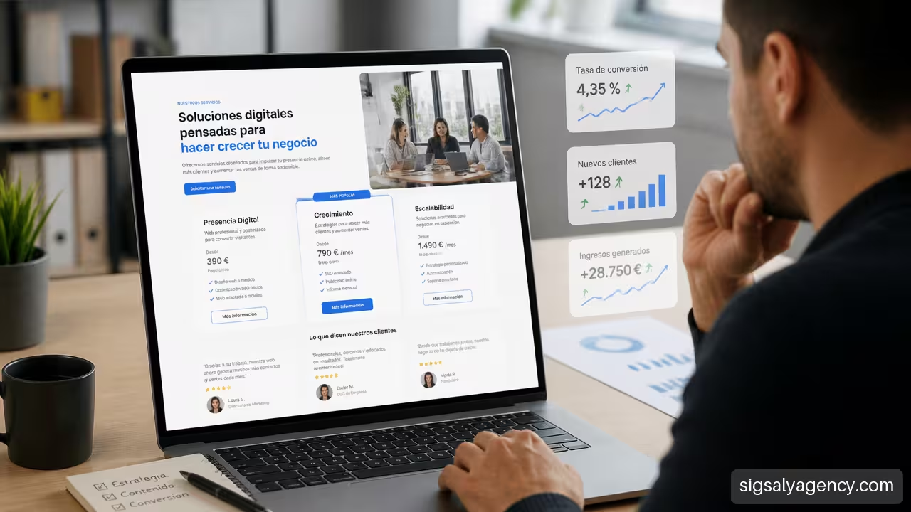
Presenting services on a website is not just about publishing a list of tasks with a contact button at the end. If you want to understand how to present services on a website to sell more, you must facilitate a decision: help the visitor recognise their problem, understand your proposition and take the next step with confidence.
A good services page reduces questions before they appear in a call or email. It explains what you offer, who it's for, what the person can expect and how to get started. It doesn't promise impossible results or resort to empty phrases; it organises the information so that the value is evident.
Contents of this guide: Page Architecture · Message and Offer · Tests, Price and Limits · Conversion and Measurement · Frequently Asked Questions
Page Architecture to Not Lose Opportunities
Structure influences conversion because it guides reading. When a person arrives from a search, an advert or a recommendation, they usually spend a few seconds deciding whether the page meets their need. If they find abstract concepts, too many services or a design that is difficult to navigate, they may leave even if the offer is suitable.
Start With Your Value Proposition
The first screen should answer three questions: what you do, who you do it for and what improvement the customer will gain. There is no need to explain your entire methodology at the beginning. The aim is to provide context and encourage further reading.
For example, a consultancy doesn't need to open with 'Comprehensive transformation services'. It's more useful to say: 'We help professional practices attract qualified enquiries with a clear, fast website focused on booking meetings'. The second sentence defines audience, service and desired outcome.
Shopify recommends that an initial presentation of services combines a clear heading, concise text, a call to action and trust indicators. This combination is explained in their guide on how to sell a service step by step. It is not an automatic formula, but it does avoid a common mistake: asking for contact before explaining why it is worth doing so.
A services page should not force the visitor to interpret your offer. It should make the decision seem reasonable and straightforward.
Organise The Page According To Visitor Intent
Not all visits arrive with the same level of preparation. A person may be discovering a problem, comparing options or ready to hire. The page must respond to those three situations without overloading.
| Visitor Intent | What They Need To Understand | Useful Element On The Page |
|---|---|---|
| Discovers a problem | Why that problem affects their business | Brief explanation of the problem and its consequences |
| Compares providers | What differentiates your service and what it includes | Scope, process, case studies and selection criteria |
| Ready to move forward | What they should do and what will happen next | Clear CTA, price or range, form or booking |
If the service is straightforward and has stable scope, such as an audit with defined pricing, a brief page may be sufficient. If it requires diagnosis, team coordination or bespoke work, a main page that summarises the service and other detailed pages for each solution are advisable.
This criterion also helps avoid an endless page. There is no need to explain every possible exception in the first section. First present the value. Then, let the person delve deeper through sections, frequently asked questions or specific pages.
To build this foundation with a broader vision of positioning, lead generation and design, this may help you strategic guide for professional web design.
Present Multiple Services Without Creating Confusion
When a company offers web design, SEO, maintenance, advertising and content, the risk is not having too many services. The risk is showing them all with equal weight and without explaining what problem each one solves.
Group them by customer objectives, not just by internal departments. For example:
• Capture opportunities: web design, landing pages and digital advertising.
• Improve visibility: SEO, content and technical optimisation.
• Maintain and scale: support, security, speed and maintenance.
Each block should include a brief explanation, a concrete benefit and a link to the detailed page. This way, the general page works as a map and each individual service answers deeper questions.
Explain The Service With A Message That Is Understood
The visitor does not buy a list of deliverables. They buy a solution to a need, although they need to know the deliverables to assess whether the proposal is serious. That's why an effective page combines features, benefits and expected results without confusing them.
Differentiate Features, Benefits And Results
This distinction improves the text and avoids irresponsible promises.
| Element | What It Explains | Example For A Web Design Service |
|---|---|---|
| Feature | What is delivered or done | Responsive design, form and analytical configuration |
| Benefit | What improves for the client | Clearer navigation and easier contact |
| Result | What effect can be achieved | More qualified requests, if there is traffic and competitive offer |
Saying "includes WordPress, technical SEO and a form" informs, but does not persuade by itself. Saying "we organise the information so the visitor finds the right service and requests a proposal" connects the service with a business need.
Fair warning: a result depends on variables that the website alone does not control. Traffic, price, reputation, competition, response times and commercial quality also matter. It's better to talk about objectives, mechanisms and metrics than to guarantee specific sales without context.
Describe The Scope Before Doubts Arise
A services page should anticipate questions such as these:
- What exactly does the service include?
- What must the client provide?
- How long does the process take?
- What deliverables does the client receive?
- What is not included?
- What happens after purchasing?
Limits do not reduce sales when they are well explained. They reduce friction and filter out requests that don't fit. For example, a web maintenance service can include updates, backups and technical support, but not complex new features or complete redesigns. If this appears clearly, the client knows what they are contracting and the business conversation starts better.
The page should also express when the service is not the right solution. An advertising campaign does not correct a confusing website; a visual redesign does not substitute a weak value proposition. Showing this logic conveys judgement and avoids offering isolated solutions to problems that require a broader strategy.
To connect the presentation of services with acquisition, content and campaigns, review how to create an online marketing strategy that sells.
Choose A Coherent Call To Action
A CTA is not just a button. It is a commitment proposal. "Buy now", "Request a quote", "Book a call" and "Ask for an audit" imply different efforts for the person visiting the page.
| Service Type | Most Coherent CTA | When to Avoid It |
|---|---|---|
| Closed offer and fixed price | Buy or hire | If the scope can vary greatly |
| Personalised service | Request a quote | If the visitor needs an immediate and simple answer |
| Complex project | Book a call | If only a brief consultation is required |
| Diagnostic service | Request an audit | If the audit does not have a defined process |
Place the CTA near the header for those already prepared, after explaining benefits for those who need context and at the end for those who have read the entire page. Repeating the next step is useful; constantly changing CTAs is not.
Use Tests, Price And Limits To Build Trust
Trust does not come from displaying many logos or generic testimonials. It arises when evidence answers a real doubt: "Can they achieve it?", "Do they understand my situation?" or "Do I know how they work?".
Combine Three Types Of Proof
Social proof is valuable, but it is best to organise it by function.
| Type Of Proof | Uncertainty It Reduces | Example |
|---|---|---|
| Result Proof | Whether the service can produce a breakthrough | Case with starting point, intervention and authorised metric |
| Process Proof | Whether there will be order and communication | Clear phases, indicative timelines and deliverables |
| Experience Proof | Whether the customer will feel well looked after | Specific testimonial about collaboration, clarity or support |
A testimonial such as "Great service, highly recommended" has little context. In contrast, a quote that indicates the problem, the service contracted and the perceived change adds more credibility. If there are still few clients, you can use process proof: samples of deliverables, methodology explained transparently, demonstrations, verifiable certifications or own examples clearly identified as such.
Destakate proposes that a commercial services page brings together problem, solution, benefits, testimonials, price or range, guarantees and CTA. You can see that approach in their article on how to present services to attract clients. The key is to select relevant proof, not to add elements as an obligation.
Decide How To Display The Price
There is insufficient evidence to assert that always displaying the price increases sales. The decision depends on the variability of the service and the type of buyer.
Shows a fixed price when the scope is repeatable. It is useful for a session, an audit or a package with defined deliverables. Shows a range when the service shares a common base, but changes according to volume, urgency or integrations. Request a quote when a prior diagnosis is essential and giving an early figure would be misleading.
For example,
When there are levels of scope, packages help to compare options. dinahosting explains that packages facilitate marketing when services progress from smaller to larger scope. However, do not use them to force highly customised work into artificial categories.
Design So More People Can Use It
Accessibility is not a decorative detail. If a button has poor contrast, a form does not have clear labels or navigation depends only on the mouse, some people will have more difficulty progressing.
The W3C Web Content Accessibility Guidelines establish that content and forms must be perceptible, operable, understandable and robust. In practice, it is advisable to apply these measures:
• Use sufficient contrast between text and background.
• Write clear buttons, such as 'Request a proposal', instead of 'Send'.
• Associate visible labels with form fields.
• Display understandable errors and explain how to correct them.
• Allow the page to be navigated and forms completed with the keyboard.
Convert Interest Into Contacts And Measure The Funnel
A page can receive visits and still not generate opportunities. To find out what is happening, separate the phases of the sales journey. ProChile distinguishes between attracting traffic, capturing prospects and converting those prospects into sales in its document on the online sale of services. This distinction avoids attributing the entire problem to the page.
Reduce Form Friction
A form should request the data necessary to initiate the next action, not to complete the entire customer file. If you offer an initial call, name, email, company and reason for inquiry may be sufficient. If you prepare a complex quote, you can ask for approximate budget, service of interest and desired timeframe.
There is no optimal universal length for all forms. A short form can increase starts, but offer little information to qualify the request. A more detailed one can reduce poorly suited contacts, although it may also discourage interested people. The decision depends on the cost of handling each request and the complexity of the service.
Explain what will happen after submission: "We will respond with availability for a call" or "We will review your request and send you an indicative proposal". That sentence reduces uncertainty without promising a timeframe you cannot meet.
Measure The Complete Journey
Don't stop at visits. Set up analytics events to understand where interest is lost.
- Visits to the service page.
- Clicks on the main CTA.
- Form start or calendar opening.
- Form completed or meeting booked.
- Valid business opportunity.
- Sale closed.
If there are many visits but few clicks, review headline, value proposition and CTA placement. If there are clicks but few forms submitted, examine friction, fields, technical errors and price expectation. If forms arrive but don't convert to sales, perhaps the problem lies in qualification, follow-up or the offer, not in page design.
Improve With Controlled Changes
Do not modify headline, prices, testimonials and form at the same time. If the result improves or worsens, you won't know what caused the change. Prioritise a concrete hypothesis: "The visitor doesn't understand who the service is for" or "The CTA asks for too much commitment".
Test a variation, keep the rest stable over a reasonable period and compare events, not just impressions. For example, changing
If you're looking for a presentation focused on sectors and lead generation, this page on professional web design SEO and Google Ads by niche expands on how to adapt messaging and structure to different audiences.
Key Takeaways
• Open with a value proposition that explains what you do, for whom and what improvement you're seeking.
• Organise services by customer problems and objectives, not just internal categories.
• Combine features, benefits and possible results without promising guaranteed outcomes.
• Show limits, exclusions and conditions to reduce doubts and filter requests that don't fit.
• Choose between fixed price, range or budget depending on service repeatability and complexity.
• Use testimonials and case studies to address specific doubts about results, process and experience.
• Adapt the CTA to the commitment the service requires: buy, book, request a quote or ask for a diagnosis.
• Measure visits, clicks, forms, meetings and sales to detect the real point of friction.
Frequently Asked Questions
What Should a Service Web Page Have to Sell More?
It should explain the problem it solves, the service offered, who it's for, what it includes, how it works, what evidence supports the proposition and what the next step is. It should also make contact easy with a visible CTA and a clear form.
How Do I Explain My Service So the Customer Understands Its Value?
Start with the change the customer is looking for and then explain the work that makes it possible. Instead of just listing 'technical SEO, content and links', relate those elements to objectives like improving visibility, attracting relevant searches and identifying technical obstacles.
Is It Better to Show the Price or Request a Quote?
It depends. Show a fixed price if the scope is stable, a range if there are foreseeable variables, and a custom budget if the project requires prior analysis. If you don't display a figure, explain at least what factors influence the cost.
Should You Create A Separate Page For Each Service?
Yes, especially when each service addresses a distinct need or requires detailed explanation. The general page can provide guidance and individual pages can delve deeper into scope, process, case studies, questions and specific CTA.
What Should A Success Case Include?
A useful case presents the initial situation, the objective, the intervention carried out, the project's limitations and the verifiable result that can be communicated. If you cannot publish metrics, explain the process and use an authorised quote that provides real context.
How Many Fields Should A Budget Form Have?
As many as are necessary to start a useful conversation, no more. For a simple inquiry, few details suffice. For a complex budget, add fields that allow you to assess scope, timeline and needs. There is no valid amount for all services; it is worth measuring drop-offs and quality of contacts.
How Do I Know If My Services Page Is Converting?
Define intermediate and final conversions: CTA click, form start, submission, booking, qualified opportunity and sale. Analyse the relationship between them. An increase in forms does not always mean improvement if the commercial quality of requests drops.
What Errors Make A Services Page Lose Opportunities?
The most common are vague headlines, excessive jargon, services without defined scope, ambiguous CTAs, testimonials without context, difficult-to-complete forms, opaque prices without explanation and pages that do not work well on mobile or with keyboard.
Sources and References
• Shopify — How to sell a service in 6 practical steps
• Destakate — How to showcase your services on your website to captivate your client and sell more
• ProChile — How to sell services online: a roadmap to start selling