Choosing a mobile and tablet-compatible web design agency is a fundamental strategic decision for any company seeking to attract customers in today's digital environment. When a user accesses a website from their phone or tablet, they expect immediate loading, buttons to respond at first touch and content to adjust flawlessly without needing manual zoom. However, achieving true multi-device compatibility requires rigorous technical work that goes far beyond reducing the size of a corporate template.
In this detailed analysis, we examine the key factors for evaluating and hiring a specialist agency. We analyse everything from web architecture methodologies and testing frameworks on real devices to contractual criteria that guarantee performance, accessibility and long-term maintenance of your digital platform.
Table of Contents
• Why Hire A Mobile And Tablet-Compatible Web Design Agency
• Technical Criteria For Evaluating A Responsive Design Agency
• Workflow Methodology Of A Specialist Agency
• Comparative Analysis Of Solutions And Service Quotation
• Frequently Asked Questions On Adaptive Web Design
• Sources and References
Project Key Points
• Rigorous multi-device evaluation: Technical compatibility is not limited to browser simulators; it must be validated against a real matrix of devices, browsers and resolutions.
• Format differentiation: Tablets demand specific attention in both portrait and landscape orientation, coordinating changes to layout and touch interaction zones.
• Contractual service separation: The contract must precisely break down the deliverables of responsivedesign, web accessibility, speed optimisation and subsequent support.
• Task-based testingUsability should be measured by the smooth execution of key actions (forms, purchases, calls), not solely by visual aesthetics.
• Field-measured performanceLoad speed should be evaluated under real mobile network conditions and on devices with average processing capabilities.
Why Hire A Mobile And Tablet-Compatible Web Design Agency
The proliferation of devices with screens of different proportions has transformed the way consumers interact with businesses. A mobile and tablet-compatible web design agency is not limited to creating a visually attractive site, but rather designs a technical infrastructure capable of adapting the graphic presentation and functional logic to the particularities of each screen.
The Impact of Multi-Device Navigation on Conversion
When a webpage interface fails on a smartphone or tablet, the user abandons the session in a matter of seconds. Common issues include buttons too small for the thumb, forms whose labels are cut off, or data tables that exceed the lateral edge of the screen.
We analyse how multi-device adaptation influences commercial behaviour:
- Reduction of bounce rateSmooth navigation from the very first second retains user attention in the sales funnel.
- Improvement of conversion rateForms optimised for virtual keyboards increase the completion of contacts and budget requests.
- Reinforcement of brand trustA site that responds with precision conveys professionalism and operational rigour.
dynamic layouts, well-defined breakpoints and appropriate typographic hierarchy ensure that the business's value proposition is legible regardless of the screen diagonal used.
Responsive Design Versus Specific Mobile Views
When approaching a digital project, a professional agency must evaluate the best technical architecture for the specific case. There are two main paths: web design responsive (adaptable through unified CSS code) and the development of views dedicated exclusively to mobile devices.
In technical practice, an agency can propose a multi-device responsive web or specific mobile views depending on the functional complexity of the system and client requirements. Below, we break down the key operational differences between both strategies:
| Evaluation Criterion | Responsive Web Design | Specific Mobile Views |
|---|---|---|
| Code Maintenance | Unified (single code base for all devices) | Duplicated (separate code bases or templates for desktop and mobile) |
| URL Management | Single (same link structure) | Often requires subdomains or dynamic redirects |
| SEO Management | Simplified, with no risk of duplicate content | Requires canonical and alternate tags strict rules |
| Cost Complexity | Lower maintenance cost in the long term | Higher operational and continuous development cost |
| Personalisation of Experience | Fluid adaptation based on breakpoints | Possibility of creating completely independent interfaces |
In the vast majority of corporate projects and e-commerce stores, the approach responsive represents the most efficient and maintainable option. However, in complex web applications with highly differentiated workflows between desktop and mobile, the dedicated views architecture can be subject to study.
The Importance of Real Performance on Mobile Networks
An adaptable website that takes five seconds to load over an unstable 4G connection invalidates any visual design effort. Advanced agencies do not analyse the speed of a site solely from corporate fibre optic connections, but by simulating real mobile network latencies and hardware with reduced processing power.
The processing of heavy Javascript scripts and the loading of unoptimised images seriously affect the mobile experience. Therefore, the agency must implement techniques such as lazy loading (lazy loading, image compression in next-generation formats (such as WebP or AVIF) and minimisation of server calls.
Technical Criteria For Evaluating A Responsive Design Agency
Not all companies that claim to offer adaptable solutions follow rigorous web engineering methodologies. To ensure we hire a competent provider, we must audit their working processes in key aspects of infrastructure, testing and accessibility standards.
In this regard, the methodology used to compare market offerings is decisive. As various sector analysts argue, the comparison of agencies should consider UX, development, performance and maintenance in an integrated manner, avoiding evaluating only the initial aesthetics of the project.
Test Matrices on Real Devices and Orientations
One of the most frequent errors in web development is considering the adaptation phase complete after verifying the site in the desktop browser inspection tool. Software simulators do not faithfully reproduce the rendering engines of real mobile browsers, nor hardware acceleration or the peculiarities of operating system customisation layers.
A first-class agency should provide a detailed validation matrix that includes:
• Testing on smartphones: iOS and Android devices of different generations and screen resolutions.
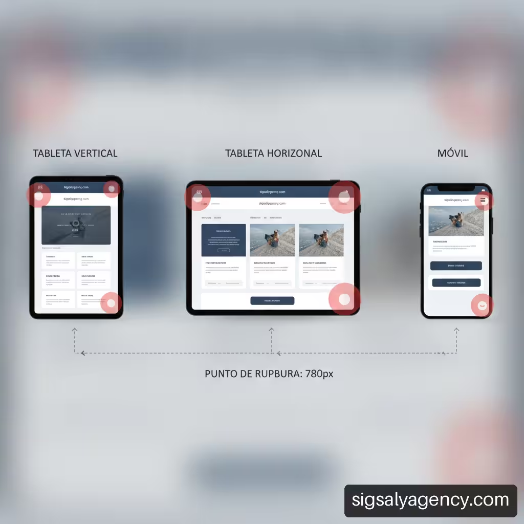
• Testing on tablets in both orientations: Strict validation of interface behaviour in both portrait (portrait) and landscape (landscape).
• Split screens and multitasking: Verification of behaviour of the layout when the tablet runs two applications simultaneously.
• Variety of browsers: Verification in Safari, Chrome, Firefox and native browsers from manufacturers.
Tablet orientation is a critical issue often overlooked. In landscape position, a tablet can offer a screen width similar to a small laptop, but maintains a touch interface without a mouse pointer. The agency must ensure that dropdown menus and interactive elements function without relying on the hover (hover) event.
Breakpoints and Optimised Viewport
The design responsive relies on CSS rules called media queries, which apply specific styles based on the dimensions of the viewport (viewport). A technical agency should not apply breakpoints rigid breakpoints based exclusively on popular commercial phone models, but rather define fluid breakpoints based on the needs of the content itself.
The core technical elements that the agency must configure properly include:
- Viewport Tag: Mandatory inclusion of scaling metadata in the HTML header to prevent mobile browsers from artificially rescaling the desktop version.
- Relative units: Use of percentages and typography-based units (
rem,em) or screen-based units (vw,vh) instead of fixed pixel values (px). - Fluid grid layout: Use of CSS Grid and Flexbox to allow columns and text boxes to reorganise naturally when available space changes.
Web Accessibility and Touch Elements on Small Screens
A website adjusting visually to a mobile phone screen width does not guarantee it is easy to use. Accessibility and touch usability require specific design rules to avoid user frustration.
Let us consider the following usability and interactivity requirements in touch environments:
• Touch targets (touch targets) of sufficient size: Buttons, links and form fields must have a minimum recommended dimension (at least 48×48 pixels) to be able to be pressed with your finger without accidentally activating adjacent elements.
• Safety spacing: Adequate distance between hyperlinks within the text to avoid misclicks.
• Typographic contrast and readability: Minimum font size for secondary text and sufficient colour contrast against the background to allow reading in outdoor environments with direct sunlight.
• Visible focus and virtual keyboard: Adjustment of input fields so that the keyboard displayed by the phone does not hide the send button or the activated checkbox.
Workflow Methodology Of A Specialist Agency
The way the project is planned and executed determines the final success of the website. An experienced agency works through structured phases that place the requirements of the mobile environment at the centre of the strategy.
Mobile-First Design Phases and Interactive Prototyping
The philosophy mobile-first (design first for the smallest screen) forces the team to prioritise the essential content of the business, eliminating superfluous elements. Once the experience is optimised for the phone, the design expands progressively towards the tablet and desktop computer.
The ideal work process consists of the following milestones:
- Information architecture definition: Hierarchical classification of content and simplification of navigation menus.
- Creation of wireframe schemes (wireframes) mobile: Structural sketches in black and white focused on usability.
- Interactive prototyping: Navigable models that allow you to test the interaction of hamburger menus, modals and galleries on touch devices before writing definitive code.
- Development frontend adaptive: Layout in clean HTML5, CSS3 and Javascript optimised for performance.
- CMS integration phase: Implementation on self-managed platforms ensuring that content entered by the client maintains the behaviour responsive.
Tests Based On Real User Tasks
Web validation should not be limited to an aesthetic review by the client. The agency must perform tests based on the execution of real tasks by end users on phones and tablets.
These tests analyse the smoothness of critical scenarios such as:
• Completion of a budget request form with date selection and file upload.
• Complete purchase process in an ecommercestore, from the product sheet to the mobile payment gateway (e.g. Apple Pay or Google Pay).
• Navigation through extensive catalogues using dropdown filters and integrated search tools.
• Location of contact information and activation of the direct phone call button.
Measurement With Core Web Vitals And Field Data
To verify that the website meets the performance standards required by Google and modern users, the agency must audit the indicators of the Core Web Vitals on mobile devices:
• Largest Contentful Paint (LCP): Measures the time it takes to render the main content element on the screen. It should be kept below 2.5 seconds.
• Interaction to Next Paint (INP): Measures the response latency of the interface after a user interaction (such as tapping a button or opening a menu).
• Cumulative Layout Shift (CLS): Measures the visual stability of the page during loading, preventing elements from suddenly jumping whilst the user reads or tries to click a link.
It is essential to distinguish between laboratory metrics (obtained through synthetic tools in ideal environments) and real field data collected from users navigating with varied networks and devices.
Comparative Analysis Of Solutions And Service Quotation
When requesting quotes from different web design agencies, it is common to find substantial economic differences. To make an informed decision, we must understand what deliverables and technical coverage each commercial proposal includes.
What A Rigorous Commercial Proposal Should Include
A professional budget for developing a website compatible with mobile phones and tablets should transparently break down each technical item. It is advisable to reject ambiguous proposals that merely promise a 'web 100% responsive'.
We recommend verifying that the proposal expressly includes:
• Matrix of devices and browsers covered: Explicit list of operating systems and screens covered during the quality phase.
• Design and layout of touch states: Graphic definition of menus, dropdowns, sliders and adapted forms.
• Technical optimisation for search engines (SEO Mobile-First): Configuration of speed, crawlability and structured data for mobile indexing.
• Training on content management: Training so that the client can upload texts and images without breaking the responsive structure.
Warranty, Error Correction And Continuous Maintenance
The ecosystem of mobile devices changes constantly. Manufacturers launch new models with unprecedented resolutions and browsers update their standards periodically. For this reason, the contract with the agency must clearly define the post-launch warranty period and the conditions for subsequent maintenance.
We analyse the recommended contractual structure to avoid unforeseen costs:
- Development warranty period: Defined period (typically between 30 and 90 days after publication) during which the agency corrects free of charge any error or layout misalignment in the agreed devices.
- Service Level Agreement (SLA) for maintenance: Monthly or annual contract covering updates to the content manager, extensions and security patches.
- Future compatibility support: Technical coverage in the event of changes in mobile browsers or new operating system releases.
Decision Matrix For Choosing The Right Provider
To facilitate the process of selecting a mobile and tablet-compatible web design agency, we present a comparative table with the factors that make the difference between a basic service and an advanced technical provider:
| Evaluation Factor | Basic / Generic Provider | Advanced Specialist Agency |
|---|---|---|
| Design Methodology | Adaptation of prefabricated desktop template | Original design Mobile-First tailored |
| Device Testing | Basic web browser emulators | Physical matrix of phones and tablets in portrait/landscape |
| Usability Testing | Visual inspection of the layout | Tests of real navigation and conversion tasks |
| Speed Measurement | Without mobile resource optimisation | Audit and optimisation of Core Web Vitals mobile |
| Support and Warranty | No express warranty after delivery | Defined warranty period and maintenance contract |
| Documentation | Without specification of breakpoints or matrix | Detailed technical deliverables in the contract |
Frequently Asked Questions On Adaptive Web Design
What exactly does a mobile and tablet-compatible web design agency do?
A specialist agency plans, designs and layouts websites whose structure, images, typography and menus adapt automatically to the size and orientation of any screen. In addition to the graphic side, it is responsible for optimising loading speed on mobile networks, ensuring touch usability and verifying that the site works without errors on a wide variety of real devices.
What is the difference between a responsive website and a mobile-specific website?
A website responsive uses a single codebase and the same URL for all devices, adapting the design through CSS rules depending on the browser size. Conversely, a mobile-specific website requires the development of an independent version or template, often hosted at a different URL or managed through dynamic redirects, which increases maintenance complexity and technical SEO management.
How can I check if a page really works well on a tablet?
To validate how it works on a tablet, it is not enough to reduce the browser window. The site must be tested on a physical device both in portrait orientation (portrait) and landscape (landscape). It is necessary to check that interactive elements can be easily tapped with fingers, that menus are not hidden by the browser bar, and that the layout makes use of the available width without distorting images or misaligning columns.
Should the website be tested in portrait and landscape orientation?
Yes. Specifically on tablets and large-format phones, users change orientation frequently depending on the task they are performing. A layout that looks correct in portrait orientation can overlap texts or cut buttons when the screen is rotated to landscape position, so the quality matrix of the agency must necessarily include both checks.
What devices and browsers should be included in the project budget?
The budget must explicitly detail the operating systems (recent versions of iOS and Android) and the main browsers (Safari, Chrome, Firefox and Edge). Regarding hardware, medium to high-end smartphones with small and large screens should be included, as well as tablets in their standard market resolutions.
Does a responsive website improve SEO positioning in search engines?
Yes. Search engines like Google use mobile-first indexing (mobile-first indexing). This means the search engine evaluates and ranks primarily the mobile version of your website to determine its position in search results. A site with poor mobile experience or slow loading loses organic visibility directly.
What problems can a responsive website have even if it looks visually correct?
A website can adapt visually but present serious functional deficiencies. Among the most common problems are: touch buttons too close together that cause accidental clicks, forms whose fields are hidden by the phone's virtual keyboard, heavy Javascript scripts that freeze the screen on slow devices and interactive elements that depend on hovering over them (hover) and that are unreachable on touch screens.
Who should correct the errors detected after the website is published?
The responsibility for corrections should be covered in the development contract. If the errors correspond to deviations from the agreed specifications or failures in the agreed device matrix, the agency must fix them at no cost within the specified warranty period. If they occur due to subsequent operating system updates or changes in content management by the client, corrections are usually covered through a web maintenance plan.
Sources and References
• Idento — Web Design Agency | Web Page Development: https://www.idento.es/agencia-diseno-web/
• Sortlist — Responsive web design agencies in Spain: https://www.sortlist.es/s/diseno-web-responsive/espana-es