He accessible web design for users with disabilities has become an essential pillar of modern digital development. Building websites that can be navigated without barriers by people with visual, hearing, motor or cognitive limitations requires understanding that accessibility is not about applying a last-minute patch. It is about structured information architecture, conscious interface decisions and rigorous code that responds to the needs of all people. The WCAG 2.1 standard defines recommendations for making web content more accessible to people with disabilities, establishing levels of conformity that serve as a global reference framework.
Table of Contents
• Key Points on Web Accessibility
• Essential Principles of Accessible Web Design for Users with Disabilities
• Practical Implementation in Web Components and Interactions
• Sensory and Cognitive Accessibility in Digital Interfaces
• Accessibility Evaluation and Testing Methodology
• Error Prioritisation and Accessible Maintenance
• Frequently Asked Questions on Web Accessibility
• Sources and References
Key Points on Web Accessibility
• Universal inclusion: Web accessibility benefits people with permanent, temporary or situational disabilities.
• Semantic code as foundation: The correct use of native HTML elements resolves much of the problems with navigation and assisted interaction.
• Flawless keyboard navigation: All interactive elements must be reachable, operable and display clear visual focus without relying on the mouse.
• Multisensory design: Information should never be communicated through a single channel (such as colour or sound alone).
• Complementarity of testing: Automated tools only detect a percentage of errors; manual testing and user testing are essential.
Essential Principles of Accessible Web Design for Users with Disabilities
We analyse accessibility from a comprehensive perspective: an accessible interface must be perceivable, operable, understandable and robust. These four fundamental principles of the Web Content Accessibility Guidelines (WCAG) guide any accessible digital development. However, applying these principles in dynamic environments requires knowledge of both the normative guidelines and their real-world applications.
Regulatory Framework and WCAG Guidelines
WCAG is structured in three levels of conformance: A (minimum), AA (the internationally accepted standard for most legislation and commercial projects) and AAA (the most demanding level). For most organisations, achieving AA level represents the ideal balance between technical feasibility and coverage of needs.
The standard covers specific requirements for different types of disabilities:
• Visual: Total blindness, low vision and colour blindness.
• Auditory: Profound deafness and partial hearing loss.
• Motor: Difficulties using the mouse, tremors or amputations.
• Cognitive and neurological: Autism, dyslexia, attention deficits and photosensitivity sensitivity.
The Scope of Web Accessibility
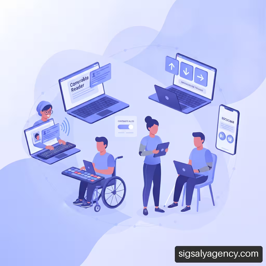
A common misconception is to associate accessibility solely with screen readers for blind people. The reality is much broader. [The audience] accessible web design for users with disabilities includes people with arthritis who cannot make precise mouse movements, older users with diminished visual and auditory capacity, people with dyslexia who require legible typefaces and appropriate spacing, and even users in environments with intense sun glare or situations of extreme noise.
According to the W3C, providing more than one navigation method, such as search and site map, can help people orient themselves on a website (W3C navigation recommendations). This demonstrates how accessible design decisions improve the overall navigation experience for any user profile.
Technical Limitations of Standards
It is fundamental to recognise a technical reality: strict compliance with WCAG checklists does not automatically guarantee a perfect web experience. A site can achieve a formal conformance score and yet present confusing or tedious user flows for those using assistive technology.
The guidelines provide the base structure, but real usability requires iteration, empathy in visual design and validation in real-world usage scenarios. Accessibility is a continuous optimisation process and not a static certificate.
| WCAG Principle | Primary Purpose | Implementation Example | Impact on the User |
|---|---|---|---|
| Perceptible | Information must be presented in forms that users can perceive. | Alt text on images, adequate text contrast. | Enables blind or low-vision people to consume content. |
| Operable | Interface components and navigation must be usable. | Complete keyboard navigation, clear focus indicators. | Facilitates interaction for people with motor disability or without a mouse. |
| Understandable | Information and interface functionality must be understandable. | Clear language, consistent navigation, explicit error messages. | Reduces mental load on users with cognitive disability or dyslexia. |
| Robust | Content must be interpretable by a wide variety of user agents. | Standard semantic HTML and correctly validated ARIA attributes. | Ensures compatibility with different screen readers and browsers. |
Practical Implementation in Web Components and Interactions
Accessible design comes to life in code structure and dynamic component response. Below we detail the necessary technical decisions in key elements of any interface.
Keyboard Navigation and Focus Management
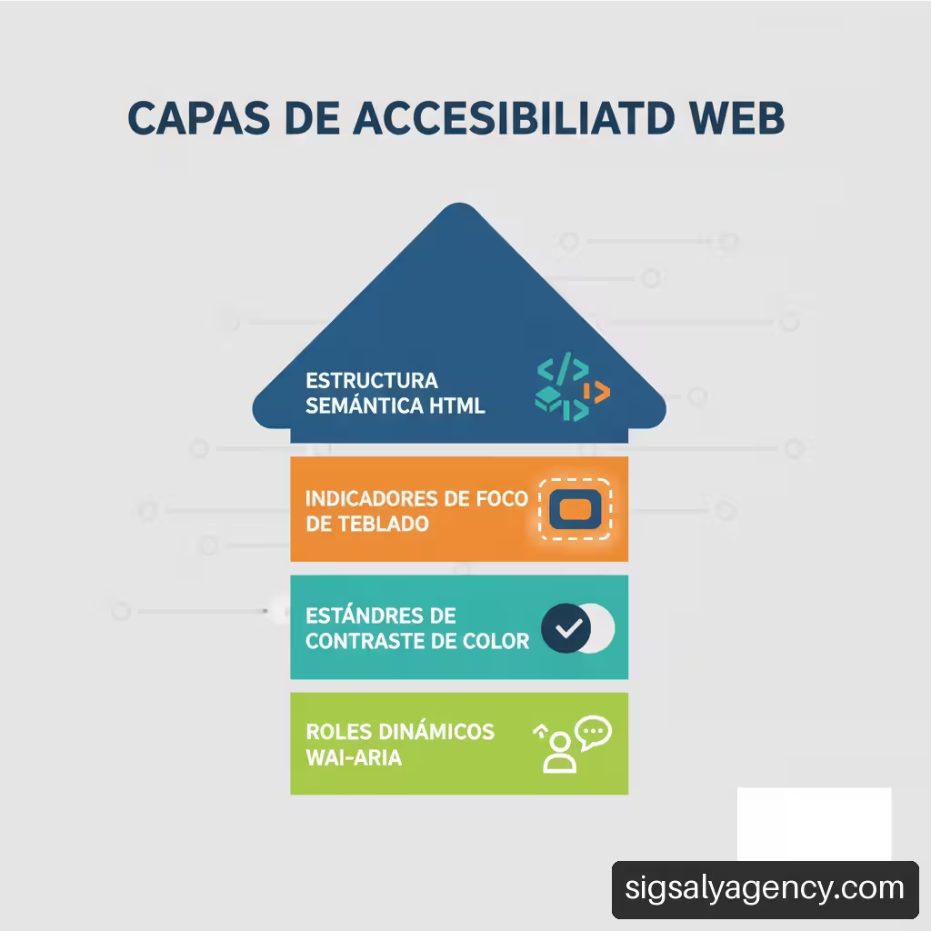
The ability to navigate an entire website using only the Tab key, Shift+Tab, Enter, Space and arrow keys is an essential requirement. To achieve this, it is necessary to respect the natural order of the DOM (Document Object Model) and maintain a highly visible focus indicator.
A common mistake in frontend development is removing the focus outline for purely aesthetic reasons (
outline: none) without providing a clear visual alternative. This leaves keyboard users completely blind about which element they have selected.
To manage focus in dynamic components such as modals or dropdown menus, these guidelines should be followed:
- Focus capture: When opening a modal dialog, keyboard focus must immediately move to the first interactive element or the modal container.
- Focus loop (Focus Trap): The user must not be able to tab out of the active modal while it is open.
- Focus restoration: When closing the modal, focus must return exactly to the button or element that originally activated it.
Semantic Stratification in HTML and ARIA Attributes
HTML5 provides native semantic elements (, , , <aside>, ) that automatically communicate structure to assistive technologies. Whenever possible, native elements such as and <a> should be used instead of neutral elements such as <div> either <span> with JavaScript event handlers.
When interface complexity requires custom components (such as tabs, dropdown menus or accordion-type dropdowns), WAI-ARIA (Accessible Rich Internet Applications) comes into play. ARIA attributes communicate roles, states and properties that HTML alone does not express:
• aria-expanded="true|false": Indicates whether a panel or menu is open or closed.
• aria-hidden="true": Hides decorative elements from screen readers.
• aria-live="polite|assertive": Announces dynamic changes on the page (such as alerts or shopping cart updates) without interrupting the user's reading.
Forms, Validations and Error States
Forms are the nerve centre of conversion and digital interaction. To ensure their accessibility, each input field must be explicitly associated with a element using the for attribute matching the id of the field.
In error management and validation:
• Clear instructions: Indicate required formats (for example, date in DD/MM/YYYY) before the user starts typing.
• Visual and textual identification: Erroneous fields should be flagged with icons or text, never relying solely on a red border.
• Error association: Use aria-describedby to connect the error message label with the corresponding field, ensuring that the screen reader reads the warning when focusing on the element.
Sensory and Cognitive Accessibility in Digital Interfaces
Design is not solely code; visual presentation and functional clarity determine whether a person with cognitive disability or low vision can process information effectively.
Visual Contrast and Colour Use
The colour contrast between text and its background must be sufficient to ensure effortless reading. WCAG 2.1 establishes precise minimum contrast ratios:
• Normal text (less than 18pt or 14pt bold): Minimum contrast ratio of 4.5:1.
• Large text (18pt or larger, or 14pt bold): Minimum contrast ratio of 3:1.
• Interface components and essential graphics: Minimum contrast ratio of 3:1.
Additionally, the use of colour as the sole resource to convey meaning should be avoided. If a graphic shows positive data in green and negative data in red, patterns, text labels or differentiated icons should be included so that users with colour blindness or achromatopsia can interpret the information correctly.
Multimedia Content, Subtitles and Transcriptions
Audiovisual content requires equivalent alternatives to be accessible to users with hearing or visual disabilities:
- Video with audio: Must include synchronised subtitles (CC) that capture not only speech, but also relevant sound effects and speaker changes. For users with visual disabilities, audio description of key visual content is required.
- Audio only (podcasts, voiceovers): It is essential to provide a complete text transcript accessible on the same page.
- Animations and movement: Automatic or looping animations must offer pause controls and respect operating system preferences (
prefers-reduced-motion). Flashes of light (more than 3 flashes per second) must be avoided entirely to prevent photosensitive epileptic seizures.
Cognitive Load and Content Clarity
Cognitive accessibility is often overlooked in web development. Reducing visual and mental complexity benefits users with intellectual disabilities, attention deficit, memory problems or people navigating in their second language.
To minimise cognitive load, we recommend:
• Predictable designs: Keep headings, menus and buttons in uniform positions throughout the entire site.
• Clear language: Use short sentences, active voice and avoid unnecessary technical jargon.
• Clear hierarchical structure: Use headings (<h1> to <h6>) ordered logically without skipping levels (for example, going from an <h2> directly to an <h4>).
• Sufficient time: Offer options to extend or disable session timers.
Accessibility Evaluation and Testing Methodology
Assessing the accessibility of a website requires a methodical approach that combines software tools with manual checks and user involvement.
Automated Audits vs. Manual Evaluation
Automated tools (such as Lighthouse, axe-core or WAVE) are excellent for detecting initial structural issues, such as lack of contrast, missing attributes alt in images or duplicate ID tags. However, these automated tools only manage to detect between 30% and 40% of real accessibility barriers.
Manual testing is irreplaceable for verifying qualitative aspects:
• Does the alternative text of an image really describe the context or is it a useless generic description?
• Does the keyboard tabulation order follow a coherent reading logic?
• Do the accessible names of the buttons clearly indicate their function?
Testing with Assistive Technologies
Testing the site using the technologies that users employ in their daily lives reveals blockages that are not apparent in the source code. We recommend conducting basic tests with the following common combinations of browsers and screen readers:
• Windows: NVDA or JAWS with Mozilla Firefox or Google Chrome.
• macOS / iOS: VoiceOver with Safari.
• Android: TalkBack with Google Chrome.
During navigation with a screen reader, the clarity of voice announcements when interacting with menus, the visual and auditory confirmation after submitting a form, and the correct indication of modal dialogues or dynamic alerts should be evaluated.
User Testing and Real Inclusion
Involving people with disabilities in the design and development phases provides indispensable empirical data on the real usability of the platform. User testing sessions should propose concrete tasks (completing a purchase, filling out a contact form, searching for specific information) and record the difficulties encountered with the different assistive technologies.
| Evaluation Phase | Tools / Methods | Aspects Detected | Limitations |
|---|---|---|---|
| Automated | axe-core, Lighthouse, WAVE | Syntax errors, lack of alt, basic colour contrast. | Limited coverage (30-40%), does not evaluate context or usability. |
| Manual Technical | Keyboard navigation, DOM inspection | Focus management, ARIA attributes, component navigation. | Requires advanced technical experience in WCAG. |
| With Assistive Technologies | NVDA, VoiceOver, TalkBack, screen magnifiers | Confusing voice announcements, reading failures, dynamic behaviour. | Depends on the evaluator's tool proficiency. |
| User Testing | Usability sessions with users with disabilities | Real flow barriers, frustration, excessive cognitive load. | Requires participant recruitment and longer analysis time. |
Error Prioritisation and Accessible Maintenance
When an existing website has multiple accessibility barriers, correcting them all simultaneously can be unmanageable. It is necessary to establish a decision matrix to address improvements according to their impact and criticality.
Decision Matrix for Defect Correction
To prioritise accessibility errors strategically, we suggest classifying them into four severity levels:
- Critical blockers (Level 1): Errors that prevent completing a main task or render the website inoperable. Example: Payment form that cannot be submitted via keyboard or dynamic buttons without accessible name. Must be corrected immediately.
- High impact (Level 2): Barriers that seriously hinder navigation but offer a complex alternative route. Example: Absence of visual focus in menus or modals without focus loop. Should be scheduled in the next development iteration.
- Medium impact (Level 3): Defects that cause annoyance or confusion without blocking the task. Example: Poorly descriptive alternative texts or missing breadcrumbs. Resolved during routine maintenance.
- Low impact (Level 4): Minor compliance failures in formatting or AAA level. Example: Contrast ratios slightly lower in secondary elements. Addressed when the base system is consolidated.
Continuous Maintenance and Barrier Prevention
Accessibility is not a definitive state, but rather a continuous commitment. The publication of new content, the update of frontend libraries or the redesign of sections can introduce new barriers if digital governance is not in place.
To guarantee long-term accessibility:
• Integrate automated accessibility tests into continuous integration (CI/CD) workflows.
• Create accessible and documented components within the organisation's design system.
• Train content creators to introduce appropriate alternative text, correct heading hierarchies and subtitled videos.
Frequently Asked Questions on Web Accessibility
Which level of WCAG compliance must be met: A, AA or AAA?
Level AA is the internationally recognised standard and the usual legal requirement for public entities and private companies of a certain size. Level A proves insufficient as it omits key criteria for readability and navigation, whilst Level AAA is very demanding and is not always applicable to all types of web content globally.
Is it possible to make JavaScript or React-rich websites accessible?
Yes, it is entirely possible. Single-page applications (SPA) created with React, Vue or Angular can be made accessible by using semantic HTML in components and manually managing page focus changes and screen reader announcements through ARIA attributes and live regions (aria-live).
Do accessibility plugins or widgets replace an accessible redesign?
No. Widgets or floating bars that claim to make a website accessible with a single click do not solve structural code problems, HTML semantics, keyboard navigation or alternative text for content. They often generate additional layers that negatively interfere with the user's own screen readers.
How should alternative text for an image be written?
The alternative text (alt) should describe the intention or function of the image in its context, not its detailed physical appearance. If an image functions as a submit button, the alt should say 'Submit form'. If it is purely decorative, it should include alt="" so that the screen reader ignores it completely.
How do you verify that a web page works correctly without a mouse?
Disconnect the mouse or use your computer's keyboard. Press the Tab key to navigate sequentially through all links, buttons and form fields. Check that the visual focus is clearly recognisable at each step and that you can activate any element by pressing the Enter or Space keys.
What is the difference between accessibility and usability?
Usability evaluates the efficiency, effectiveness and satisfaction with which any user achieves an objective on the web. Accessibility focuses on ensuring that there are no barriers that prevent or hinder access for people with different abilities or disabilities. An accessible website is the essential first step to being truly usable.
What requirements must dropdown menus meet to be accessible?
They must be navigable using arrow keys or Tab, announce their expanded or collapsed state using the attribute aria-expanded, and allow immediate closure when the Escape key is pressed. Additionally, the mouse cursor should not be the only way to expand the options.
Sources and References
• W3C / WAI: Designing for Web Accessibility – Tips for Getting Started
• W3C: Web Content Accessibility Guidelines (WCAG) 2.1