He professional website design aimed at attracting customers Does not consist solely in creating an attractive interface. Its function is to help the right person understand an offer, trust it and take a next step: request a quote, book a call, buy, request a demonstration or get in touch.
A website can look good and still not generate opportunities. The problem usually lies in a lack of clarity, a confusing journey or a disconnect between the message, the acquisition channel and commercial follow-up. To capture clients, we need to design a complete system, not a collection of pages.
Index
• Define Conversion Before Designing
• Build an Architecture That Guides the User
• Measure, Qualify and Improve Lead Capture
• Sources
Define Conversion Before Designing
A professional page must first answer a business question: What concrete action do we expect the visitor to take? If the answer is ambiguous, so will the design be.
Not all businesses seek the same conversion. A clinic may need bookings. A B2B company may prioritise a demonstration request. A law firm may need filtered consultations. An online shop may seek a direct purchase. The content, user interface (UI) and calls to action must start from that decision.
Separating Demand, Acquisition And Conversion
It is worth distinguishing three pieces that are often mixed:
| Element | Main Function | Practical Example |
|---|---|---|
| Demand generation | Getting people with potential interest to know about the company | SEO, Google Ads campaigns, content, social media or referrals |
| Acquisition | Making it easy for the visitor to start a business relationship | Form, phone, WhatsApp, calendar or purchase |
| Commercial conversion | Turning a contact into an opportunity, sale or customer | Qualification, response, proposal and follow-up |
The website is decisive, but usually does not create demand by itself. It can facilitate a purchase or a contact, whilst traffic comes from SEO, advertising, recommendations, social media or business activities. This separation also appears in a discussion about How a website supports contact, but needs acquisition and tracking channels.
This avoids an unrealistic expectation: publishing a website does not guarantee customers if no relevant person visits it. Similarly, attracting thousands of visits is not much use if the page does not explain what is offered or allow easy action.
A lead capture website should not promise everything. It should guide the right person towards the correct next step.
Choosing A Primary Conversion And Several Secondary Ones
Each page needs a primary conversion. It is the action with the greatest value for the business. It can also have secondary conversions for less prepared users.
For example, a company that sells high-value services could define this hierarchy:
- Primary conversion: Book a diagnostic meeting.
- Secondary conversion: Request a quote via form.
- Supporting conversion: download a guide or view use cases.
It is not advisable to give the same visual weight to all of them. If one button says "Request a quote", another "Chat on WhatsApp", another "Call now" and another "Download catalogue", the user may hesitate. The interface should order the options according to intention and context.
On a service page with search traffic,
Converting the Value Proposition Into an Understandable Message
The first screen, also called hero, must allow three things to be understood in a few seconds:
• What problem is being solved.
• Who the solution is intended for.
• What step the visitor can take now.
A wording like
The idea is not to oversimplify or make impossible promises. If the service requires analysis, personalisation or technical validation, this should be stated. A clear proposition filters better than a generic one. It can reduce irrelevant contacts and improve lead quality.
Commercial pages tend to agree that a website should explain the offering quickly, build trust and facilitate contact. That approach is covered in Professional Web 360's professional web design proposal. The key is to convert that principle into visible decisions: a specific headline, relevant evidence and a coherent CTA.
Build an Architecture That Guides the User
A lead capture website needs a structure that supports the decision-making process. An extensive homepage that tries to explain all services, sectors and advantages at the same time is not enough. When everything competes for attention, nothing ends up being a priority.
Designing Pages by Service, Audience and Intention
Effective architecture often combines corporate pages with service-specific pages. If a company offers SEO, web design, maintenance and digital advertising, each service should be able to explain itself with its own problem, scope, evidence and CTA.
It can also be useful to create pages for specific sectors or profiles when their needs change in real ways. A local business, an industrial company and a B2B consultancy do not usually look for the same things or make decisions at the same pace.
Specialisation by niche and detection of specific problems can guide the acquisition of web services, as a conversation about Specialisation and needs analysis in specific businessessuggests. It is not a guaranteed formula, but it helps avoid interchangeable messages.
A well-planned service page can follow this sequence:
- Present the problem and value proposition.
- Explain the service and its main deliverables.
- Show the process, limits or requirements.
- Add relevant trust evidence.
- Resolve frequent objections.
- Propose a CTA tailored to the intention level.
The strategic guide for professional web design expands on how accessibility, performance and technical structure influence that browsing experience.
Creating Friction-Free Journeys
User experience (UX) is the ease with which a person understands, navigates and completes an action. In acquisition, every obstacle can cost an opportunity: confusing text, poorly visible buttons, unnecessary fields, high load times or a mobile web that is difficult to use.
Responsive design should not be treated as a final adjustment. On mobile, the visitor usually reads less, compares first and needs immediate actions. A phone number that doesn't allow calling, a calendar that doesn't fit on screen or a contact button hidden under several blocks are functional errors, not aesthetic details.
Accessibility also matters. Sufficient contrast, readable typography, clear labels on forms and understandable buttons help people with different abilities, but also improve general understanding. A button that only shows an ambiguous icon can create doubts for any user.
We can summarise the most common friction points as follows:
| Problem | Effect on Acquisition | Recommended Correction |
|---|---|---|
| Generic heading | The visitor does not know if the offer is relevant | Explain audience, problem and benefit |
| Scattered CTAs | Decision is delayed | Prioritise one main action per page |
| Extended form | Abandonment increases | Only ask for necessary data at the start |
| Poor mobile navigation | High-intent contacts are lost | Review buttons, loading, keyboard and readability |
| Weak trust signals | Uncertainty increases | Show method, authorised cases, process and conditions |
Forms, Channels and Trust Signals
Not all users want to contact in the same way. A form is useful when context needs to be gathered before responding. The phone suits urgent needs. Online booking reduces email exchanges. WhatsApp can work for quick queries, although it requires real capacity to respond and expectation management.
The decision is not about adding every possible channel. You must choose the ones your business can handle well. If WhatsApp is offered but responses arrive several days later, the channel conveys a promise that is not kept.
An initial form can ask for:
• Name and company.
• Email or telephone.
• Service of interest.
• Brief description of the need.
Asking for a quote, target date, team size, estimated budget and other details may be reasonable in a second phase. If the form demands too much information before trust exists, some users will abandon it.
Trust is also built through verifiable details: clear process description, frequently asked questions, working conditions, visible privacy policies and authorised testimonies. It is not advisable to invent figures, logos or results. A professional website gains credibility when it explains what it does, for whom and what happens after contact.
Acquisition design can integrate persuasive design, SEO, systems and processes to capture opportunities, as summarises Axioma Creativa's approach to conversion-focused web pages. The Professional web design strategy with SEO and Google Ads helps connect that architecture with higher-intent traffic channels.
Measure, Qualify and Improve Lead Capture
Publishing is not finishing. Conversion rate optimisation requires observing what happens between the visit and the business result. Without measurement, it is easy to confuse a beautiful page with a useful page.
Setting Up A Measurement Model From The Start
Before launching, we must decide which events matter. It is not enough to count visits or submitted forms. It is advisable to record the source of contact, the page from which it converted, the type of conversion and the subsequent result in the business process.
A basic model can include:
| Metrics | What It Indicates | Decision It Can Support |
|---|---|---|
| Users by channel | Where the audience comes from | Prioritise SEO, campaigns or content |
| CTA clicked | Interest in a specific action | Review message, position or proposal |
| Forms initiated and submitted | Friction during contact | Simplify fields or improve instructions |
| Bookings or calls | Highest commercial intent | Adjust availability and qualification |
| Qualified leads | Fit with the target customer | Improve segmentation and messages |
| Sales attributed | Real value of each channel | Decide investment and priorities |
Attribution of conversions will not always be perfect. A person may find the company on Google, return from a campaign and contact after a recommendation. Even so, recording available sources is better than attributing each opportunity to the last visit without context.
Connect The Web With Commercial Tracking
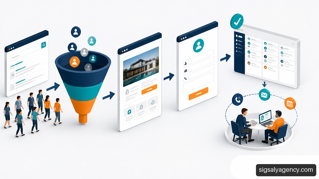
The form is not the end of the funnel. You must activate a clear sequence: confirmation for the user, registration in CRM or equivalent system, assignment to a responsible person and a defined response deadline.
A simple protocol could be:
- Confirm receipt with a clear and realistic message.
- Register the lead with source, page, service and information sent.
- Check if it meets minimum qualification criteria.
- Assign responsible person and response deadline.
- Record whether there was a meeting, proposal, sale or discard.
Fair warning: increasing the conversion rate without reviewing quality can worsen commercial efficiency. A form that is too open can multiply enquiries without budget, outside area or unrelated to the service. Sometimes it is worth asking for additional data to filter; other times, filtering should come later to avoid blocking valid customers. The decision depends on demand volume and team capacity.
Improve With Hypotheses, Not With Random Changes
CRO is not about changing colours by intuition. It is about formulating a hypothesis and checking whether a change improves a defined objective. For example: "If we explain the response deadline alongside the form, there will be more complete submissions because we reduce uncertainty".
A/B tests, forms, CTAs, analytics and continuous improvement can be part of a conversion-oriented design, as shown by Burando Kizuna's web design methodology. However, there may not always be enough traffic for a statistically useful test. In an SME with few conversions per month, it may be more reasonable to review session recordings, form errors, enquiries received and sales conversations before drawing conclusions.
If a website receives traffic but does not generate contacts, let us first review:
• The match between search intention and page content.
• The clarity of the offer on the first screen.
• The speed and usability on mobile.
• The technical functioning of the form and notifications.
• The visibility of the main CTA.
• The objections the page is not resolving.
• The real-time response after each contact.
He web design and online marketing allows positioning the website within a broader visibility, content and acquisition strategy.
Key Ideas
• Let us design each page around a primary conversion, not multiple competing actions.
• Attracting visits and converting them are different tasks: SEO, advertising and content feed the system; the website reduces friction and guides the decision.
• Lead quality matters more than the raw number of forms.
• An effective CTA needs context: action, benefit and, when useful, a response time expectation.
• Accessibility, performance and responsive design are part of lead capture because they prevent real bottlenecks.
• Sales tracking must be ready before activating campaigns or increasing traffic.
Frequently Asked Questions
What Is The Difference Between A Corporate Website And A Website Designed To Capture Clients?
A corporate website can focus on presenting a company, its history and its services. A lead capture website retains that information, but organises each page to facilitate a measurable action. It prioritises value propositions, CTAs, trust proof, clear journeys and data on business results.
What Should Appear On The First Screen Of A Service Page?
A headline explaining the offer, a phrase clarifying who it is for or what problem it solves and a main CTA should appear. A brief trust proof can also be included, as long as it is verifiable. Let us avoid carousels, abstract messages or too many links that delay understanding.
How Many Calls To Action Should A Page Have?
There may be multiple repetitions of the same CTA throughout a long page, but there must be a priority action. Secondary conversions are useful for users with lower intent. The key is that they should not compete visually or contradict the main objective.
Is It Better To Use A Form, Phone, WhatsApp Or Online Booking?
It depends on the service and expected behaviour. Phone fits emergencies; online booking works well when sales meetings are scheduled; forms help gather context; WhatsApp can work for quick questions. Let us choose the channels that the team can handle quickly and consistently.
Is It Worth Creating A Separate Page For Each Service Or Customer Type?
Yes, when the problem, language, benefits, objections or CTA change. A specific page usually improves relevance compared to a generic page that tries to serve everyone. It is not advisable to create almost identical pages: they should provide different and useful information.
What Metrics Indicate That A Website Generates Quality Opportunities?
Beyond forms and calls, it is worth measuring qualified leads, meetings held, proposals sent, attributed sales and response time. A high number of contacts without commercial fit does not demonstrate efficient lead capture.
What Happens After A User Submits Their Data?
They should receive a clear confirmation. Internally, the contact must be registered, assigned and responded to according to protocol. If it is not validated that forms arrive, are registered in the CRM and receive follow-up, investment in design and traffic can lose value.
Sources
• Axioma Creativa + Web Pages Focused on Conversion: https://axioma-creativa.es/es/servicios/paginas-web/
• Web Profesional 360 + Professional web design for businesses that want to attract clients: https://webprofesional360.es/servicios/diseno-web/
• Burando Kizuna + Web Design: https://www.burandokizuna.com/es/servicios/diseo-web
• Reddit + How do you actually build websites that generate leads: https://www.reddit.com/r/UI_Design/comments/1sioefr/how_do_you_actually_build_websites_that_generate/
• Reddit + Getting clients: https://www.reddit.com/r/webdesign/comments/1wv1qbr/getting_clients/