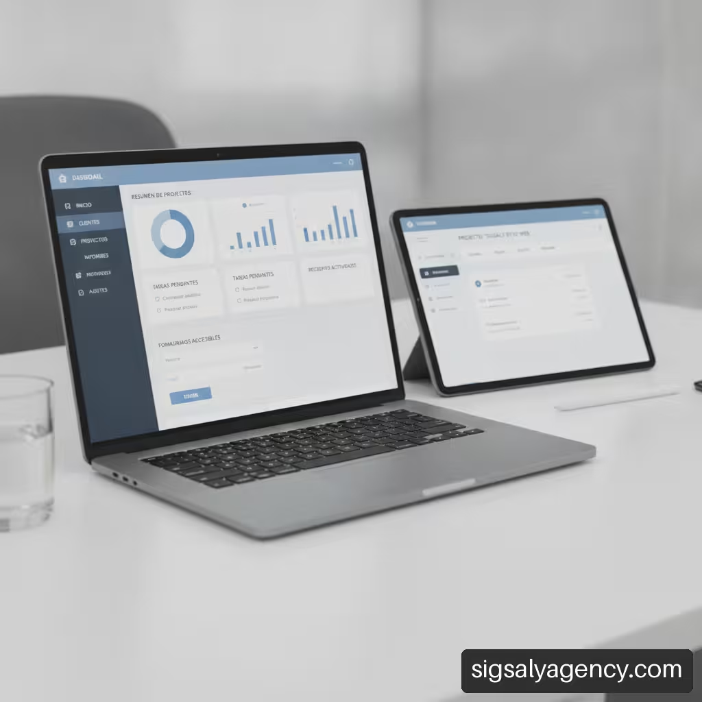
Understanding how to create a clear web interface for business services is one of the most strategically relevant challenges for B2B organisations and professional services firms. When a company offers complex solutions—from strategic consulting to infrastructure maintenance or technology development—the website must act as an efficient translator of its value proposition. If the visual architecture is confusing or navigation presents friction, potential buyers will abandon the page before understanding the scope of what is being offered. In this analysis, we explain how to structure visual hierarchy, optimise conversion flows, ensure compliance with accessibility standards, and validate the interface with real data.
Table of Contents
• Key Points on Enterprise Interface Design
• Information Architecture and Clarity in Complex Services
• Interaction Patterns and High-Conversion Form Design
• Visibility, Performance and Accessibility in the Digital Interface
• UX Audit Methodology and Validation with Real Users
• Frequently Asked Questions about Interface Design for Enterprise Services
• Sources and References
Key Points on Enterprise Interface Design
• Conceptual clarity demands translating internal jargon into tangible deliverables, estimated timelines and measurable business benefits.
• The choice between short, progressive or direct contact forms depends on service complexity and perceived friction by the user.
• Compliance with web accessibility guidelines ensures that the interface programmatically exposes the name, role and state of each component.
• Operations with commercial or legal implications must include visual review stages, explicit summaries and confirmation options.
• Usability audits should prioritise identified issues by weighing business impact, compliance risk and technical severity
Information Architecture and Clarity in Complex Services
Structuring a catalogue of business services requires thorough classification work. Companies often make the mistake of organising their website according to their internal departmental structure, rather than according to the problems that the client is seeking to solve. To achieve clear presentation, we must organise information according to visitor intent.
Service Classification and Reduction of Cognitive Load
When a corporate user arrives at a services page, they are looking for immediate answers to specific needs. To reduce cognitive load, it is advisable to limit the hierarchical levels of main navigation. It is recommended to categorise services into no more than five or six major functional blocks.
Each main category should provide access to dedicated pages per service where the proposal is clearly defined. We recommend structuring each service page using the following visual pattern:
- Summary Header: An executive summary that defines in two sentences who the service is aimed at and what problem it solves.
- Scope and Deliverables: A detailed list of what the service includes, avoiding generalities.
- Methodology and Timescales: Graphical representation of the working process divided into temporal stages.
- Trust Proofs: Case studies, certifications or metrics from previous projects.
- Call to Action (CTA): The next step clearly defined, such as requesting a technical evaluation or scheduling an initial session.
An effective resource for consolidating web architecture consists in linking structured content strategies with business acquisition. In this regard, integrating the web structure with web design online marketing and mcp to improve your positioning facilitates complex services gaining visibility without losing technical rigour.
Translation of Technical Scope into Deliverables and Results
One of the greatest obstacles in B2B design is the presence of excessively abstract or highly specialised terminology. Procurement managers need to understand exactly what they will receive when hiring the service.
To solve this problem, it is advisable to implement comparative scope tables or explicit breakdowns. For example, instead of stating 'Complete cloud infrastructure optimisation', the interface should specify the practical components:
• Initial security audit with delivery of vulnerability report.
• Database migration without interruption of active service.
• Configuration of automated backups and recovery protocol.
• Technical training of 4 hours for the client's internal team.
By formalising the deliverables, we prevent unrealistic expectations and reduce the time needed to close business agreements.
Journey Mapping for Multiple Customer Profiles
In the business environment, different buyer profiles coexist. A Chief Financial Officer (CFO) seeks cost impact and return on investment, whilst a Chief Technology Officer (CTO) evaluates compatibility, security and scalability.
Designing a clear interface means offering visual shortcuts for each profile. This is achieved through role selectors on the homepage or through content blocks segmented by business sector. By allowing the user to filter information according to their priorities, the navigation experience becomes much smoother and more relevant.
Interaction Patterns and High-Conversion Form Design
The contact form or budget request is the critical conversion point in a service company's interface. Poor design in this section creates friction and causes qualified potential customers to abandon the process.
Short Form vs. Progressive Form: Selection Criteria
There is no single rule regarding the ideal number of fields in a business form. The decision depends on the balance between qualifying the business opportunity and the level of effort the user is willing to make.
We analyse the main options in the following patterns table:
| Form Type | When to Use It | Main Advantages | Risks and Limitations |
|---|---|---|---|
| Short Form (3-4 fields) | Standardised services, resource downloads or quick first contact. | High initial conversion rate, very low friction. | Requires greater subsequent effort for business qualification. |
| Progressive Form (Multi-step) | Bespoke services, complex projects or detailed quote requests. | Reduces the perception of complexity by grouping questions by topic. | If clear progress is not shown, it can lead to abandonment. |
| Direct Contact / Calendar | High-value services where the customer seeks immediate attention. | Streamlines the sales cycle by eliminating intermediate emails. | Depends entirely on the availability of the sales team's schedule. |
Following the formal guidance of the W3C on form concepts allows you to implement forms divided into logical stages that show user progress and provide clear instructions before completing each section.
Semantic Grouping and Error Prevention in Requests
In lengthy forms, it is essential to structure information through semantic groupings. The HTML standard provides specific elements such as fieldset and legend to provide context to sets of related fields, such as 'Company Details', 'Project Scope' or 'Estimated Budget'.
Likewise, error prevention should be integrated into the visual and programmatic interface itself. In accordance with the W3C WCAG 2.2 accessibility guidelinesIt is mandatory that automatically detected errors are identified and described through explanatory text, without relying solely on colour codes that may be inaccessible to users with visual impairments.
We recommend applying the following practices in the design of data entry fields:
- Permanent visible labelling: Keep field labels visible at all times, avoiding replacing them with placeholder text (placeholder) that disappears when typing.
- Explicit expected formats: Indicate the required format (for example, in dates or tax identification numbers) through help text placed before the field.
- Prudent real-time validation: Validate fields on loss of focus (on blur) and not whilst the user is typing, to avoid unnecessary interruptions.
- Required field indicators: Mark required fields through explicit text or symbols accompanied by a clarifying legend.
Confirmations and Transactions with Legal or Financial Impact
In business services involving direct online contracting, acceptance of contractual conditions or transfer of sensitive data, the interface must offer reinforced security and review mechanisms.
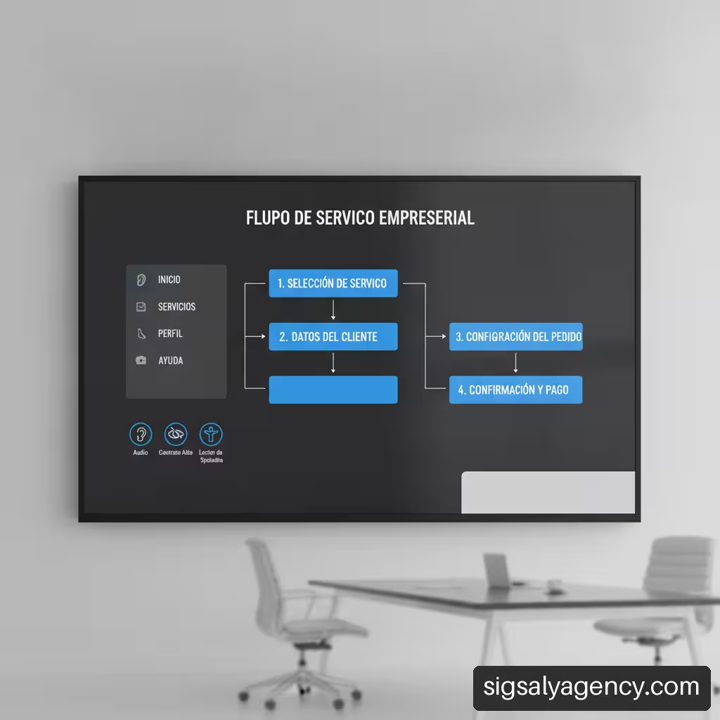
For these situations, the WCAG standard requires that the user can review, correct or revert the information before finalising the definitive submission. This translates into pre-submission summary screens where all entered data are detailed, allowing the specific modification of any section without losing the information already completed.
Subsequently, the submission confirmation must display a clear success message along with the steps to follow (for example: "We have received your request. A senior consultant will review your project and respond to you within a maximum of 24 working hours").
Visibility, Performance and Accessibility in the Digital Interface
A clear web interface must not only be aesthetically orderly; it must also be technically sound, fast to load and accessible to anyone regardless of the computing tools they use.
WCAG 2.2 Compliance and Programmatic Accessibility Standards
Digital accessibility ensures that assistive technologies, such as screen readers used by people with visual disabilities, can interpret the interface unambiguously. To achieve this, it is essential that interface components programmatically expose their name, role, status and value.
If we design a custom dropdown to select types of business service, it is not enough to give it an attractive graphical appearance through CSS. We must ensure that the element communicates to the browser's accessibility API its function (role combobox), whether it is expanded or collapsed (state aria-expanded) and which option is selected (value).
Similarly, all non-textual elements, such as process diagrams or service schemas, must have equivalent alternative text that explains the information they convey.
Visual Management of Service and Process States
In environments where customers interact with customer portals or service management dashboards, the interface must communicate the exact status of each process. Users should not wonder whether a request has been saved or whether a process is still ongoing.
It is essential to design specific components for the different states of a service:
• Draft / Saved: Indicates that the information has been stored locally or on server but has not been sent.
• Under Technical Review: Shows that the proposal is being evaluated by the specialist team.
• Pending Documentation: Alerts the user about the need to provide attachments to proceed.
• Approved / Active: Confirms the validity and implementation of the service.
These statuses should be accompanied by visual support elements such as distinguished icons, clarifying texts and indications of the date of last update.
Integration of the Interface with Digital Acquisition Strategies
The clarity of the interface directly influences the performance of acquisition campaigns and search engine positioning. A well-defined landing page structure facilitates the work of indexation algorithms and improves the quality level on advertising platforms.
To maximise the commercial impact of the website, it is advisable to synchronise the site design with a global vision of capture. You can delve deeper into this approach by consulting our guide on online marketing how to create a strategy that sells, where we analyse the connection between user experience and demand generation.
Likewise, when the technical platform is integrated with complex advertising infrastructures, it is advisable to resort to advanced ecosystems such as mcp integrated systems for improving your positioning with connections to your website and your advertising campaigns, which guarantee precise attribution of conversions generated from the interface.
UX Audit Methodology and Validation with Real Users
Creating a clear interface is not a static project, but a continuous process of evaluation and improvement. To identify friction in the service contracting flow, it is necessary to apply objective analysis methodologies.
Prioritisation of Findings according to Commercial Impact and Severity
When conducting a usability evaluation, it is common to find dozens of possible improvements. However, attempting to resolve all details simultaneously paralyses execution. We must prioritise corrections by combining technical severity and its impact on the business.
An effective methodology supported by the expert review of Nielsen Norman Group It consists of auditing the interface by evaluating consistency, error prevention and user control, classifying the findings according to their severity level.
We present below a suggested prioritisation matrix for design and development teams:
| Severity Level | Problem Description | Prioritisation Criterion | Recommended Action |
|---|---|---|---|
| Blocking (Grade 4) | Prevents completing the conversion (e.g. failure in the form submission button). | Mandatory immediate correction. | Priority patch deployment in production. |
| Severe (Grade 3) | Seriously hinders understanding or causes high user confusion. | High priority in the next development sprint. | Redesign of the affected component or flow. |
| Minor (Grade 2) | Causes slight annoyance or secondary visual inconsistency. | Medium priority; scheduled in the usual roadmap. | Style adjustments or microcopy (microcopy). |
| Cosmetic (Grade 1) | Aesthetic detail that does not impact usability or the task. | Low priority; addressed in general reviews. | Secondary visual improvements. |
Direct Usability Testing and Keyboard Protocols
Theoretical reviews should be complemented with practical testing. Resorting to user research from Nielsen Norman Group allows analysing feedback from potential customers whilst attempting to complete specific tasks on the business website.
A basic testing protocol should include the following scenarios:
- Keyboard navigation test: Navigate through the entire website using the
Tabkey. Visual focus must always be perceptible and the navigation order should follow a logical sequence from top to bottom and left to right. - Service understanding test: Ask a user external to the company to read a service page for 30 seconds and then explain what the company offers and who it is aimed at.
- Form completion test: Observe without intervening how the user fills out a quote request form, recording the pauses, doubts or errors made during the process.
Continuous Optimisation Based on Data and Real Interaction
Once the interface is published, web analytics provides evidence about the real behaviour of visitors. The bounce rate on key service pages, the percentage of abandonment at each step of the form and the time spent are primary indicators of the degree of clarity of the site.
If we detect a high level of abandonment in the second step of a progressive form, the interface is signalling to us that the questions in that block are intrusive or complex. With that information, the design team can formulate hypotheses, run A/B tests and adjust the wording or structure of the form to optimise conversion.
Frequently Asked Questions about Interface Design for Enterprise Services
What are the main elements a clear web interface should have for B2B services?
A clear interface for business services must have simple navigation architecture, a visible value proposition in the first block, explicit breakdowns of deliverables and methodology, social proof (such as case studies or certifications), an accessible contact form and contextual calls to action in each section.
How do I organise complex services so that a visitor understands which one they need?
You must structure the catalogue thinking about the customer's problems and not your internal organisational chart. Use reduced hierarchical lists, classifiers by sector or business role and comparative scope tables that clearly show what each level of service includes and excludes.
How many fields should a quote request form include?
It depends on the degree of qualification required. For quick initial recruitment, 3 to 5 fields are usually sufficient (name, corporate email, company and message). For bespoke projects or complex tenders, it is advisable to use a form with 8 to 12 fields structured in several logical steps.
When is it advisable to use a multi-step form?
A progressive or multi-step form is recommended when the amount of information required could overwhelm the user if presented all on one screen. Dividing the request into stages (e.g. 1. Personal data, 2. Project scope, 3. Budget) reduces the perceived cognitive load.
How to write technical services in plain language without losing accuracy?
The key is to separate the general description from the detailed breakdown. Use clear language headlines focused on the business benefit and supplement the information with well-defined technical bullet points where specifications, tools and methodologies used are detailed.
Where should the main call to action (CTA) be placed?
The main call to action should be positioned prominently at the top of the page (above the fold) and repeated strategically at the end of key explanatory blocks, such as after the description of deliverables or the presentation of case studies.
How do error messages help improve form usability?
Error messages should be descriptive, contextual and constructive. They should be placed next to the affected field, explain in clear text what the problem was (e.g. «The email address must include a valid domain such as name@company.com«) and offer the solution to correct it.
What accessibility tests are essential before publishing the website?
It is essential to verify complete keyboard navigability, check the colour contrast between text and background according to WCAG guidelines, ensure that all form fields have associated labels and validate the interface readability through screen readers.
Sources and References
• W3C — Forms Concepts: https://www.w3.org/WAI/EO/Drafts/tutorials/forms/
• W3C — How to Meet WCAG (Quick Reference): https://www.w3.org/WAI/WCAG22/quickref/
• Nielsen Norman Group — Expert Review: https://www.nngroup.com/consulting/expert-review/
• Nielsen Norman Group — Usability and UX Consulting Services: https://www.nngroup.com/consulting/